Brian said here to make suggestions list for Markers after the beta thread for the last version. So here I am making one. Some of these I’ve already mentioned before but I go into more detail on them.
I made a suggestion to be able to select more than one marker for the ability to move more than one around. Dan said that he doubts markers will ever be selectable. Is there really no way to make them selectable so that more than one marker can be moved at a time?
Enable markers to have full snapping capabilities. That means frame and range markers when moved snap to the playhead and also to clips on the timeline. That latter is important because one of the benefits of markers is to indicate where a video or audio clip will be placed later and when that time comes dragging a clip right up to that marker should just snap to it to make placement easy and precise.
Being able to seek to the next or previous marker on the timeline with a shortcut key. I suggested Alt + up/down arrow keys which is already taken by another action but I think that should be changed to remain consistent with Alt being the shortcut key to seek (e.g. seek based on clips, seek on simple keyframes and hold with Shift to drag playhead without mouse button).
Move the color option menu from the Marker Edit menu to the right click menu. Along with this suggestion a possible keyboard shortcut to go directly to the color menu. Something like Ctrl + M when on a marker.
A Delete All Markers option.
Have that choosing a range marker to export has as the default name for export the name of the range marker and not the name of the project. This in case a person is going to export more than one range marker then they don’t need to keep typing a new name so that it won’t clash with a range that has already has been exported.
How about adding an additional “Each Range Item” as a choice in Export > From in case there is more than one range? No management menu would be needed for this one as it would just automatically export them with the names of the ranges.
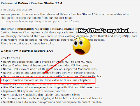
The capability to use the marker data to convert to chapter stops. Seeing as chapter stops are based on the start of a chapter and its end is determined by the next chapter then this would be done with frame markers instead of range markers. The two purposes for this are:
Taking the markers’ start points along with the names and being able to offer the option of encoding that as chapters to Quicktime and Matroska files. Both Quicktime and Matroska files support chapter stops and it’d be fantastic if Shotcut can offer this. F!nal Cut offers a very similar feature so this is not far fetched.
Converting the markers’ start points along with the names into the format that youtube requires (i.e. no milliseconds/frames just hour, minutes and seconds) for it to layout chapter stops on videos. This could be done as some sort of button somewhere like in a management dock that is pressed that would then present a window with all of the chapter listings already converted into the youtube format. The user can then further edit them before coping it the clipboard so they can paste this into the description box for their youtube video to have chapter stops.
There should be rules in order to make the chapter stops idea work. 1) All markers that are to be made into chapter stops must all be of the same color. This to make the rounding up of the markers into chapters very easy. 2) At the very least, the very first frame must have a chapter stop. 3) Chapter stops must have at least 10 seconds in between them. 4) There must be at the least 3 chapter stops. The latter three rules are actually youtube’s but it wouldn’t be a bad idea to borrow them especially since one of the purposes of this suggestion is for youtube. If these rules aren’t all followed then the option to do anything regarding chapter stops won’t be available.
And just to add a cherry on top on this, here are the two posts where I first suggested this idea:
and
The first was on September 26th and the other on the 27th. Guess what happened almost a month later when DaV!nc! Rǝsolve released their new version:
Rǝsolve is on this forum reading my posts, I tell ya!
See, @brian I wasn’t crazy suggesting this! Even Rǝsolve thought it was a great idea! Seriously though, it was a funny coincidence.
Also, I know that there is a Markers dock being worked on which is great! I’ going to get a little ahead of it by suggesting a few things:
Assuming that this is being built on top of the current Markers Edit menu, how about a collapse button for the dock that would open the dock or close it to look like the current Markers Edit menu?
A button to extend the markers list to see more markers in the list at a time. Many users will put down a lot of markers and would be appreciated to have the option of having more room to see more items without having to scroll so much.
A search bar option to filter the list down for cases when there are a lot of markers. Either words can be typed to filter via the name or the HTML code can be typed to filter for color.
Ability to hide columns (e.g. Color, Marker, Start, End, etc…) and bring them back.
Shortcut keys to navigate between markers would be nice for a lot of people. But for old chunks of coal like me, who prefer buttons, might I suggest an arrow button (or half button if such a thing is possible) on each side of the Markers button?
I already know the answer to that: “Not enough room in the toolbar”
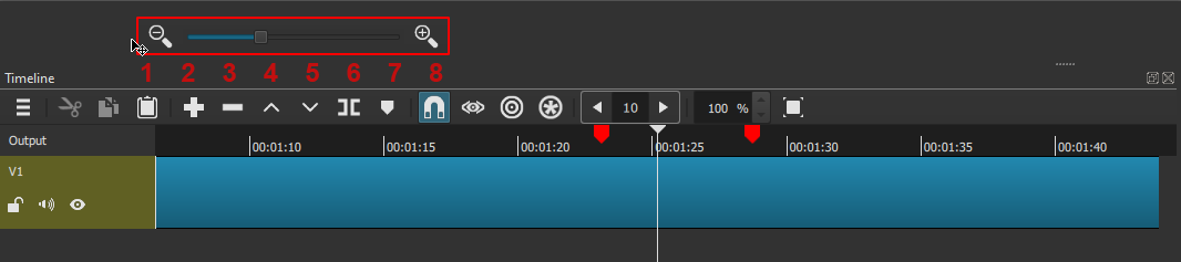
That brings me to an almost related suggestion: Replace the timeline zoom slider by a spinbox
Works like a charm.
That’s not a bad idea to redo the Zoom controls to free up some real estate on the timeline toolbar. But instead of just a generic spinner, the magnifying glass icons should still be kept as it makes it clear visually what that control is about. It could be something like this:
Could be. I won’t deny they make the zoom easier to spot.
Although, in my experience with only a spinbox, I can say that after you’ve used it a few times, you don’t search for it anymore.
A bit like these buttons
Their use is not at all obvious on first sight, but after a while, you learn what they are for.
Thanks for making this list. I plan on working on some of these ideas. Are the suggestions in order of priority?
Here are a few comments:
It is possible. But it is also time consuming and makes the code much more complicated. I think Dan’s comment was his prediction that no one would volunteer to do it.
I have a draft of this already in my development code.
Should be easy to add to the markers panel
In the current implementation, if no marker is selected the editing fields are hidden and the entire vertical space is used for the list of markers.
It would be good to add to the list: the ripple idea that someone posted in one of the other threads.
I do not like a UI where there is a button for everything always presented all of the time. Neither do I like the UI with one big easy button. There will be a panel to list the markers that you can click on so I see no need to add buttons in the toolbar for this. We might be able to hook markers into the existing player buttons and keyboard shortcuts for previous/next edit.
Can you consider instead to have them be separate keyboard shortcuts to seek to markers only and not be the same as the one for clips on the timeline? If markers are placed for future actions, and you want to go down the line at a later time, then it’d be so useful to quickly seek to just them and do those actions instead of having to go through clips in between while seeking to markers.
Not really although since you mentioned that making the markers selectable would take a lot of work, I’d then put that higher on a list just to get that one before anything else that takes less work. I don’t know if the question is that if the work it would take to make markers selectable is not worth the result but if that is the question I would argue that it would be. If markers are available it’s pretty much expected that you can also do multi-select with them for dragging, deleting and even copying and pasting especially as projects get bigger.
Would it make any difference in coding if it was only for multi-select? Like you can’t categorically select an individual marker per say but you can do so just for purposes of multi-select when pressing Shift or Ctrl?
Speaking of multi-select, will the management dock support or can it be made to support any kind of multi-select from the list?
I didn’t add it because @Austin and I discussed it at some length in that previous thread which you already read. I assume it got you to think of something by now.
I suggested Alt + up/down arrow keys which is already taken by another action but I think that should be changed to remain consistent with Alt being the shortcut key to seek (e.g. seek based on clips, seek on simple keyframes and hold with Shift to drag playhead without mouse button).
I do not like changing these if it can be avoided, and it can be avoided in this case. Alt is not strongly tied to seeking; it has many applications. However, left and right are more associated with seeking than up and down (page-up and -down are special and do not apply here). Premiere uses Shift+M for next and Ctrl+Shift+M for previous, but that is already taken by delete marker since Ctrl+Alt+M is a global shortcut on Windows for GeForce overlay. I do not know if I want to keep piling on the M key. Some ideas:
Shift+Left, Shift+Right
,, .
<, >
(, )
Do keep in mind future needs such as nudging, slip edit, and slide edit. I like the proximity of ,.<> keys near M. However, it is nice that there are two pairs of these keys on the US keyboard. For example, for nudging, slip, or slide ,. could move by one frame and <> by several.
On parle beaucoup de raccourcis clavier … C’est bien … Surtout pour les personnes qui utilisent le logiciel toute la journée, Ils les connaissent par cœur et cela améliore leur productivité, j’en conviens. Mais il y a aussi tous les autres utilisateurs qui utilisent d’autres logiciels (DAO, PAO, GPAO …) dans le cadre de leur profession et qui ne font des montages vidéo qu’occasionnellement. Pour ces personnes, les boutons et commandes via les menus ou les dialogues sont aussi à mon avis indispensables.
We talk a lot about keyboard shortcuts … It’s good …
Especially for people who use the software all day, they know them by heart and it improves their productivity, I agree.
But there are also all the other users who use other software (CAD, DTP, CAPM …) as part of their profession and who do video editing only occasionally. For these people, the buttons and commands via menus or dialogs are also essential in my opinion.
Sorry but I am not going to take every other software into consideration. Only a few popular video editors will be considered for input. Others who need more need to wait for configurable shortcuts.
Oh wait, you are asking about non-shortcuts. Yes, there will be something visible in the UI such as toolbar buttons and/or context menu items.
Oui, c’est ce que je voulais dire, les raccourcis clavier ne doivent pas remplacer les commandes intuitives. Celles-ci doivent obligatoirement exister, les raccourcis n’étant là que pour améliorer le flux de travail. Je ne demande pas que Shotcut s’aligne sur tous les autres logiciels, j’essaie simplement de faire comprendre qu’il n’est pas évident de mémoriser tous les raccourcis de tous les logiciels que l’on utilise quotidiennement dans son activité professionnelle ou personnelle.
Yes, that’s what I meant, keyboard shortcuts should not replace intuitive commands.
The intuitive commands must be there, the shortcuts are there to improve the workflow.
I’m not asking Shotcut to align with all other software, I’m just trying to make it clear that it’s not easy to memorize all the shortcuts of all the software you use every day in your professional or personal activity.
It’s not so much that Alt is only used for seeking. It’s more than the seek actions that have been established so far involve Alt. Since Alt+left or right is already seeking then the the expectation would follow that if I also hold Alt and press the keys that are next to left and right which are up and down it will also do some kind of seeking.
Looking at the keyboard shortcuts for the Playlist, most of them involve Shift. How about modifying the Alt+up and down keys to open the next playlist item to Shift+Alt+up and down?
That way, Alt+up and down are free to be used for marker seeking.
Well, up and down in Premiere are actually the keys to seek through clips not left and right. Same with Rǝsolve. That Shift+M, Ctrl+Shift+M business that Premiere has going on for marker seeking is awkward.
It’d be a good idea to start reserving those keyboard shortcuts way ahead of time like how you already knew M was going to be the marker shortcut key. Would you want a thread started for the members here to discuss what could be good shortcuts for those actions when they get implemented in the future?
By the way, I don’t know if this is actually a bug so I will mention it here, but with markers right now you can erase the name and leave the marker with no name. Is that how you want it? I don’t think it’s a good idea. The management dock is coming up and that needs names to be able to put on that list as well as being able to list them properly in Export > From. I suggest that if the name bar is left blank in the Edit menu that the name default to the “Marker #” format that was originally set for that specific marker.
Not really, because then you have itemize with some detail everything possible including the kitchen sink, some of which may not happen or even planned. And some people just say clone all the features of Avid, Final Cut, Premiere, Vegas, Resolve, and/or Lightworks and give us configurable shortcuts with these for presets (not going to happen, obviously). I am not very keen to design by committee. With my statement, I am simply considering some obvious things casually within context.
@brian, I took the Markers Dock for a whirl. Here is some feedback:
I think there is way too many recent colors to choose from. The issue is that the list of recent colors gets so long that the Other option to go to the color menu gets buried and you have to scroll down to get it. That defeats the whole purpose of adding the Color option to the context menu which was to go to that color menu as quickly as possible. First, I think limiting the recent colors to just 4 is better. Second, is there any way that the Other option can stay on the same line in the context menu as “Color” and the recent colors just stack on top of it instead of them burying the Other option?
Entering the HTML codes for the colors in the search bar in the Markers dock doesn’t work. Can it be made to? It’d be nice and useful to be able to filter just colors.
I think the placement of the Markers icon in the toolbar on top should be moved. It seems awkward to have it come after Export and Jobs. Looking at the toolbar I think it would make the most sense to place Markers after Timeline.
Seeing the Markers icon in the toolbar got me wondering if the tooltip for the icon in the toolbar can be updated to include the shortcut key for it like they are included for the icons in the timeline toolbar?
I notice that if you use the mouse scroll wheel to change the Start or End while in the Markers dock and then you undo, it gets undone in small increments rather than going back to where it actually was last before scrolling the mouse wheel like when creating a range with Ctrl or when making changes in the Markers Edit menu. Can that be fixed?