Please test the BETA for version 21.12

This is not new to this release, and I do not agree to change it.

While a video is playing go to its Properties’ panel and change the Rotation to either 90 or 270. Shotcut will crash.

Fixed

I had noticed this previously and took a quick look at it. The highlighting behavior is controlled by our GUI toolkit and the highlight color is driven by the theme. So I would have to re-implement a lot of functionality that is provided by the toolkit in order to change the highlighting. I decided to spend my time on other things.

En parlant de la couleur des marqueurs:
La couleur de la police est choisie en fonction de la couleur du fond. Ainsi le texte est affiché en blanc lorsque le fond est sombre et en noir lorsque le fond est clair.
Cependant cela ne fonctionne pas toujours, par exemple pour le bleu. Le texte est en noir et serait plus lisible si il était en blanc.

Speaking of marker colors:
The font color is chosen based on the background color. Thus the text is displayed in white when the background is dark and in black when the background is light.
However this does not always work, for example for blue. The text is in black and would be more readable if it was in white.

It uses a simple heuristic based on the “value” of the color per the HSV color model. The same is used in the color clip Properties. The value of pure/full blue is the maximum value. Thus, making it work for pure blue would always make the text white. So, I tried using “lightness” per HSL, and the lightness of pure blue is 0.5. When I change the threshold to that inclusive, then the lightness of pure green and yellow are the same lighness and white on those colors is mostly unreadable. I also tried building a text color from hue, 0 saturation, and 1.0 - value; but that did not work either. This is not important enough to get fixed before the release, and maybe eventually someone will make a code contribution.

I was able to fix this

image

If you turn off all of the other columns you can still see which is selected by looking at the edit form:

image

2 Likes
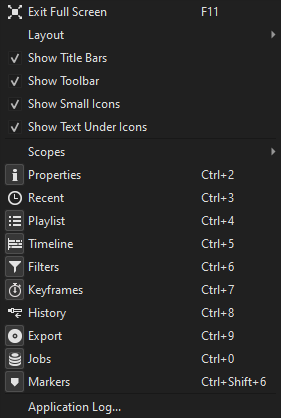
  • I had suggested in my Markers thread about changing the placement of the Markers toolbar on top to somewhere it would visually make sense and you had brought up the issue with the shortcut key in the View menu. I suggested that placing it after Filters would work since they both use Ctrl and the 6 key with Shift being the one for the Markers panel. I did a mock-up and I think it looks good:

Original:

Mock-up:

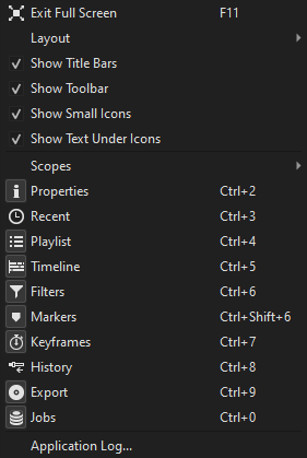
There is sort of a logic in the mock-up order but where it is now is just out of place and awkward by putting it after Export and Jobs especially with the icons in the toolbar on top.

  • There is no shortcut key set for rippling markers. Based on how the others are set, it’d make sense to have it be Alt+R so that way there can be the additional shortcut key of Ctrl+Alt+Shift+R to toggle all 3 of the ripple functions on and off.

  • None of the ripple icons on the toolbar nor the snapping icon nor the scrub icon include the shortcut keys for them in their tool tips. All the other icons on the timeline toolbar do.

  • A slight rename suggestion for the rippling markers icon: “Ripple timeline markers with edits.” That way it will be differentiated from clip markers for when they get included.

  • Has it been decided what the default placement of the Markers panel is going to be in the set layouts? When I hit the default, it’s floating in Editing, Color and Audio but placed right next to Playlist in FX.

I agree, thanks for trying

It is not specified in any of the defaults for preset layouts including whether it is visible or floating. Also, when you start with no configuration, it appears by default docked below Recent/History:

If it is floating for you in those layouts after restoring default it is because you turned it on and made it floating.
These layout defaults may be difficult to edit without changing them slightly in subtle, unforseen ways because they are not defined programmatically but by taking a snapshot of their state from using a library API:

I changed the placement in the View menu and toolbar.

1 Like

I just pushed a change to add Markers into the default layouts so that Restore Default Layout does the expected thing: Markers is hidden. I also changed the default placement of the markers panel to be to the right of the Timeline. Then, when making a new snapshot of layout defaults - such that after Timeline is made visible (if hidden) - I made sure Markers appears to the right of the Timeline when turned on. Here is the default Editing layout after turning on Markers:

That’s peculiar how on yours the placement of the Markers panel cropped the bottom half. On Windows, if I do that and try to bring the timeline all the way down to make the player bigger than the Markers panel will follow but won’t crop out name, color, start, end and duration. It’ll all just be squished together.

Also, that’s an interesting place to put the Markers panel. I was thinking that for the Editing, Color and Audio layouts the default could be right next to the Filters panel since that would fit all of the components of the panel like the categories and the area for name, color, start, end and duration. And for the FX layout right next to the Playlist on the bottom left for the same reason.

Ctrl+Alt+Shift+R is used by Ubuntu to start screen recording. So I used Alt+Shift+R instead.

Alt + R = Toggle ripple markers
Alt + Shift + R = Toggle ripple markers, mode, and all tracks

Done. Scrub does not have a keyboard shortcut.

Done

2 Likes
  • If you add the Size, Position & rotate filter to a video then rotate it to 90 or 270 in the Properties tab the VUI gets thrown to the side like this:

  • In the Hue/Light/Saturation filter, I notice if I drop the Hue to 0 or raise it to 200 it looks the same as 100. Is that on purpose?

  • In the Markers panel, if you click on one column item to add or remove the Column menu goes away. This could get annoying if you want to add or remove more than one column. Maybe just keep the menu up and when the user is done they can just click away to close the menu?

  • Delete in the context menu for Markers doesn’t note the shortcut key for it.

  • If you create a name for a range then in Export > From it lists it as “Marker”. The documentation page for it though specifically calls it a “Range”. I think it would be better to call it “Range” in Export > From for consistency.

Yes, Hue is rotational in nature, and this could also have been represented as -360 to 360 degrees.

In the Markers panel, if you click on one column item to add or remove the Column menu goes away.

It is standard behavior from the UI library and menus in general. We would have to try to alter the behavior, and that is far from obvious how to do, and I bet someone will report it as a bug. So, no. But we could remove the submenu and let “Columns” be a category label like we have in the Settings menu.

I think it would be better to call it “Range” in Export > From for consistency.

But it is not consistent. There is nothing in the UI labeled “Range.” Technically, there is only “Marker” and range is logically a marker with a duration. The documentation is incorrect for making “range” bold and capitalized since that documentation formatting convention is for references to matching UI labels. It is important that things in the UI that refer to one another use the same term. I will fix the documentation.

Changing the Hue parameter to represent as 360 degrees would make perfect sense.

Speaking of 360 degrees, and I know that this is not specific to this beta, but I just noticed that all of the 360 video filters have the keyframe icon come before the reset icon unlike all other filters where the reset icons come before the keyframe icon. How come? That’s a strange inconsistency.

Sorry. I was the one that put “range” in bold since I wasn’t aware of what your standard was for making terms bold.

The contributor did that maybe by accident, and I overlooked it.

If you add the Size, Position & rotate filter to a video then rotate it to 90 or 270 in the Properties tab the VUI gets thrown to the side like this:

This happens in Fill mode only because it reads the source display aspect ratio, which just changes, and adjusts the Size only. The position cannot be changed arbitrarily or assume that you want it relative to frame. All it knows are X and Y coordinates. So, in your screenshot, the image should appear within the VUI rectangle, which might not actually be what you want. The UI needs to update the filter in the engine. I have come up with a fix for when there are no keyframes. But when there are keyframes it would need to iterate each of them, and, again it is not exactly clear this will give the user what they wanted. Ultimately, when something is based on the source aspect ratio and that changes, dependencies will be a little whack and probably need redoing - similar to changing the resolution and aspect ratio of Video Mode affects any spatial-oriented filters. I decline to do anything about this at this time.

This is done.

And this is done after Brian agreed:
Screenshot from 2021-12-17 16-23-37

Instead of having it say “Remove all” I suggest “Remove all markers” to make clear what it does. Because the way it’s laid out there now “Remove all” almost makes it sound like it’s to remove all columns.

As much as I did not want to introduce a string change now, I agree this is necessary now and made the change.

1 Like
  • I was experimenting with the Hue/Lightness/Saturation filter and came upon a crash that happens again and again with every video file I experimented with. I was testing this for at least a half hour to find exactly what triggers it and I haven’t exactly nailed it but it seems to be triggered based on the speed and rhythm of using the mouse to slide the bar back and forth. Basically, you apply the filter, go directly to the the Hue parameter and slide it right then left then right again and it will eventually crash. Sometimes this has happened in an instant and sometimes it takes a few slides back and forth before it will crash Shotcut. But it can and will happen. Demo.

  • When I choose the default Editing layout and bring up the Markers panel here is how it looks on the lower right with some markers already set:

You can only see two columns and two marker listings. If you rather keep it on the bottom than putting it along with the Playlist, Filters and Properties tab like this:

then I would suggest putting it on the bottom left rather than the bottom right. In all of the default layouts, the panels placed on the left side are the panels that the user can modify (e.g. Playlist, Filters, Properties, etc…) whereas the panels placed on the right side are the ones for monitoring (e.g. Jobs, Audio & Video counters & meters, History, etc…). So placing the Markers panel on the left side in the Editing, FX, Audio and Color default layouts would keep that consistency. Also, if you raise the height of the timeline a little in the default layout for Editing, Audio and Color and open the Markers panel just a little more then when the Marker panel is activated, it won’t look so squished like it does above. Something like this:

  • @brian, there is a bit of a bug in the Markers panel when a marker is deleted and that is that in the edit form still shows the listing of the marker that was deleted even if you click on the listing that automatically gets highlighted after deletion. In this demo I delete Marker 3 and Marker 4 gets automatically selected. But after I select Marker 4 so that the playhead goes to it, the edit form doesn’t update as it still lists Marker 3.