V20.02 BETA is now available to test

  1. Pick the Crop: Source filter and add it to a clip that is either in the Source tab or the Project tab. Then switch to the other tab and back again to the tab that has the clip with the Crop: Source filter. The filter will now say that it’s a GPU effect.

  2. Right click on a clip in the playlist and pick “Copy”. Go to Properties and change the speed. The playlist item’s running time will change even though “Copy” was picked.

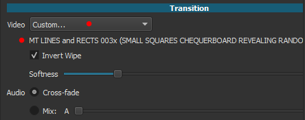
  3. Using the Pitch filter adds lots of clipping sounds to the audio. Here is a demo I made using a video clip where I do 3 comparisons. The original clip with no modifications. The same clip but sped up 2x. Then finally the same clip sped up 2x but with the Pitch filter added with a Speed Compensation of 2x to match. There is no clipping heard in the first two examples but when it gets to the example with the Pitch filter the clipping sounds are heard throughout: https://streamable.com/hjtzx

  4. Can 6 decimal points be added to the Pitch filter to match the amount of decimal points in the Speed parameter found in Properties?

  5. I believe that the location of the Preview Scaling option should be under the player. It’d be better here:

I believe this is the best place because people who are going to be depending on this feature may want to toggle back and forth to see how certain things are looking especially if they are using the 360p setting. Since the zoom, grid and volume options are all toggle buttons this fits right in as it would be very convenient for a Preview Scaling button to have a small drop down menu with the different scaling options along with the ability to simply turn Preview Scaling off and on without having to choose “None” all the time. I also think that having that button be a little separated from the others under the player as I have it in the picture would be good to make the button stand out so that new users who will need it but are unaware that this feature exists can notice it better. Plus, when the eventual proxy generator gets implemented, it’d be nice to also have a toggle on and off button for proxy use placed alongside this suggested Preview Button. The current location of Preview Scaling being under Settings and having to scroll down that list is too hidden and is just inconvenient for toggling. Although, that location under Settings could still be kept in case users make the player very small and end up collapsing those player buttons.

  1. The change in behavior where now dragging from the Source tab to the timeline automatically toggles the tab to Project I think isn’t as convenient as it may seem. The convenience of having it stay on the Source tab even after dragging to the timeline is that if I have a large clip that I want to pick smaller clips out of to drop in the timeline, I can go from setting in and out points to dragging to the timeline again and again. By having the tabs switch, I would have to manually switch the tabs between picking smaller clips to drag which makes it an uncomfortable workflow. I could add those smaller clips to the playlist but I like to limit the playlist to more important clips rather than short clips that will just be one offs. So having to add them to the playlist just to drag them to the timeline then removing those clips in the playlist is adding unneeded steps.

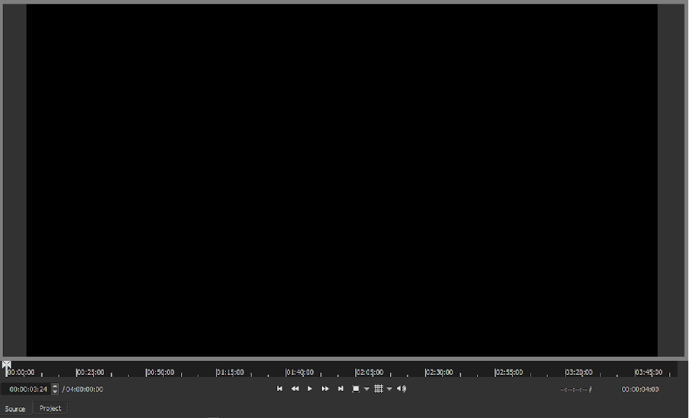
I think the real issue that was going on here is that the current design of the layout doesn’t make it clear right away to the user that the tabs have switched between Source and Project. One problem is that the colors for the Source and Project tabs when they are active and inactive are too similar:

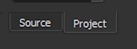
The colors could be more obvious when one tab is active and the other inactive. Perhaps when one is active the colors are inverted or made even brighter?

Alternatively or even additionally, there could be some kind of a border around the player with a different color representing each tab. So let’s say when the Source tab is the focus, the border around the player can be grayish:

And when the Project tab is the focus the border around the player can be that blue color that Shotcut uses:

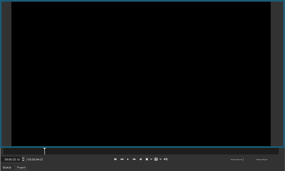
Something like that will always make it clear to the user when the Source and Project tabs switch which would be very useful especially if one is deep into their workflow.

  1. The change to now allow the rectangle controls to be moved from anywhere within the rectangle is useful but it creates a problem: You can’t drag a clip from the source to the timeline if the rectangle controls fill the screen. I believe a button should be placed to the left of the word “Position” for the filters with rectangle controls. That would turn the option to be able to move it from within the rectangle on and off. I think the default should be off.

  2. I believe the “Rectangle” filter should get a new name. The current name does not represent how versatile this filter is. The default shape may be a rectangle but ovals/circles could also be created with this filter. Perhaps something like “Shapes: Squares & Circles”?

1 Like

The 161 matte transitions that @jonray collected and shared are short video files that could be used with the Mask from file filter.

The recent change allows the video files to be used when making an overlap transition.
Select the transition. Select properties, select custom, use the matte video file for the transition.

image

1 Like

This is fixed for the release.

  1. Right click on a clip in the playlist and pick “Copy”…

This is fixed for the release.

  1. Using the Pitch filter adds lots of clipping sounds to the audio.

We are using a library for this with no plans to work on its code.

  1. Can 6 decimal points be added to the Pitch filter

This change is made for release.

  1. I believe that the location of the Preview Scaling option should be under the player.

Perhaps but there are already many things here already, I do not want to clutter, and many times people have this as a small window.

  1. The change in behavior where now dragging from the Source tab to the timeline automatically toggles the tab to Project

This will not be changed. This was not some arbitrary change. The recent change to not seek upon drag-n-drop introduced a regression in the consistency of selection. After a drag-n-drop, the clip in the timeline is selected, and the other parts of the UI must reflect that including the player. Once you switch the player to the Source tab the timeline clip is no longer selected. Once you switch the player to the Project tab, the timeline clip is selected. When you select a clip in the timeline, the player switches to the Project tab. When you double-click a clip in the playlist, the player switches to the Source tab. This is all part of the design to make selection clear and consistent. Along with these Properties, Filters, and Keyframes are all updated to reflect the selection. You are basically asking that drag-n-drop does not select the clip you dragged into the timeline and thus change focus to the timeline (and project player). But the current behavior is a typical drag-n-drop behavior - see Explorer for example. If I change this people will complain. They will drag-n-drop a clip to the timeline, make changes in Properties and Filters, and complain that it is not affecting the clip in the timeline.

One problem is that the colors for the Source and Project tabs when they are active and inactive are too similar:

This is the standard tab styling that comes in our GUI toolkit that I am not going to override - at least not for this release.

  1. The change to now allow the rectangle controls to be moved from anywhere within the rectangle is useful but it creates a problem…

That is true, but there are multiple ways to add the clip to the timeline. I will think about this some more and possibly revert the change but not build upon it with new controls as you suggested for release. There is a plan to eventually add a video UI visibility toggle that would address this. My rule for the beta period is minimal changes.

  1. I believe the “Rectangle” filter should get a new name

You cannot really create an arbitrary ellipse, only a circle if the rectangle is a square. This filter is an experiment, and it could expand or be replaced in the future into a more full but simple drawing tool. I think “shape” is too arbitrary now, and people will complain it does not support ellipse, triangle, polygon, bezier, etc.

WOW! I tested almost everything listed in the changelog, and everything works! This is the final release quality.

What a mastery coding skill! Dan and Brian! NASA should hire you guys and we already on the mars.

I joined Shotcut like 2 months ago, there were many shortcomings and I was complaining in this forum like I want this function and we should have that filter, etc, etc.

And in a little 1 month time, boom! We have it all!

2 suggestions:

  1. Preview scale selection “Auto”, detect and use users “actual preview size” as the preview scale (Most users actual preview size is around 500p~700p) then we don’t need to worry about it anymore…

  2. Widen the pitch filter shift range. For effect videos (like special transitions) sometimes 10x speed up or slow down are used. Now the sound pitch speed compensation only can reach 4x times. Often it is not enough.

Then I think the Pitch filter’s debut should be delayed. The clipping that it can produce in the audio makes it unusable. I would expect to see complaints about it.

Yeah, that’s why I suggested that the option could still be kept under Settings in case people make the the preview window very small and the player buttons collapse. But I found myself switching the Preview Scaling back and forth several times in a session just to get a better look at things and a toggle button would be very convenient.

I understand the reason why you changed it. What I brought up is that there was actually a convenience that came about to what you saw as a regression. You designed Shotcut so that the Source and Player screens would share the same space. That’s a good idea as it saves on real estate and allows the preview screen to be made bigger which is good for editing unlike other editors that use two screens. But with other editors that separate those screens, the one advantage that they have is that you can quickly pick off smaller clips from the source viewer screen, drop them into the timeline and quickly go back again to the source viewer to do it again. This convenience accidentally came to Shotcut this past fall but with this latest change this convenience has been removed.

Maybe I am misreading that sentence but I wasn’t asking that the focus change to the timeline (aka the Project tab) after dragging and dropping. That’s what it does now after this new change. What I said was that the behavior of having the Source tab switch to the Project tab after dragging and dropping not happen in order to keep the convenience that came about this fall.

Your concern seems to be coming from the expectation that if the user drags and drops a clip on the timeline then that must mean that the user right away wants that clip selected in order to be ready to add filters. But I don’t believe that’s the expectation most users have. If I am dragging and dropping a clip to the timeline, then I don’t expect that clip to have been selected yet because I didn’t actually select it in the timeline. I just dragged and dropped it to the timeline. In other editors like Resolve that use two separate viewer screens, dragging and dropping a smaller clip from the source viewer to the timeline does not automatically select that clip in the timeline to add effects to. Even after dragging and dropping a clip, Resolve stays on the clip in the timeline that was actually selected last. So If I last select Clip B then I add 5 new clips in a row to the timeline from the source viewer and place them all after Clip B, Resolve will still stay on Clip B even after dropping the 5th clip down on the timeline.

That’s why I went on to suggest having a much clearer visual cue to the user when the Source and Project tabs have switched. I think the real issue is that users may not be noticing when the Source and Project tabs have switched because it isn’t obvious unless the user is experienced.

I figured that. Hopefully you can consider something similar to the 2nd suggestion about the border around the player. I think something like that would be the best of the 2 options I suggested. It really needs to be made clear visually to the user that the Source and Project tabs are two different players.

Believe it or not that was exactly my second and preferred idea. :smile: I was thinking that maybe the circle control could have a second function somehow that could be used to switch the rectangle controls from just the circle to how you have it now where it could be moved from anywhere inside. But I didn’t suggest it because I didn’t know if that would be too much or not possible given whatever technology is being used.

That’s why I suggested the name be something like "Shapes: Squares & Circles” to make clear what the shapes are limited to. It’s a good filter but “Rectangle” is something that I can see people easily passing by as it doesn’t seem to mean anything.


Rectangle Filter.
I use saved Preset but Preset does not change Corner Radius, Position and Size

I think this is not necessary and clutters the UI. Your ear can not discern a 0.0001% pitch change. A future feature/change will add perfect pitch compensation to the speed control.

Can you please do some additional testing to see if any parameters affect the clipping sound? Suggestions:

  1. Different pitch compensations: is there a certain level of pitch compensation where the slipping starts to occur?
  2. Different export frame rates?
  3. If you “convert to edit friendly” the source, does that have any effect?

Thanks for your help on this.

I think that “obscure” was the wrong word. I mean that there is a lack of contrast. One use case that I was testing was opening the 75% color bars generator (file->open other). When you do that, you get a dot on each of the markers. If I make the markers full brightness, then there is little contrast between the dot and the marker - especially yellow.

I would like to avoid adding a user control for graticule brightness. But maybe it will come to that some day. In the mean time, I will spend some time to experiment some more with the graticule brightness to see if I can find a better compromise.

I do agree.

Gotcha, gotcha. It sounds like there are two audiences for this scope… engineers versus graphic designers and colorists (more creative than technical). What if we appeased both disciplines like this?

I borrowed this image from Van Hurkman’s web site and hacked in new markers using Microsoft Paint because I’m not at my main computer right now, but hopefully the idea survives. What about making the 75% area completely black (unmarked) and with a little padded spacing so that the dot from color bars would be completely uncontested? Then small but brighter marks could point the way for creative users as opposed to engineers. Or larger but dimmer marks if they were also pointy spires just like the other six lines in the image (it could look like a bowtie was laying on the hue line).

Just brainstorming. I feel your pain. Thanks for listening to our madness.

The reason I had suggested it is to be able to easily copy and paste whatever speed change is made in Properties to the Pitch filter. Because the Speed parameter in Properties has more decimals than the Pitch filter you can’t do that. You can though copy Pitch values to Speed because Pitch has less decimals.

I’ll be back to post additional tests.

Just to come back to add to this because I just got a look at the updated Pitch UI. The added decimals look fine to me in the UI. It looks just as fine as it does in the Speed control in the Properties menu. And I was able to quickly copy and paste the Speed numbers from Properties to the Pitch filter which wasn’t possible before.

I’ll be back with those additional Pitch audio tests.

Yes, that is a good assessment. I hope that we can find one solution that satisfies both needs. I like your idea about leaving a gap. I will experiment with that.

After some experimentation, I have decided to brighten the marks for now. Even with the darker marks, the colorbar view was not easy to see.

Thanks for trying out some alternatives. It’s already a fantastic scope.

I compared three of the “161” matte files using 1) the new “transition” method and 2) the original “Mask from File” method and found that they came out differently.

Unfortunately the “transition” transitions are far worse than the “mask from file” transitions. (Unless I’m not doing it right - I used “properties >custom”. On Dan’s release notes (20.02 BETA) it mentions “properties >video” but I couldn’t find that anywhere).

Anyway I made a short demo using the matte files #3, #7 and #13 from the “Lines and Rectangles” folder (Jonray collection). In both cases the “transition” method looks worse:

https://streamable.com/m6ghh

It’s a shame because doing it the new way was far easier (provided the transition was made as long or longer than the duration of the matte video).

A further point: I had to select “invert” in each case for it to work properly. (I made the transition by dragging the right clip back over the left).

I too tried it last night comparing both methods, albeit on a single transition (one of the “splat” transitions) but didn’t notice the glitch on that particular one. I certainly agree the technique is much simpler and although an overuse of transitions can ruin video’s these are a really good addition to Shotcut. @sauron highlighted earlier in the thread that the invert option is required.

The “properties >video” caught me out too.

It says “transition Properties”. I will try to emphasize that better in the release post.

In both cases the “transition” method looks worse

I will look into it but not making any promises. Part of the problem is that it is the same code that deals with still image. Same goes for

I had to select “invert” in each case

I can probably check if the source has more than one frame duration and change behavior slightly.

1 Like

I am going to add keyboard shortcuts for the release. In a future version, I will add a gear icon to the player controls and move all player settings from the Settings menu into there. As a button unto itself, I am worried about making an icon that makes it clear it is preview scaling. I worry people will see a list of resolutions when they click some abstract icon and think that is their project resolution. I can hear it now, “Shotcut is limited to 720p!”

This convenience accidentally came to Shotcut this past fall but with this latest change this convenience has been removed.

I understand your point, but I must fix the selection consistency bug that exists since v19.09. It is too big of a change to not select the timeline clip after drag-n-drop at this point. That is the traditional behavior of Shotcut, and I might want to make people opt into a new behavior.

I was thinking that maybe the circle control could have a second function

I will change the rectangle control so that when you double-click it, it will be like a position-lock and toggle on the new behavior. I will also try to make it include some visual indication of the state.

1 Like