Thoughtless timeline stops

I’m having big trouble using the timeline now. In a first phase I went through my video recording and noted all the interesting time marks, what happened there and made some notes about what parts I want to cut out.

Now I’m revisiting these places on the timeline and select the exact times to cut. But reading the timeline labels is very confusing. Here’s the text that reads on my timeline right now:

00:00:00:00
00:01:02:19
00:02:05:14
00:03:08:08
00:04:11:03
00:05:13:22
00:06:16:17
00:07:19:11
00:08:22:06
00:09:25:00
00:10:27:20

Where should I click when I want to go to the time 3m30s? Normally I’d click halfway between 3m and 4m. But these don’t exist, both are off by several seconds. I have to turn up my brain calculator to compensate for these errors. Or 3m43s? That’s about three quarters between 3m and 4m. Here it’s probably more halfway between the two adjacent stops. I basically have to guess and point anywhere between the closest numbers. I get no feeling about where the even numbers are.

Usually when you draw a graph axis, you pick even numbers like 1, 2, 3, 4. This time axis feels like its numbers were chosen randomly. Visually it appears that they were distributed evenly so they fit the screen space well and look somehow “pleasant”. But that design immediately makes them almost unusable. Function follows form? Not a good idea.

I suggest changing the timeline and display time stops at even numbers in steps like 1m, 30s, 15s, 5s, 2s or 1s as appropriate.

The time format is HH:MM:SS:Frames

The simplest way to navigate the timeline is to use the time display/spinner.

image

You can click on the timeline to get roughly to the area you want. Then hover over the time display and use the mouse scroll wheel or the up/down arrow keys to scroll frame by frame. You can also type in the exact time you want to go then press enter.

@sauron I’m not sure what you mean. Were you suggesting me to ignore the text on the timeline axis and only enter the desired time into the current position field? Then what is the timeline text for? It’s still not very usable .

I really don’t see what the problem is.
@sauron explained it perfectly.

The “text” you refer to is only for guidance to see where you are roughly on the timeline.
If you want exact frame accurate placement you have the options that @sauron explained, or you can also drag the playhead cursor to the exact place you want to be.
The exact time in HH:MM:SS:FF is displayed in the spinner box.

41%20PM

2 Likes

I don’t expect frame-precise time info in the timeline, that wouldn’t be possible anyway since there’s simply not enough space as you can imagine. I’m simply talking about the values that are displayed there. And they’re chosen in a way that I just can’t get a good feeling about where something is. I’m wondering how you can actually work with the times that are displayed. When I want to go to 3m30s for example, I intuitively know that that time will be in the middle of 3m and 4m, if these two happen to be displayed. Transfer this situation to anything you like. If displayed stops are 3:30 and 3:40 and you want to go to 3:37, then it’ll be at about three quarters between these two stops. We’re all used to think in the decimal system that uses 10s for orientation. This also allows for reading very little text to know what time is at that place.

Shotcut however doesn’t offer me 10s. It offers me arbitrary numbers that are anywhere off these even numbers. I have to read a long text to know what time it is there. It doesn’t care to give me any guidance to quickly find a certain time location.

This is basically the same situation as with any line chart. Please take a closer look at line charts and google some if you haven’t seen one recently. What are the numbers shown in the X axis? Are they random, at a very high precision? Or are they even, at the lowest possible precision? There’s a reason why the latter is true.

Maybe I’m just unable to explain this to you. I just take this circumstance for granted and Shotcut now fails at such very basics of UI support. I’m even stunned that you don’t see it the same way. Most people I know would.

Did you ever stop to think that the timings on your video are not 10 based as per the “charts” you refer to but most likely 25 or 30 fps?
(Increments of 40mS for 25fps or increments of 33mS for 30fps)
That means that half way between say 2 and 3 seconds will NOT be 2.5 seconds but 2 seconds and 15 frames (for a 30fps video).
The time is always to the right of the marker.

At exactly 00:00:02:00

04%20PM

Between 2 and 3 seconds will be 2 secs and 13 frames (rounded up as my video is at 25fps)

59%20PM

At 3 seconds

15%20PM

Halfway between 3 and 4 secs…you guessed it, 3 secs and 13 frames

30%20PM

You’re looking at the wrong place. The upper time scale near the source/preview area is just fine. The lower one, near the project timeline, is the one that’s broken. Here’s a screenshot:

And no, I won’t stop thinking in decimals. Why should I? After all, the minutes and seconds are the numbers that are displayed by Shotcut, not the global frame counters. And it’s these minutes and seconds that are picked for the scale in an almost unusable way.

And I’ve found another bug in this time scale: When you zoom in far enough to do precise frame selection, the scale is almost empty:

There’s so much space that could be filled with useful information but it’s mostly empty. Makes me feel blind at large parts. Like driving through the dark and only seeing the road every 500 metres.

1 Like

Looks fine to me.
Your first screen shot shows roughly 14 secs between markers and the second one is roughly every 5 seconds.
It all depends on how much you are zoomed.

Yes, the more you zoom the less of the over all timeline you see.

Think of it in terms of a camera’s zoom.
When you go wide, you see the whole “picture”, as you zoom in more and more, you start seeing more and more of only what you are zooming into and less of everything else.

The timeline would other wise be completely cluttered with time graduations.

You are missing the point, when you zoom out completely, each “frame” may only take a few mm’s of screen real estate, however as you zoom in, each frame takes up more and more space.
Hence your “empty space” is not really empty, it may represent only a handful of frames, where as when zoomed out completely, the same space could represent several hundred frames.

The timeline ticks were removed a long time ago.

If you read Paul’s reply (number 4 above) carefully it shows exactly how to get what you want. There are 2 ways to get approximately where you want to get to and one that is exact.To get to the exact time it takes less than two seconds to type the value in the spinner, I really can’t see what you are getting at.

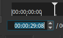
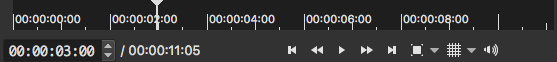
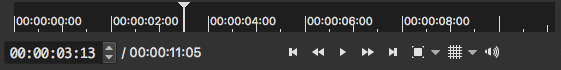
See, that “roughly” is the error. Scale ticks are supposed to be “on the value”, not anywhere in between. I don’t need a tick that is “somewhere”. I can get “somewhere” myself by clicking anywhere. It’s like using non-rectangular sheets of paper for a letter, because who the heck needs rectangles when you actually write your text somewhere else anyway? Or why use regular intervals? The app might as well throw in timeline ticks at random intervals without being any less predictable or helpful. I get the impression that you never really used a real working scale, or have understood how to use it.

And when it rains you may get wet. This is obvious. Yet, you cannot compare a scale with dynamic ticks with a real physical thing. When you “zoom” a real thing, it won’t change. You just see a different part of the same thing. A scale can change. And it should. This one actually does, but in a very poor way.

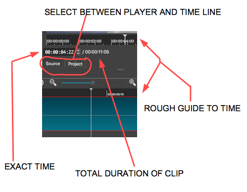
It’s the timeline’s job to show the time, not to “look clean” by being empty! That’s Apple design logic, remove everything useful so that it’s pretty. I’m sorry but the more I read from your arguments, the more it sounds completely stupid to me.

And you seem to believe that I am stupid and don’t have the slightest idea of what I’m doing here. Rest assured that I am fully aware of the concept of time and its various digital representations, as well as the concept of finite discrete data, be it audio samples or image pixels. I’ve been editing with a timeline (or pixel ruler) and zoom levels for three decades or so.

Your comparisons simply don’t apply. You argue that the timescale should more or less use the same absolute interval no matter the zoom level. This is nonsense. (And even just my second point of criticism, not even the main one.) A timescale selects the ticks by evaluating the available screen space and the amount of it that a tick label takes. It then adds some margin to keep it readable and aligns the actual ticks so that a human brain can easily consume and navigate them. It’s supposed to provide orientation, not to confuse with noise. For most people in western Europe that would be the decimal scale. And that’s exactly what everybody else in this world does (as far as I’ve seen it). Would you dare to state that every other developer of timescales or axes in general is wrong? After all, being wrong is often a matter of your point of view. To you, everybody else is wrong. To everybody else, you are wrong. Who’s right?

Wow, so this is “by design”. I’d say a particularly bad design. And “to improve timeline rendering performance” – are the Shotcut developer that bad at their job so they can’t compute proper time ticks sufficiently efficient? I hadn’t expected that, really! (Because until now, everybody could.)

If you do everything with your keyboard and leave the mouse untouched, if you know all the key shortcuts, then your point seems plausible. I, however, prefer a pointing device of some kind for all tasks that deal with graphical interaction.

I’ve spent some time now digging through the source code of Shotcut and MLT on GitHub but wasn’t able to locate the code that performs this time ticks selection. The closest interesting part was this. Maybe somebody could point me to the right place so I could analyse it and suggest an improvement, if one is desired at all.

As you say, it’s all a matter of perception as to who is right and who isn’t.
I, and by the looks of it, many others, perceive the timeline markers in SC to be not only OK, but very useable as they are.

Your perception of SC is obviously very different, that is fine and you have several options:
-Accept it
-Find another NLE
-Make changes and compile your own.

1 Like

Contribution are always welcome! I think that sometimes people do not realize that Shotcut is being actively built by a very small group of volunteers who have many other priorities competing for their time.

1 Like

I might possibly be able to contribute a code suggestion if only I knew where the responsible code is located. I wasn’t able to find anything near calculating or drawing this part of the UI.

I think that the function that manages the display of this rule is in the file:

Shotcut.app/Contents/Resources/shotcut/qml/timeline/ruler.qml

at line 25
Math.round(136 * Math.max(1.0, timeScale)) + adjustment

That is the correct location of that code for Timeline, and there is a similar file in qml/views/keyframes. timeScale is the zoom factor, and adjustment is merely a refresh hack if you look near the bottom of the file. 136 is arbitrary and lower values increase the frequency of ticks. I agree this should be smarter about the time interval used. The performance problem occurs because the timeline is using Qt Quick technology, which is an OpenGL scenegraph API. Everything drawn is a separate object that must managed. Probably the ruler drawing should be moved to qmltypes/timelineitems.cpp and drawn using the QPainter canvas API as a QQuickPaintedItem.

Update:
In this QML code, #frames = pixels / timeScale
application.timecode() takes #frames and returns a string
profile.fps is available and returns a real number that corresponds to video mode or project fps.
Thus, if we want to show every 10 seconds:
stepSize = profile.fps * 10 * timeScale

Also, when playing with the code, to understand the performance impact, load a long clip or project of at least an hour and change the timeline zoom.

Related

1 Like

Thank you Dan for these clarifications.
It is true that I have already played a few hours on this file in the hope of obtaining values rounded to the second, but without success.
In the end I just replaced 136 by 100 (as for the rule Keyframes) and increase the font size from 7.5 to 11 for more readability

I will remove the font size to let it use the normal size.
As for getting the frames field of the timecode to show 00 when using a non-integer frame rate, I am experimenting locally with a change that does not show frames. I think it works better.
Here is a timeline/Ruler.qml that you drop into your existing install to try. Maybe after I finalize how I want it, I will try making a QQuickPaintedItem in C++ to see if it is faster when the precision increases as you zoom in.

Ruler.qml.txt (2.2 KB)

1 Like

Thank you Dan for working on this subject.
Your solution suits me perfectly, it is much more readable.
The integration of the function “timecode” allowed me to display the hours on 1 single digit (I never do project of 10 hours) by modifying the line 39.
I also keep the font size to 11 to match with the source player rule. Without this, the font size is too big.

30

OK, got it.