Hi guys, I just created a Barn Door transition using a HTML file, created in Notepad++, applied to a transparent clip and used to overlay on top of an existing cut between 2 clips.
Demo:
I got the idea of the diagonal wipe from @jonray just did it a different way.
Sincere apologies for using Pompeo but it was the first clip I found.
It was no coincidence that once he started talking, there was a system crash.
One of the great things about this forum, sharing and developing ideas from others
(Hey, I see the BBC have nicked my idea too … - Here’s the TV footage after the USA scored their penalty (football world cup final). Recorded on my handicam direct from the TV):
(The design is cunning, in that, for one frame, the screen is completely covered in opaque colour, enabling the user to position two clips next to each other below it at that precise moment to achieve a perfect transition).
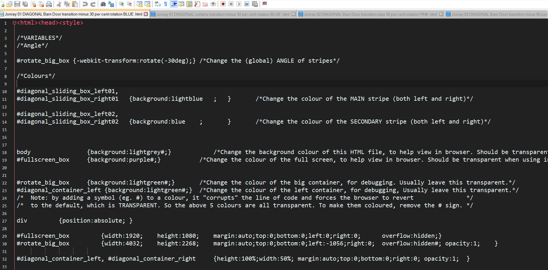
I’ve annotated the code so a user with no experience can easily change the angle of stripes and/or colour (of both the main and secondary stripes) and then save the HTML file accordingly. - see this screenshot:
This is so easy to use! It really is a user-friendly coincidence(?) that there are frames covering the whole screen and therefore just aligning the transparent clip with the video clips is enough. Also the comments are certainly useful for people who just want to make minimal changes and do not care using HTML for other usages.
The other transition was way more complicated - although not anymore with the custom filter.
Then, thank you very much for your effort! Both transitions are definitely going to be in my repertoire .
What I noticed though is the blending of the stripes’ colours instead of just having two distinct colours. In the following example I used yellow and blue and the blue is rather a swampy green.
(https://streamable.com/jqs1b)
I tried setting the colour with RGBa to state the alpha channel. I also tried using background-blend-mode to set the value to normal so no blending. They did not work.
Do you know the corresponding setting?
Ah yes, I forgot to mention that. Go down to near the bottom of the file and there are two columns of “opacty:0.3;” - change the 0.3s to 1s. The blue strip was turning green because the yellow was showing through.
I was not thorough enough . I should have found this setting. I only saw the initial setting which was already 1.
I actually use hex codes and rarely write out colour names. I use most of the time the following site because it groups colours which makes searching easier: https://html-color.codes/color-groups
Of course I do! If I like them, I want to test them and then add them to my asset library .
I used it also for testing this transition to create one with a “pop” to it and another one which is subdued. And for the third transition I changed the borders to have uniform widths:
(https://streamable.com/yzw8h)
The first one is way too busy. The second one works but the different widths bother me; just too distracting for me. The last one is something I would use with different colours because it does not have the flaws the other two have.
Overall the idea is nice and some might like it more than the one without borders. However, I am rather using the one without borders.
What transition do you like more? With or without borders?
Hi @samth, the colours site is great and very useful - bookmarked.
I agree with everything you say about your transition colours - #1 - far too complex and busy. #2 - better but still distracts the eye. #3 is also best for me. Nice contrasting colours but not too glaring. I like the white borders. Maybe experiment with the width of the borders - really thin, say 2px? It may then look a litle less like stripy pyjamas …
Thanks for testing this. Shows how crucial it is to get the right colour balance.
We have similar taste, I guess. I thought I keep the white borders to not have some sort of “mushy” appearance quasi a way to add some sort of distinctiveness. You liking them makes it worth the “effort”.
With the first iteration I did not notice that besides angle and colour there is another variable one can change. We are spoilt for choice .
Pyjama stripes , I see why.
Indeed, but that has nothing to do with the transition itself. I congratulate you on creating this easy-to-use transiton.
@Elusien I knew of Coolors before and i think it is a nice concept if you have no idea and need inspiration. The other one seems interesting as well.
Hi @samth - (sorry for late reply, could not get online for a day for enough time to reply…)
Thanks for your further observations on colours. Fascination subject, colour choice for video effects. I guess there is a fine line between something which is classy and something which is less so (even tacky or garish…)
I thought it would be interesting to analyse the BBC football Barn Door effect (see video in post #4 above) so I imported it into SC and made a screen capture of me advancing it frame by frame - very interesting how the pros did it!!
 .
. .
.
 .
. . I should have found this setting. I only saw the initial setting which was already 1.

 .
.