On second thought instead of placing the button in the Markers panel it can be added right next to the ripple all tracks button in the timeline toolbar. That would help make the user understand that these ripple buttons all have a relationship with each other as longtime users already understand with the two ripple buttons that have been there. And to further communicate this, if ripple all tracks is turned off then the ripple markers button right next to it would be grayed out and unavailable just like how the Cut and Copy buttons on the timeline toolbar are grayed out if the user deselects from the timeline.
Also putting the ripple markers button next to the others would make turning on and off rippling markers fast instead of putting them in the Markers panel like I first suggested.
You see, I’m thinking that users that don’t use the ripple all tracks button would overlap with those that don’t want to ripple markers and those that do use ripple all tracks would also want the markers to follow.
That sounds like what clip markers are about. Because the regular ripple button doesn’t ripple just V1. It ripples any one singular track at a time. So unless I’m missing something, a user would have to turn the ripple button off when working on another track that isn’t V1 then back on again when working with V1 just to get the markers to ripple only with V1. That’s a peculiar workflow.
This use case is exactly what clip markers would take care of since with clip markers you would set your markers on the clips of that one track and you would turn on only the regular ripple button. Then when you are moving your clips on V1 around and having only that track ripple, the markers that are only on the V1 clips would also be the only ones that ripple.
I agree with the marker ripple button in the timeline. I will work on that. Based on the comments, I think the button will be unrelated to the other ripple buttons.
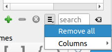
@brian, with the beta out and a couple of weeks until the final release, can the grouping of markers by color for Export > Markers As Chapters be added before this beta period is over?
I don’t have any plans to make changes to this. Also, I expect it is important for the chapters to be listed in order of time, not color. But I haven’t studied the use of this feature or even tried it myself.
There is a misunderstanding. What I suggested before here is about listing the chapters by time in the exported txt file:
It’s just that instead of using all of the markers in the txt file it would only use markers of the same color in one txt file. That color is determined at Export > Markers As Chapters. I gave some reasons why this would be very useful and time-saving in that earlier post of mine I quoted from. Dan seemingly agreed with it.
I should also point out that it’s a natural extension of allowing the user to pick the colors of the markers. Most people when they use different colors for markers are doing so in order to categorize the markers on the timeline so that markers are differentiated from each other. Therefore having it that Export > Markers As Chapters filters by color which markers will be used in the txt file is the logical conclusion.
Right. I has suggested a “type” or “category” field to fill that purpose . But you and Dan were suggesting that the color could fill both purposes (choosing the color and defining the purpose). I have not worked on the chapters export and I do not have plans to work on it. But maybe someone else will.
Not everyone uses the color of a marker for a role. A lot of times it is a simple way for people to remember certain positions without tooltip for faster visual scanning, for example: green is where ___ happens and red is when something else happens. In these cases, if export were to filter by color, we would have to also give the choice of multiple or all colors. There could be a dialog that lists all the colors as checkboxes probably all selected by default. Our existing general purpose list-of-checkboxes dialog would not be suitable as this needs to show the color, color code (and marker texts in an expandable tree?) somewhat similar to the markers panel. That will not be done for the 21.12 release.
Believe it or not, what you are describing there is pretty much what I was talking about above when I wrote this:
There could be more colors to mark off edit points. Two, four, six, etc… colors in fact. It doesn’t matter. The point is if the user is going to use different colors to bookmark anything on the timeline and at the same time mark chapters down, it’s natural that the user would make those markers for chapters the same color. Otherwise, how would it make any sense to the user when the timeline is zoomed out and each chapter marker is a different color along with every other edit point?
Not at all. This is way over complicating it. If the user wants to export more marker entries in one txt file then they would just have to go to the timeline and change the color of the marker or markers that are also to be included in that txt file.
All that has to be done is reuse the Recent Colors list from the timeline for Export > Markers As Chapters and the message would be very clear. It makes the whole process very easy both for you as the programmer and for the user.
This easiness also matches what you’ve done before on Shotcut like for Proxy. You designed Proxy so that there wouldn’t have be a big menu with a bunch of options to choose from before generating proxy files. Exporting markers as chapters is a much less complicated issue than proxy files. So why make a big menu for that when you didn’t for Proxy? Just reuse the Recent Colors list from the timeline.
@shotcut , I know you said you didn’t agree with changing the shortcut key for deleting a marker in the 21.12 beta thread but allow me to make the case for it one more time.
Right now, it’s Ctrl+Shift+M. When the user clicks on a marker to delete it with the mouse, the only comfortable way of doing it is to take the right hand off the mouse to hit the M while the left hand grabs Ctrl+Shift. But that’s a lot of movement to do such a simple task. Imagine if the user wants to delete more than one marker. Having to do this amount of movement to hit 3 keys including most likely taking one hand away from the mouse for that action over and over again would just make the whole thing unappealing and the grand majority of people would just stick with right clicking the marker to choose Delete.
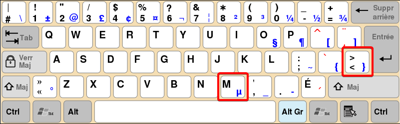
But if you change it to Z which right now is just a repeating the same function as the Delete key, it makes the option of deleting a marker with a shortcut key favorable because the user can keep one hand on the mouse and only has to hit the one key Z to delete a marker with the other hand. It’s much quicker and there is far less movement of the hands. If the user wants to delete more than one marker then there is nothing to it. And it could be even faster than right clicking and choosing Delete.
And making it Z would be easy to find because it’s on the exact opposite end as M and on the same line. So that means if the user is also seeking to markers with Shift and there is a marker to delete then Z is right next to Shift to press. It’s pretty convenient.
Maybe. But if we are going to say that then why have the shortcut key at all, ya know? If the shortcut key is there as another option then might as well make it as effortless as possible.
I agree with your rationale for Z as the delete marker shortcut, but here is the counter argument. The set of editing keys in the bottom left corner of the keyboard were established by Avid around 30 years ago, and some other tools like Lightworks (around the same age) adopted them as well. When I added timeline editing to Shotcut around 7 years ago, I adopted them but also Delete and Backspace for their common usage and familiarity. So, I am hesitant to break a convention that existed for so long even though I believe most people are using Backspace, Delete, and Cut. Also, the tooltip for Lift has its Z shortcut embedded in its string, and this would break that translation for all languages very close to release in a few days. There are a few translators that frequently update and strive for 100%. So, I try to only update the English language once per release at the beginning of the beta period. We are essentially in what other projects refer to as a “string freeze.” I also do not want to establish the precedent of changing keyboard shortcuts frequently because you or someone else asked for it as their preference and feel people just need to wait for configurable keyboard shortcuts.
Warning: I confess that I didn’t read all the 77 entries in this topic before posting this. So forgive me in advance if this was already suggested. Christmas is just around the corner… be kind
I’ve been using the markers a lot and I love them.
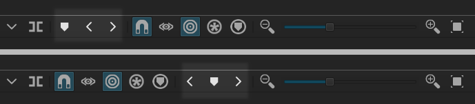
The only problem I have is this: I occasionally confuse the Marker (M) button with the Split button.
Does it happen to anyone else?
Maybe the 3 marker buttons could be moved next to the Ripple Markers button?
I also suggest to move the Marker (M) button between the two arrow buttons. For a first time user, it would look more obvious that those arrows are related to the markers.
It wasn’t, so you’re good. Besides even if it was, anyone who made this video:
should get free passes for the rest of December.
I like your suggestion except that the Marker icon being put before the seeking icons was done by @brian to reflect the placement on the keyboard of the shortcut keys:
Also, by putting the Marker icon in front of the < and > in your layout it actually puts it right beside the icon for rippling marker which would be nice as it sort of groups it together.
Also not on: Chilean (Spanish) keyboards, French (France) azerty keyboards, Asian keyboards etc..
But it’s OK. The argument makes sense for English keyboards