Very interesting. So where are the up, down, left and right arrow keys? Are they also in between the Ctrl and 0 keys on your keyboard?
What you show there is the bilingual Canadian keyboard. I hate those.
But to answer your question, yes, I do have those arrows on my unilingual French Canadian keyboard.
I only quickly grabbed that image just to ask about the up, down, left and right arrow keys cause where they are there in that image is the same as mine. ![]()
Since the < > placement are different for you, how does it feel to grab the keys from there to do marker seeking on your keyboard?
Well, it’s not too bad I guess. But like I said elsewhere, I’m not a big keyboard shortcuts user. I know only 5 to 10 shortcuts on each of the programs I use on a regular basis. I prefer buttons and menues. It’s slower, but I’m in no hurry 
That doesn’t sound very reassuring. ![]()
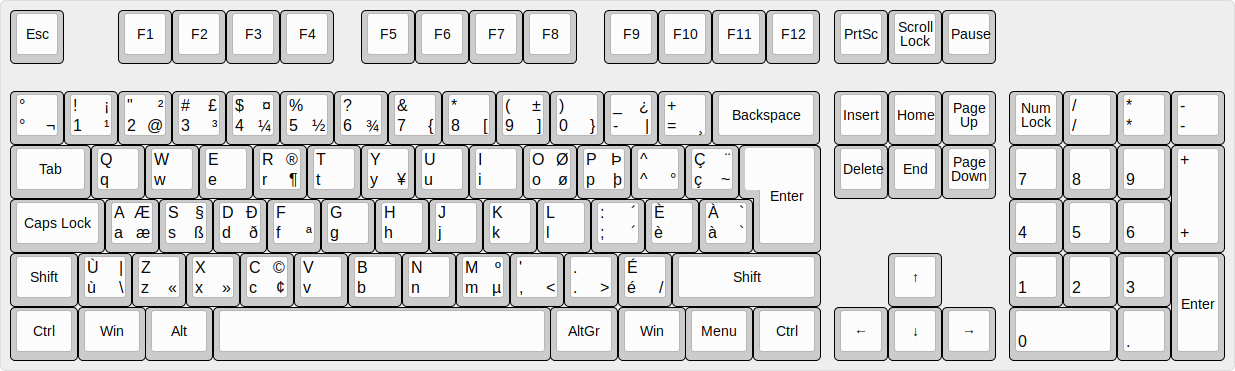
So I looked up a Latin American keyboard and this is what it looks like:

The < and > are next to Z instead of M and they are on one key instead of two.
So the convenience of the < and > keys for seeking markers being next to M is not universally shared on all keyboards.
I think it makes it worth reconsidering. Thanks for bringing it up @MusicalBox. ![]()
1 Like
Also, if you think about it, shortcuts users with English keyboards will no doubt appreciate the convenience of having those 3 keys located next to each other on the keyboard, but they wont really care where the matching buttons are located on the tool bar… because they don’t use the tool bar buttons.
It does not happen to me. Do you think this is because the buttons are too close together, or because they look similar?
I do not have a strong preference about this except… is it just one person’s preference and another person prefers the current location.
I really like the symmetry of your mockup. It is pleasing to the eye.
I prefer that any previous/next buttons should always be next to each other. What if we add a 3rd or 4th button some day? They would move farther and farther apart.
@brian , what do you think about the < and > shortcut key issue?
I do not have any ideas about that. I wonder of other keyboard shortcuts have similar problems on different keyboards.
It’s worth reconsidering because what @MusicalBox helped bring to light is important. Both Premiere and Rǝsolve have M as the shortcut key for Markers but neither of them have < and > as the shortcut keys for marker seeking. Now we know why. It might be convenient for users with English language keyboards but for international keyboards it’s anything but convenient. Just looking at the Latin American keyboard shows how uncomfortable it would be to seek markers with < and > which are not only on the opposite end but on one key instead of two.
Just the opposite in my opinion. Single key is just as convenient. It is impossible to choose the single keyboard system that works well with every keyboard. It is absurd to claim “we know why.”
I thought about that. And to be honest, it’s probably just because I was so used to find the Split button right next to the blue magnet that I didn’t even have to think about it or look at the toolbar when I needed to cut a clip. The mouse cursor practically moved by itself to that button next to the blue magnet. It’s as silly as that.
I agree, maybe it is just me. If so, then you have no good reason to move the buttons. That’s why I asked if anyone else have the same problem. Of course, I don’t really expect feedbacks on that question. Very few people will take the time to read this topic and it’s 91 posts. And of those who will actually read it, very few will bother to reply. But, nothing ventured, nothing gained, I asked anyway ![]()
I agree that having the 2 shortcuts on the same key is not inconvenient. I forced myself to use them on a project I’m working on and it wasn’t that bad. Much easier to remember than something like Ctrl+Shift+Page Down for example.
Personnellement, je préfère aussi la disposition proposée par @MusicalBox au post 78 à celle actuelle. Les outils marqueurs sont regroupés ensembles et les flèches de déplacement situées de chaque coté du bouton marqueur sont plus conformes à ce que l’on a l’habitude de voir sur tous les appareils audio et vidéo.
Personally, I also prefer the layout proposed by @MusicalBox in post 78 to the current one. The marker tools are grouped together and the arrow keys on either side of the marker button are more in line with what we’re used to seeing on all audio and video devices.
1 Like
@brian do you think the context menu for markers should have the shortcut keys for Edit and Delete (M & Ctrl+Shift+M)?
Done
The 21.12 release has provided much of the functionality of this suggestion. I’m going to mark this thread as solved. I welcome further suggestions in new threads.