I downloaded the new beta and I think that “{ }” is awkward by being placed before each line of Position and Size. People are not going to naturally associate “{ }” with Simple Keyframes. Since you don’t like underlining the names of the parameters but want “{ }” to be associated with Simple Keyframes then I think a better placement of “{ }” is have it take the place of the Advanced Keyframe button that is on the Size and Position and Text filters (on the right side of the value boxes in the middle of Position and Size). Then have a dialog box appear after “{ }” is clicked on saying something like "Only Simple Keyframes Available”.
Sorry about that but you wrote that the undo bugs you were aware of were associated with multiple-selected clips. 4 & 8 were not triggered by multiple-selected clips. I thought they were triggered with the change of now being able to create a transition clip after dragging past a gap.
That sounds good. Do you want any more bugs to be reported on here in this thread then? Are you going to be fixing other bugs before this release?
Ok Thanks for the feedback. I’ll nix that idea. The idea is not that it means only advanced keyframes but merely that this parameter is involved in simple. The idea is to add something to every filter with this indication. Many parameters in other filters support both kinds of keyframes.
At this point I only have time for the undo related bugs and anything that is severely broken and going to give current users already successfully using it major grief.
The square brackets in the Keyframes toolbar and the square bracket keyboard shortcuts are used for filter trimming. The curly braces are used for simple keyframes. Hence, that ties them together. I looked at putting the label inside curly braces, but I did not like the look of it. I also tried making the label bold, but that is rather subtle. Bullet might be an option.
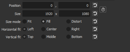
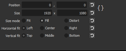
I made an image to show what I meant by my last suggestion for a visual indication of Simple Keyframes for the size and position parameters in the Gradient filter. I used the Size and Position filter just to make the point.
So here it is as it is now with the Advanced Keyframe icon:
And here’s what I suggested:
I think it would be good to put that symbol in the same place as where the Advanced Keyframe would normally be because that’s where experienced Shotcut users would expect to find the Advanced Keyframe button. So seeing “{ }” in its place would let the user know that they keyframe function is different. The addition of a text box that would appear when the mouse hovers over it letting the user know only simple keyframes are available would then help people from then on associate the symbol “{ }” with the Simple Keyframe function.
I like the idea of an hourglass icon for Simple Keyframes. It symbolizes very well the idea of a simple tool for time while also being totally distinct visually from a stopwatch.
The difference between the two stop watches is subtle, and an indication is not a button. People will be clicking it to add a keyframe and get frustrated and complain. And I don’t want to make it into a button that opens a dialog window. The curly braces in a column after the reset buttons might be ok. Of course, none of this is for the next release and is off topic, but I do appreciate the ideas. Hourglass… well we already have a number of time related icons. See the main tool bar: recent, timeline, keyframes, history. :-S
11 - In Mask From File, there are now default buttons next to Invert and Reverse. Considering that those options only have an on and off mode, aren’t default buttons redundant?
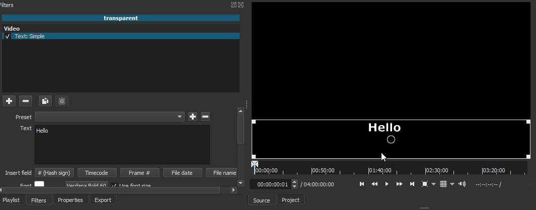
12 - When text from Text Simple is moved around, a white flash now randomly keeps appearing. Demo.
I did reproduce it both in the beta and the previous version, but it is only very occasional in the last release and much worse in the new version. We are working on it.
This is fixed for the next release 19.12. I had noticed and when I looked at it before, I did not see the problem. Today, the problem jumped right out at me.
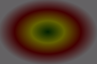
This is not a major bug. The color gradient of the audio light visualization filter isn’t working properly.
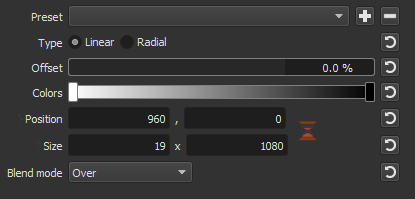
Add Audio Light Visualization filter.
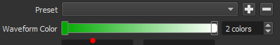
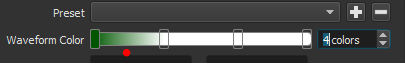
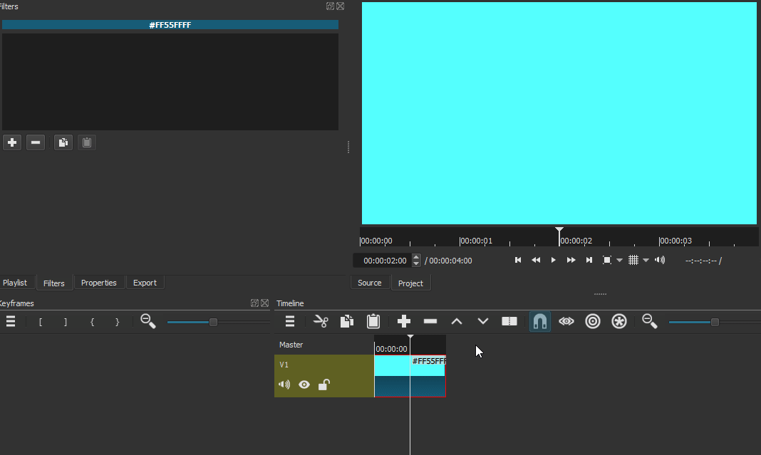
Color defaults to white, spinner box shows two colors. Click the right end of the gradient bar to select a color. The color will not change. Click the left end of the gradient bar, the color can be changed.
Set the color to 4 colors. Click anywhere on the gradient bar to change colors, colors will not change unless the left end of the bar is clicked. That is the only color can be changed.
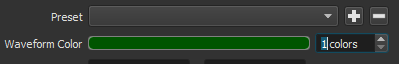
Set the color to 1.
Then set to 4.
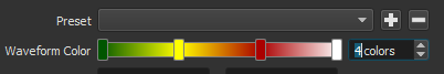
Now the colors can be changed. The filter looks like this.
The default color on the right is transparent. When you are trying to change the color, you are not changing the transparency. So it stays transparent and appears that it did not change. So this is not really a bug, but perhaps the usability is poor because it is not obvious that the 2nd color is transparent. I would be open to suggestions on this.


