The Timer filter overlays a time counter on the video. It can count up or down, display time in various formats, and be styled and animated like a title.
This filter generates visible graphics, not metadata, and therefore must be applied in a context where video output exists.
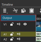
Where the Timer must be applied
For the timer to be visible, the filter must be added to:
- A video clip, or
- The Output track on top of the stack (top-left of the timeline panel)
Warning:
If the Timer filter is added to an empty video track, the timer will not be visible, because there is no image to render onto.
When applied to:
- A clip: timing is relative to that clip.
- Output: timing is relative to the full project timeline.
Time controls
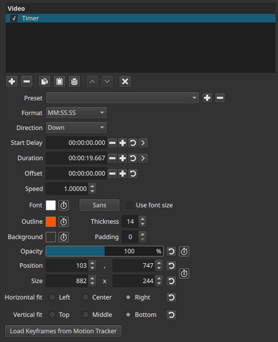
Format
Selects how time is displayed (for example: HH:MM:SS.SSS).
HH= hoursMM= minutesSS= secondsSSS= milliseconds
Different formats control the level of precision shown.
Direction
Controls how the timer progresses.
-
Up
Counts upward from the starting value -
Down
Counts downward toward zero
Start Delay (default: 00:00:00.000)
Delays when the timer becomes active.
- The “>” button sets the start delay to the current playhead position
- When applied to a clip, the delay is relative to the clip start
- When applied to Output, the delay is relative to the project start
Duration (default: 00:00:10.000)
Defines how long the timer runs.
- Default is 10 seconds
- The “>” button sets the duration so the timer ends at the current playhead position
- Like Start Delay, this is relative to the clip or Output context
Offset (default: 00:00:00.000)
Controls the starting value of the timer.
-
Direction = Up
The timer counts upward starting from the Offset value -
Direction = Down
The timer counts downward starting from the Offset value
Speed (default: 1.00000)
Scales how fast the timer runs.
- 1.0 = real time (seconds)
- Higher values = faster counting
- Lower values = slower counting
This affects how Duration is interpreted.
Text appearance
Font
Selects the font used for the timer.
- Includes a color selector
- Font color can be keyframed
- A separate button selects the font family
- Optional Use font size checkbox enables manual font sizing
Outline
Controls the text outline.
- Color (keyframeable)
- Thickness (default 0)
Useful for improving readability over complex backgrounds.
Background
Adds a background behind the timer text.
- Color selector (transparent by default)
- Color can be keyframed
- Padding controls space around the text (default 0)
Opacity (0–100%)
Controls overall transparency of the timer overlay.
- Can be keyframed
- Affects text, outline, and background together
Position and size
Position / Size
Controls where the timer appears and how large it is.
- Both are keyframeable
- Can be adjusted numerically or directly in the viewer
- Viewer-based adjustment is often easier and more precise
Alignment
Controls how the timer fits within its bounding area:
- Horizontal: Left / Center / Right
- Vertical: Top / Middle / Bottom
Motion tracking integration
Load Keyframes from Motion Tracker
Loads motion-tracking data so the timer can follow moving objects or people.
This allows the timer to:
- Stay attached to a subject
- Move dynamically with the scene
Recommended use cases
- On-screen timers and countdowns
- Sports or performance timing
- Synchronization references
- Educational or instructional videos
- Motion-tracked overlays
Limitations
- Must be applied to a clip or Output to be visible
- Generates graphics, not metadata
- Timing behavior depends on clip vs Output context
- Requires motion tracking data to follow movement