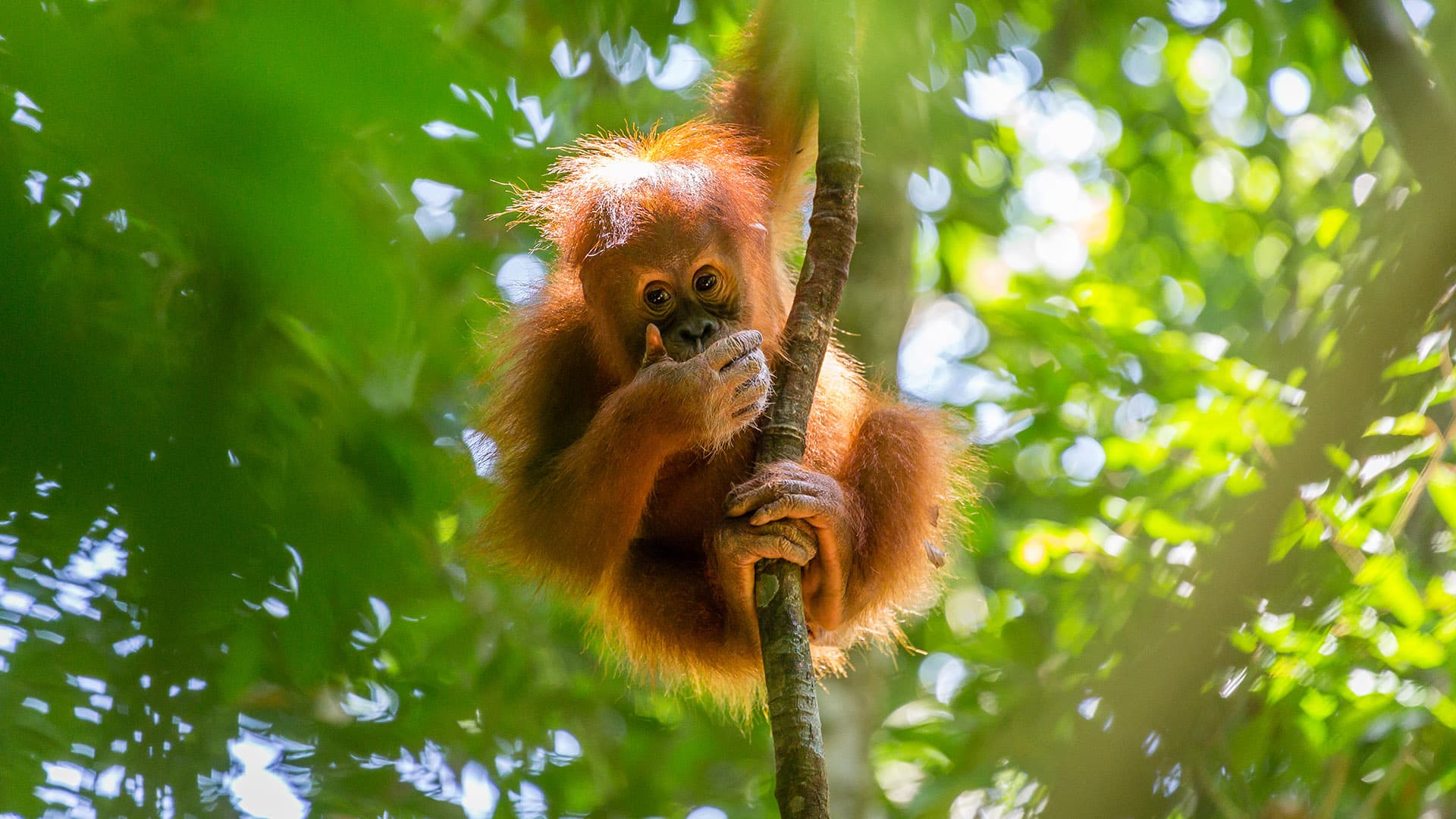
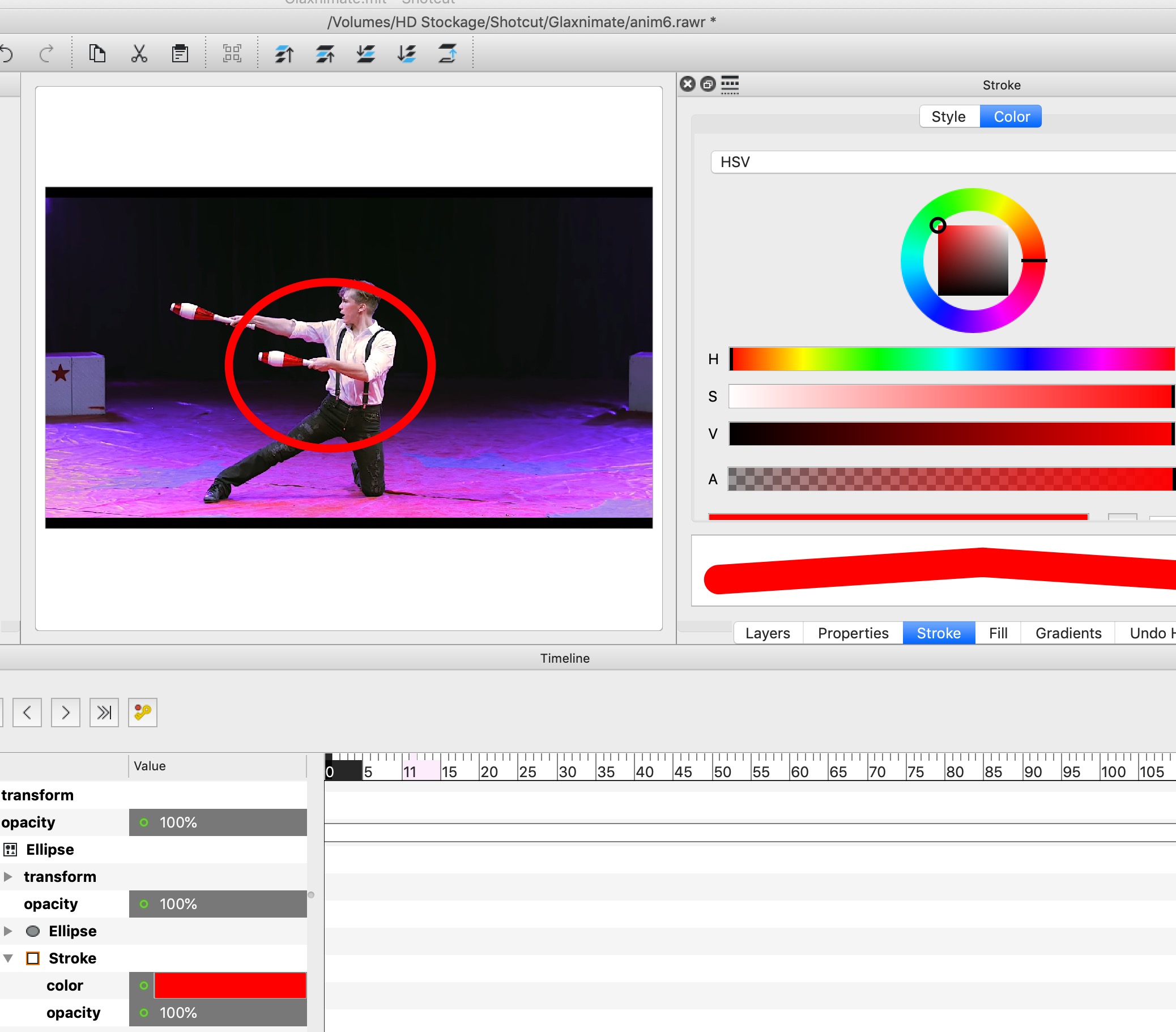
Depuis que j’utilise SC, je regarde avec un autre œil les différentes animations utilisées dans les programmes TV, que ce soit dans des jeux ou des publicités, et je me demande si elles sont réalisables avec SC. Par exemple, j’ai essayé de reproduire cette animation.
Since I use SC, I look with a different eye at the different animations used in TV programs, whether in games or commercials, and I wonder if they are feasible with SC.
For example, I tried to reproduce this animation.
Je me suis limité à 2 personnages et ajouté une rotation à l’apparition de la vignette. Volontairement l’animation est plus lente afin de bien pouvoir la détailler. Fans de SC, Glaxnimate, html et autres, à vos claviers, tout est autorisé.
I limited myself to 2 persons and added a rotation when the thumbnail appears. Voluntarily the animation is slower in order to be able to detail it well.
Fans of SC, Glaxnimate, html and others, to your keyboards, everything is authorized
Votre défi n’est pas facile. La parti où l’image apparaît est assez facile à réaliser…
Your challenge is not easy. The part where the image appears is easy enough to do…
…mais j’avoue que mon cerveau n’a pas encore eu l’éclair de génie pour trouver comment ajouter la bordure.
…but I must admit that my brain has not yet had the lightbulb moment to figure out how to add the border.
This can be done reasonably simply in HTML by animating the “clip-path” property.
Here is the HTML/CSS.
<!DOCTYPE html>
<html>
<head>
    <title>Reveal</title>
	<style>
/*
        ==========
        PARAMETERS
        ==========
*/
:root {
    --image : url('Penguin.png');  /* The image to reveal (Devcore, CC0, via Wikimedia Commons)    */
    --w     : 512px;             /* The width  of the image */
    --h     : 512px;             /* The height of the image */
    --b     : 8px;               /* The width of the border */
    --reveal: 1s;                /* Time taken to reveal the image */
    --twistF: -20deg;           /* Rotation (From) of the image set to "0deg" for no rotation */
    --twistT:  -3deg;           /* Rotation ( To ) of the image set to "0deg" for no rotation */
}
@property --v_iw {
  syntax: "<length>";
  inherits: false;
  initial-value: 0px;
}
@property --v_ih {
  syntax: "<length>";
  inherits: false;
  initial-value: 0px;
}

@keyframes expand { to {--v_iw: var(--w); --v_ih: var(--h);} }
@keyframes twist  { from {transform: rotateZ(var(--twistF));}
                    to   {transform: rotateZ(var(--twistT));} }

body {
    display: flex;
    align-items: center;
    justify-content: center;
    background-color: transparent;
    --ow     : calc(var(--w) + 2 * var(--b));
    --oh     : calc(var(--h) + 2 * var(--b));
    --v_i100w: calc(var(--w) - var(--v_iw));
    --v_i100h: calc(var(--h) - var(--v_ih));
    --v_ow   : calc(var(--v_iw) + 2 * var(--b));
    --v_oh   : calc(var(--v_ih) + 2 * var(--b));
    --v_o100w: var(--v_i100w);
    --v_o100h: var(--v_i100h);
    width    : 100vw;
    height   : 100vh;
    margin   : 0;
    padding  : 0;
    overflow :hidden;
}
#container {
    position:relative;
    width   : var(--ow);
    height  : var(--oh);
    animation: twist var(--reveal) linear 2s forwards;
}
#outer {
    position: absolute;
    top     : 0;
    left    : 0;
    width   : var(--ow);
    height  : var(--oh);
    background-color: white;
    --v_iw   : calc(-2 * var(--b));
    --v_ih   : calc(-2 * var(--b));
    --v_i100w: calc(var(--w) - var(--v_iw));
    --v_i100h: calc(var(--h) - var(--v_ih));
    --v_ow   : calc(var(--v_iw) + 2 * var(--b));
    --v_oh   : calc(var(--v_ih) + 2 * var(--b));
    --v_o100w: var(--v_i100w);
    --v_o100h: var(--v_i100h);
    clip-path : polygon(0              0             , var(--v_ow) 0         ,
                        var(--ow     ) var(--v_o100h), var(--ow  ) var(--oh ),
                        var(--v_o100w) var(--oh     ), 0           var(--v_oh)
                );
    animation: expand var(--reveal) linear 2s forwards;
}
#inner {
    position: absolute;
    top:      var(--b);
    left:     var(--b);
    width   : var(--w);
    height  : var(--h);
    background: red;
    background-image: var(--image);
    background-size : cover;
    --v_iw   : calc(-2 * var(--b));
    --v_ih   : calc(-2 * var(--b));
    clip-path : polygon(0              0             , var(--v_iw) 0          ,
                        var(--w      ) var(--v_i100h), var(--w  )  var(--h   ),
                        var(--v_i100w) var(--h      ), 0           var(--v_ih)
                );
    animation: expand var(--reveal) linear 2s forwards;
}
    </style>
</head>
<body>
    <div id="container">
        <div id="outer">
            <div id="inner"></div>
        </div>
    </div>
</body>
</html>
P.S. This only works on Google Chrome, Microsoft Edge and Opera at present, as it uses the CSS directive “@property”, which is only supported by them currently (not Safari or Firefox).
I just altered the HTML slightly to get rid of the line at the beginning. i.e. the screen starts blank then animates, rather than starting with a diagonal line.
Photos don’t seem to work if they have spaces and brackets (and maybe other characters, not tested) in them…
The clip-path crops the photo, so with a large photo, only a section of the photo shows…and it’s the section beginning in the left-hand corner… could there be a way of re-coding to re-size the photo first so the whole (smaller) photo shows, instead of just the cropped bit? Or maybe to crop the centre of the image?
This is what I mean: original photo I used (size 1920 x 1080):
I think i would rather do such kind of animations with a 3d-animation program, like 3d max, blender oder cinema4d. You need some deeper knowledge of the tool but it can be done in a few min. i guess…
would probably also be very easy in adobe AE or premiere…
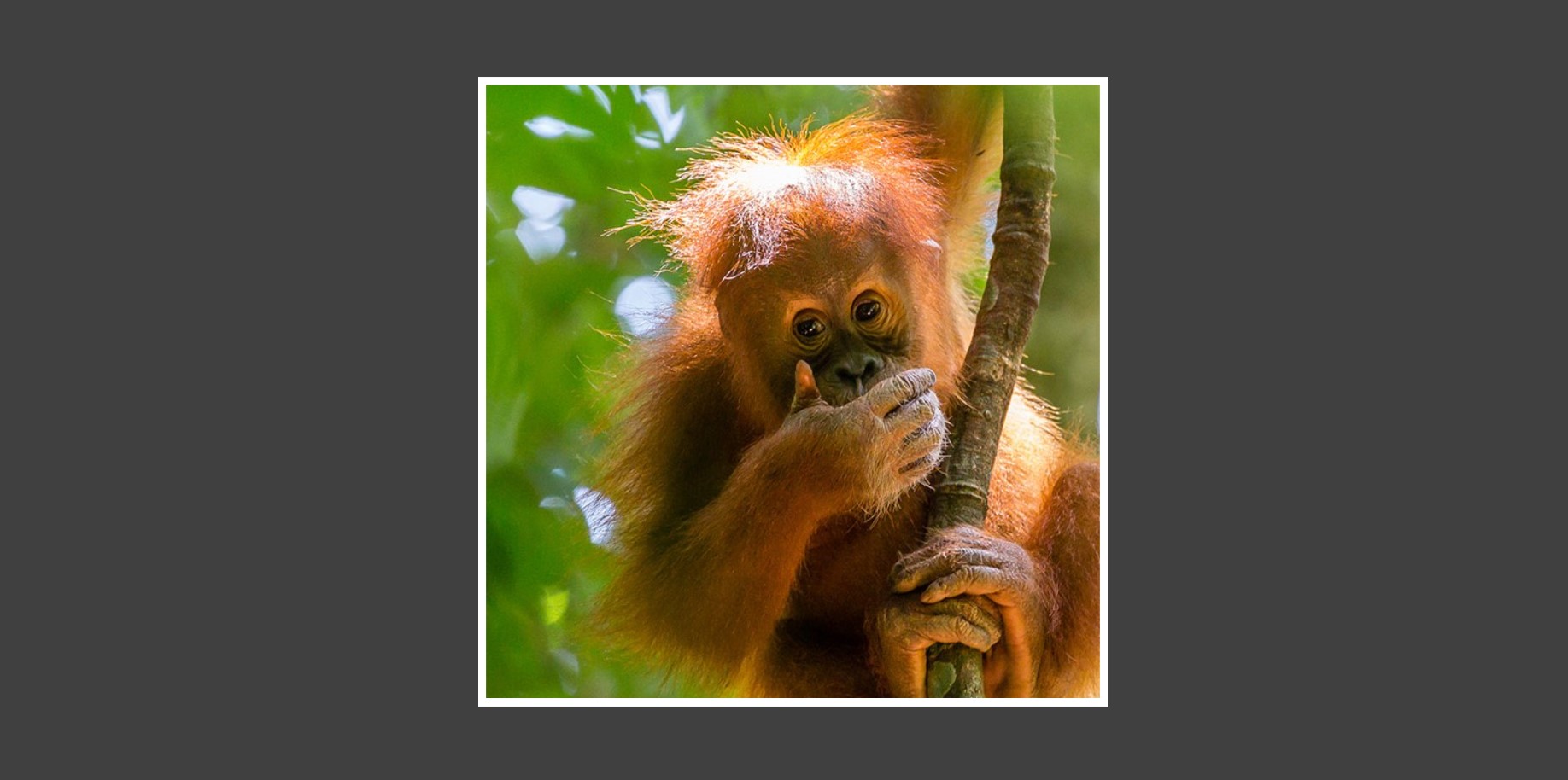
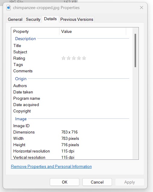
Yep, so I snipped the photo and it works. The only problem is knowing the exact size in pixels of the photo so I can match the size in the HTML… result:


 This bit in particular. …