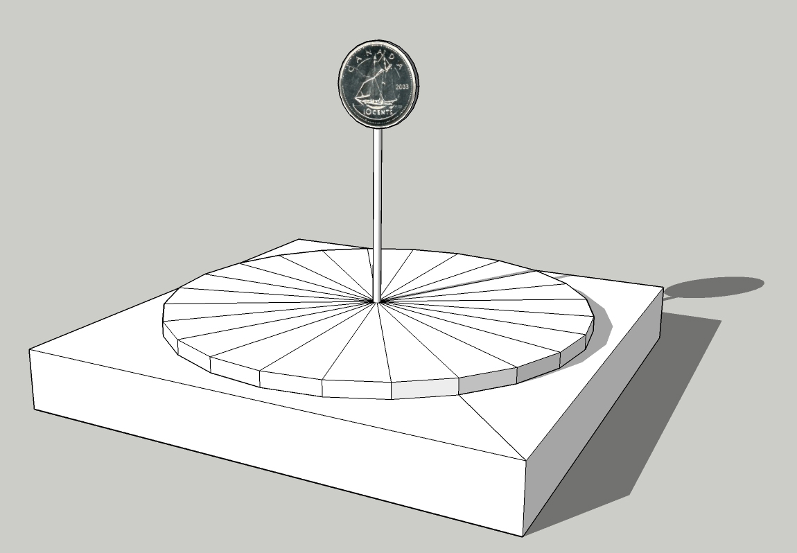
You can also do it with two images (the Obverse and Reverse of the dime - mine are 220px x 220px) using my WebVfx framework (see HTML Filters: Titles, Scrolling Credits, Stopwatches, Gauges etc) and the Overlay HTML filter. If you know HTML and CSS it helps, I knocked up the code below in about half an hour.
I made a simple video of how to use this as an Overlay HTML for a 4 second clip.
The Overlay HTML code is:
	<html lang="en">
	<head>
	<meta charset="utf-8">
	<title>Logo</title>
	<style>
			html, body {margin:0; padding:0; width: 100vw; height: 100vf; background-color: #000; overflow: hidden;}
			#flipper {width: 220px; height: 220px; bottom: 0px;	left: 500px; position: absolute;
			}
			#front, #back {
				background-color: transparent;
				width           : 220px;
				height          : 220px;
				position        : absolute;
				top             : 0px;
				left            : 0px;
			}
			img {width: 220px; height: 220px;}
	</style>
	<script src='./webvfx.js'></script>

	</head>
	<body data-control='4:30'>		<!-- 4 seconds clip at 30 fps -->>
		<div id='flipper'class='webvfx' ease: 'easeInOutExp' data-animate='{
				0%: {bottom:   0px;},
			 50%: {bottom: 400px;},
			100%: {bottom:   0px;}
			}'>

			<div id='front' class='webvfx' ease: "easeInOutSine" data-animate='{
					 0%: {webkitTransform: scale(1, 1);},
					 5%: {webkitTransform: scale(1, 0);},
					10%: {webkitTransform: scale(1, 0);},
					15%: {webkitTransform: scale(1, 0);},
					20%: {webkitTransform: scale(1, 1);},
					25%: {webkitTransform: scale(1, 0);},
					30%: {webkitTransform: scale(1, 0);},
					35%: {webkitTransform: scale(1, 0);},
					40%: {webkitTransform: scale(1, 1);},
					45%: {webkitTransform: scale(1, 0);},
					50%: {webkitTransform: scale(1, 0);},
					55%: {webkitTransform: scale(1, 0);},
					60%: {webkitTransform: scale(1, 1);},
					65%: {webkitTransform: scale(1, 0);},
					70%: {webkitTransform: scale(1, 0);},
					75%: {webkitTransform: scale(1, 0);},
					80%: {webkitTransform: scale(1, 1);},
					85%: {webkitTransform: scale(1, 0);},
					90%: {webkitTransform: scale(1, 0);},
					95%: {webkitTransform: scale(1, 0);},
				 100%: {webkitTransform: scale(1, 1);}
				}'>
					<img src='Dime_Obverse.png'>
			</div>
			<div id='back'  class='webvfx' data-animate='{
					 0%: {webkitTransform: scale(1, 0);},
					 5%: {webkitTransform: scale(1, 0);},
					10%: {webkitTransform: scale(1, 1);},
					15%: {webkitTransform: scale(1, 0);},
					20%: {webkitTransform: scale(1, 0);},
					25%: {webkitTransform: scale(1, 0);},
					30%: {webkitTransform: scale(1, 1);},
					35%: {webkitTransform: scale(1, 0);},
					40%: {webkitTransform: scale(1, 0);},
					45%: {webkitTransform: scale(1, 0);},
					50%: {webkitTransform: scale(1, 1);},
					55%: {webkitTransform: scale(1, 0);},
					60%: {webkitTransform: scale(1, 0);},
					65%: {webkitTransform: scale(1, 0);},
					70%: {webkitTransform: scale(1, 1);},
					75%: {webkitTransform: scale(1, 0);},
					80%: {webkitTransform: scale(1, 0);},
					85%: {webkitTransform: scale(1, 0);},
					90%: {webkitTransform: scale(1, 1);},
					95%: {webkitTransform: scale(1, 0);},
				 100%: {webkitTransform: scale(1, 0);}
				}'>
				<img src='Dime_Reverse.png'>
			</div>
		</div>
	</body>
	</html>