Beyond many fixes:
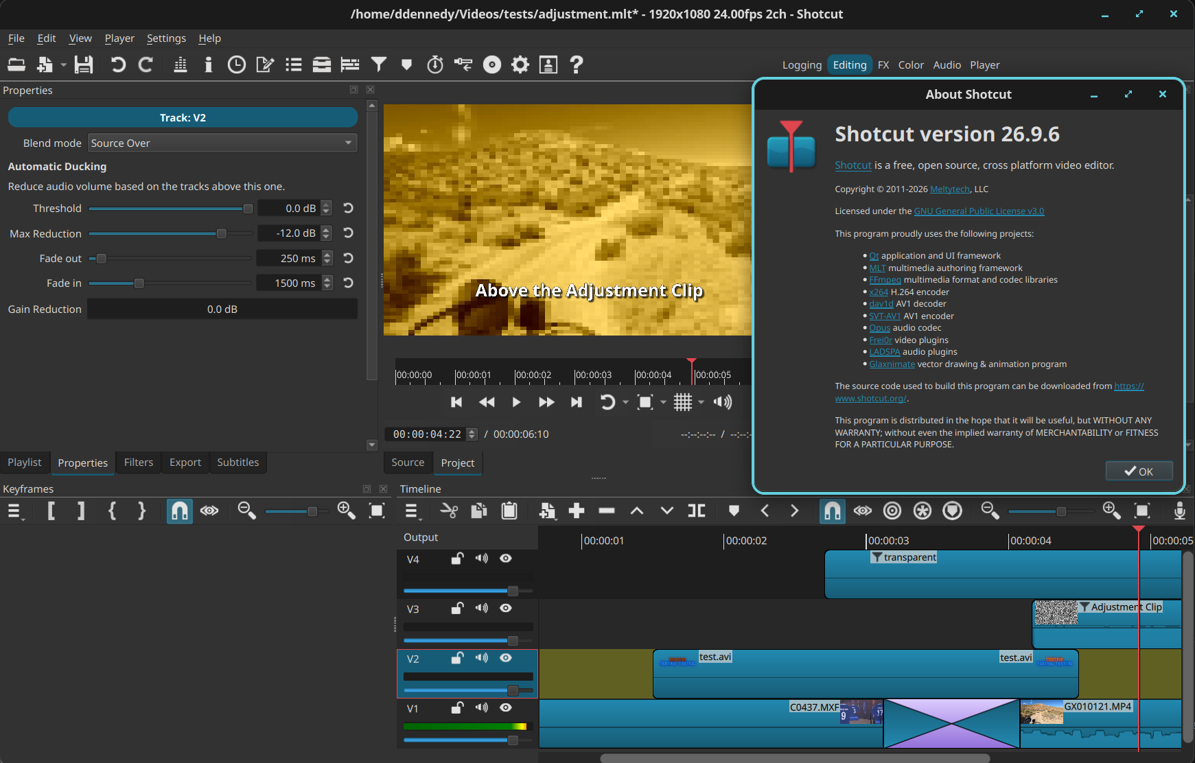
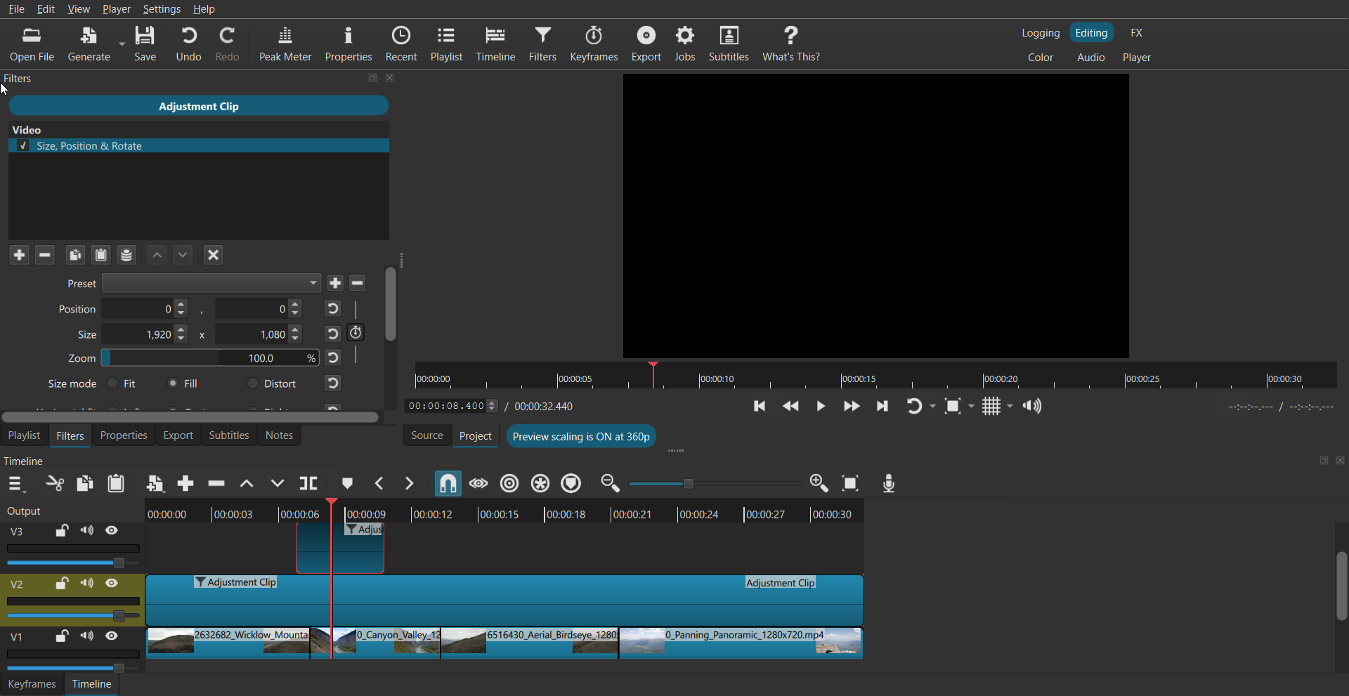
- Adjustment Clip
- Auto Ducking Audio
- track headers as mixing console
- faster timeline
- modernized look
- new logo
Beyond many fixes:
Some interesting new stuff!
I like the new logo
Not sure how I feel right now about the thicker playhead (timeline and player). But I guess it’s just a mater of getting used to it.
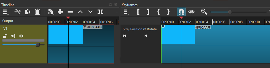
The one in the Keyframes panel is still thin though. But I guess a thicker line would kind of hide the keyframe icons.
Will test more this week.
Thanks!
Can’t wait to try it out ! 
I think the new logo looks a bit too much like the Kdenlive one.
Kdenlive’s logo is very nice! It is similar but different enough. I specifically avoided the same red-like color: Kdenlive’s is a paler, more salmon. Look at how many media players have similar logos. Triangle play button anyone? Kdenlive’s has it too. In any case, the general design of the new logo has been long in the making and is already decided by me to stay. It is an evolution of the old logo, better captures the essence of its intention, and is a more modern rendition.
Hi Dan, congratulations on the new version, and all your hard work with the new features and fixes.
I’m loving the level meters on the audio tracks. Today I tried it out, adding cymbal crash mp3 clips to a backing track I’m working on. By setting different levels on different tracks, it is a good way of getting correct levels for the cymbal clips. Just move the clip to a track with lower volume if I want it quieter. Easier than using individual gain filters. It also gives me a “mixing console” as you mention in the release notes. Thanks for this! 
PS the “nudge” (, and.) feature is very useful in this context to set the correct frame-by-frame position of the cymbal crashes.
Quick Demo:
wow … why changing logo … the “last” one is fantastic and used and familiar to users !!! no reason for that … so consolidated … so markable …
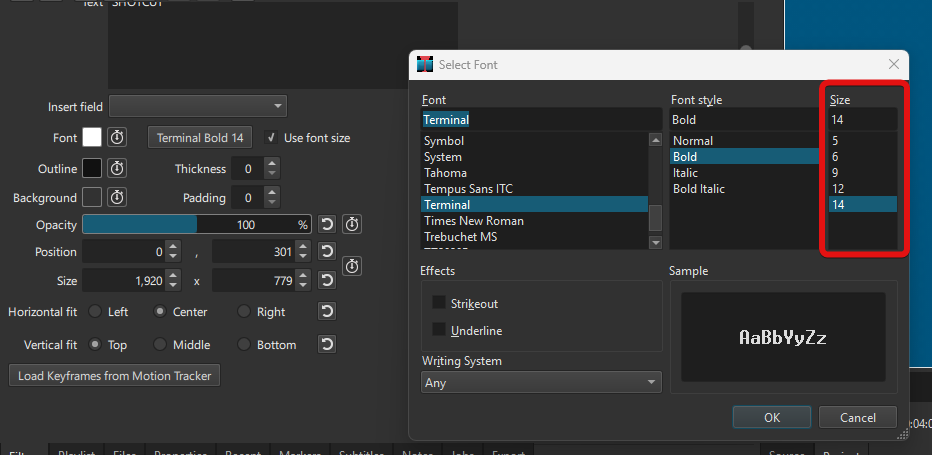
I like the new logo, and the new sleek design. But I have noticed something. There is a font called Terminal, when you use it, in the project it looks good, but the moment you export it the text becomes very small and blurred. I have attached the video to see the issue.
For me, the Terminal font has only these size values available:
It’s not a new for this Shotcut version, it has been the same for as long as I can remember.
Hello
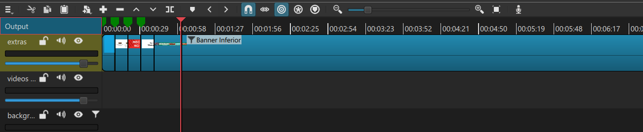
How can I set timeline time division set with a different duration … for example each 1 minute or 5 minutes or other pattern?
And how to change middle line color from black to blue used on background ?
That’s an upgrade! I love everything about it, and the new logo is top, for those who wants it, it’s here > shotcut/icons/shotcut-logo-large.png at master · mltframework/shotcut · GitHub I already changed the older icon to it 
There is one thing I found disturbing (if I can say that), it’s that black line along the red line on the playhead of the time line (on the keyframes timeline there is no black vertical line and it’s perfect like this).
Thus a question: Why 2 vertical lines instead of the red one only? previously there were only 1 white line.
I mean, it’s a strange feeling that feel less accurate, which one I should look at when cutting something, the red or the black 
In all cases thanks A LOT! that’s a beautiful upgrade. Love it!
I don’t remember seeing this behavior in previous versions:
Steps (Windows 11):
In both text filter:
The text is copied. But instead of closing after copying, the dialog pops back and you need to click again somewhere to close it for good.
Same thing when you Select > Right-click > Paste.
On some High DPI displays the single orange-red line against the blue and green background can appear to narrow and drop-out. The black line also helps it stand out depending on the color theme. Of course, it is like a shadow. FYI Davinci Resolve has an even thicker playhead with a black outline (both sides). The new version even has a bulge.
I mean, it’s a strange feeling that feel less accurate
You should look at the video and the timecode. Not a great idea to be judging things by the timeline position or even the waveform, both of which are affected by the zoom level.
There was a change to make the timecode more frequent but that made it less deterministic and readable, so I since reverted it.
It also appears in Shotcut 26.8 due to a change in Qt–but only on Windows. It is a bug that will be fixed.
Ohhh, ok, I understand now (I’m with a 1080p screen so I can’t see for high DPI)
I don’t know for other people but you(all devs) did a great job, because for me the playhead is very accurate even when zooming in like crazy, it perfectly cuts where I want to cut 
In all cases that an absolute great upgrade, thanks A LOT to all the team 
If you add any GPU effect to an adjustment layer, the application closes.
If you add an image to the timeline and then press “Ctrl+I” to create a new track, the application restarts (and sometimes freezes completely). This bug is not present in the previous version.
When you add a crop filter to a video in Shotcut, you get a white rectangle overlay that you can click and drag to adjust your crop visually. However, when I add a crop filter to an adjustment layer, that interactive white rectangle does not appear so I can control it directly.
The only workaround I found is to add the crop filter to an underlying video clip first while the adjustment layer is active. Once the crop filter is on the video clip, I select the adjustment layer, and suddenly the white interactive rectangle appears. I can then do my cropping on the adjustment layer as desired, and finally delete the temporary crop filter from the video clip.
And applying the Size, Position & Rotate (SPR) filter causes the entire project preview screen to turn completely black instead of affecting the underlying tracks transparently.
Thanks, those issues fixed now.