Hi,
I know this is not the most important thing, but…
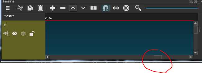
Sometimes it is difficult to quickly find actual position of sliders in default (dark) theme (Im running windows 7 64 bit machine, Shotcut 18.08.01) because of low contrast between the colors. Its true I use bit lower contrast on my display to save eyes.
I suggest to use more contrasting colors for sliders. Maybe somebody will have the same impression…
I have no idea what you are talking about. I see a rather bright blue against dark gray, which is rather good contrast. You are probably calling something a slider that is not a slider. Here is a slider:
In any case, colors are assigned by roles. We do not set colors of each individual UI element. Changing the theme colors is likely to going to make the UI have too much contrast, which most people working with media dislike as it is tiring and distracting from the media.
We could possibly add “high contrast” variants of both Light and Dark themes, however.
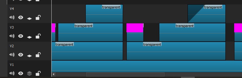
I have to agree with martin106015. The look of the dark theme is really lovely - but there’s not much differentiation between the grey of the slider and its immediate background. Especially difficult to see on my laptop on a sunny day.
I looked into it, and the scrollbar background and outlines are part of the theme engine code in a library I do not modify and not the palette, which I control. All I can do is make the buttons lighter, which also affects the scrollbars, but that makes it rather ugly. Or, I can make the dark theme brighter, which defeats the point as it is not that dark IMHO. It is possible an upgrade to the library will change this.