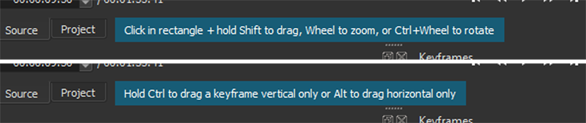
Yet they are hardly noticeable when they appear in the Shotcut window. Especially if Proxy and Preview Scaling are enabled. And they are only displayed for 5 or 6 seconds.
It would make them nearly impossible to miss if Shotcut used a different background color when such a message appears. And to make sure everyone have time to read them, how about adding a button to close the messages manually? Or at least leave them on the screen for a longer time, like maybe 30 seconds?
Yup. I suggested this also back when I suggested about the need for a message for Ctrl and Alt for keyframes with curves in the pre-release thread for 20.05.01:
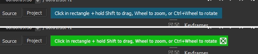
Also, I think the color for these kinds of notes should be something else other than blue. Blue is the color that is used to note use of Proxy and Preview Scaling so when that new note for the filter comes up users miss it because it blends in with the note for Proxy and Preview Scaling. Notes should be a different color like maybe green.
Nice one on providing a visual example too of how green could look like, @MusicalBox.
And let’s not forget the part time experienced Shotcut user.
The one that will edit videos 3 or 4 times a year.
Helen, on December 27 :
“Honey what was that shortcut you showed me last summer?”.
Bill, in the basement, still trying to figure out how to put together that thing:
“What ??”.
“The Shotcut shortcut that rotates the…”
“What !??”.
“OooOohh… forget it !!!”