V20.09 BETA is now available to test

We primarily use only Oxygen (System theme) and Default Icon (Fusion themes) collections.
For System theme, it is appropriately using the Oxygen text alignment icons (these icons will vary on some Linux desktop environments):
image

Everywhere in the Shotcut UI, the text fully-justified icon is reused for the menu icon.

Default Icon for Fusion themes does not have text alignment icons, but it does have object alignment icons, which I reused for this purpose (in the old HTML editor):
image
The justified icon does not match the others.

I plan to copy the Oxygen text alignment icons to the Default Icon collection with a modification to remove shading, and copy the menu icon I am using for the Fusion theme to the Oxygen collection. Then, menu will have 3 solid bars, and text alignment icons will use 4 bars.


Here is how it looks after the change.
Fusion:
image
System:
image

Notice I moved the text alignment icons so they are not next to the menu icon to be less confusing.

3 Likes

That seems much better and less confusing. Great

In Linux Ubuntu Studio version 20.04.1 LTS (Focal Fossa) (Xfce Desktop)
Shotcut x86_64 AppImage
Open another - Color
The color selection does not work. The color selection window does not appear.
I can only open black or transparent as it looks:

In Windows 10 the same thing happens.

This was already mentioned and fixed. For the beta, you can change the color in Properties afterward.

This looks really great and is very clear to me now. Thank you!

Sorry, I missed that. :woozy_face:
Wasting time doing GIF captures.

These issues are fixed; it now properly uses the image aspect ratio in Fill mode.

Size Position & Rotate filter’s advanced key frames are a bit wonky.
Click the stopwatch for Size and Position, the size parameter is set to 0,0, zoom is set to 0.1% every time the filter is applied.

Demo.

Click the Rotation stopwatch, no key frame is placed at the play head. The slider has to be nudged with the mouse to create a key frame.

If the stopwatch is clicked again to remove the key frames, the confirm remove dialogue appears but the key frames are not removed. The only way to remove them is to select each key frame and delete them one by one.

Simple key frames are working properly.

Those issues are fixed now. Thanks

Finally downloaded V20.09. On my PC, there is a big improvement when working on the Timeline ! Thanks

1 - Take a clip and apply a Simple Keyframe animation that lasts the whole clip. Split the clip. The Simple Keyframes will be messed up on both clips. Demo.

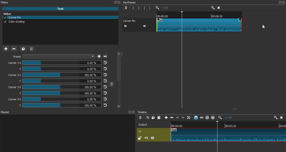
2 - Add the Choppy filter to a clip. Split the clip. The Choppy filter will no longer work for the clip on the right side. That also means that even if you remove the Choppy filter and add it again to the split clip on the right side, the Choppy filter will not work on that clip.

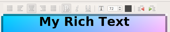
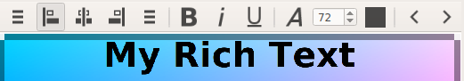
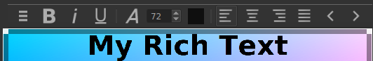
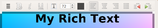
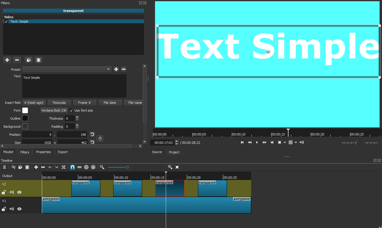
3 - Add Text: Rich to a clip. Highlight the default “Shotcut” text. Insert a table. The font size changes to 8. Select “8” in the font size and try to change the font size by typing a number on the keyboard. Shotcut will crash.

4 - When you change the font in Text: Simple the text on screen changes as you are scrolling through the different fonts. Can this be made to happen in Text: Rich also?

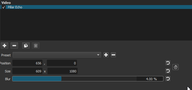
5 - The Pad Blur option in the Slideshow Generator does not work with video clips.

6 - Arguably, the most common use case for the Pad Blur filter is to use them on vertical videos clips like from cell phones. Could an “auto-crop” option be added for the filter that would automatically crop the video to eliminate the dead space? This capability is already available in the Slideshow Generator and it could help save a lot of time when using it on its own.

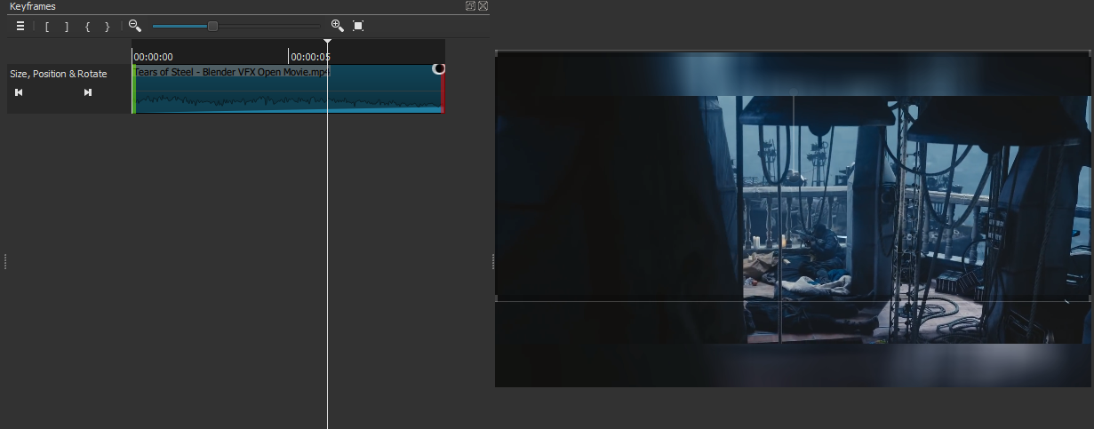
7 - In the new Size, Position and Rotation, as soon as you rotate the image the VUI disappears. Can this be changed so that VUI remains even after rotating? It’d be extremely useful to have the VUI still there especially for animations.

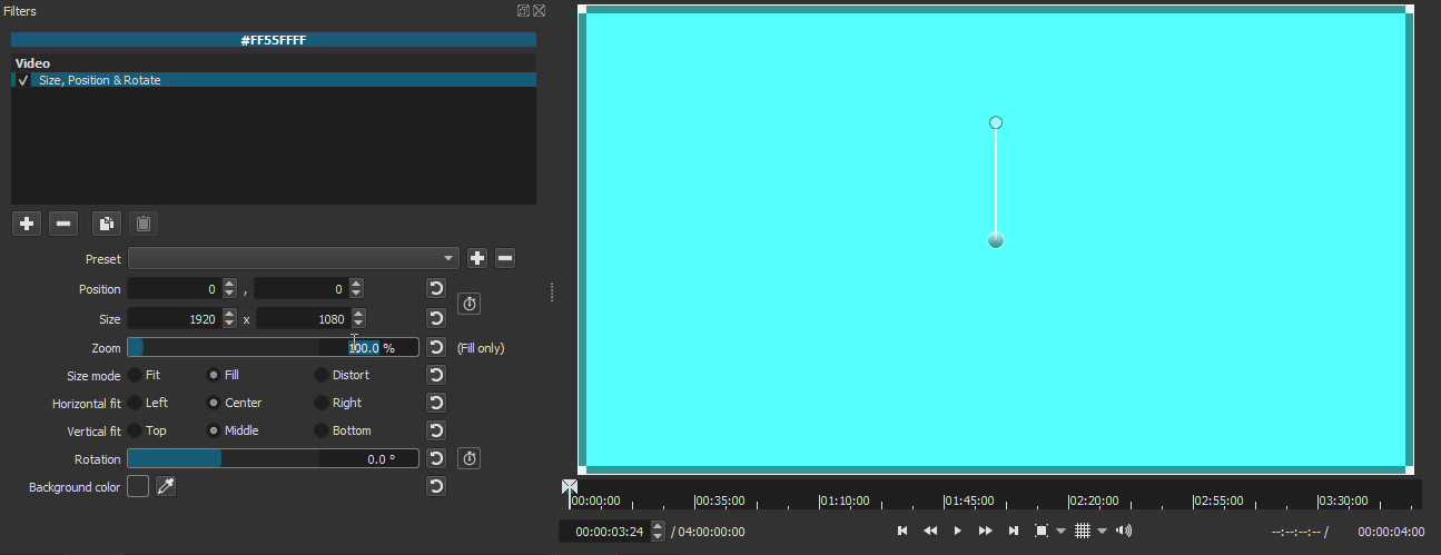
8 - Zoom is only available in Size, Position and Rotation for Fill. Can this be made for Distortion as well since it would be a matter of just maintaining the aspect ratio that the image was distorted to while zooming?

9 - The above also exposes that the current Size, Position and Rotation isn’t that compatible when a second Size, Position and Rotation filter is added to the same image. For example, with the previous filters, you could distort an image with Size and Position then add either a second Size and Position filter or the Rotate and Scale filter to zoom the distorted image in and out. Now with the Size, Position and Rotation filter, if you distort an image then add a second Size, Position and Rotation filter, the second one will straighten the image out.

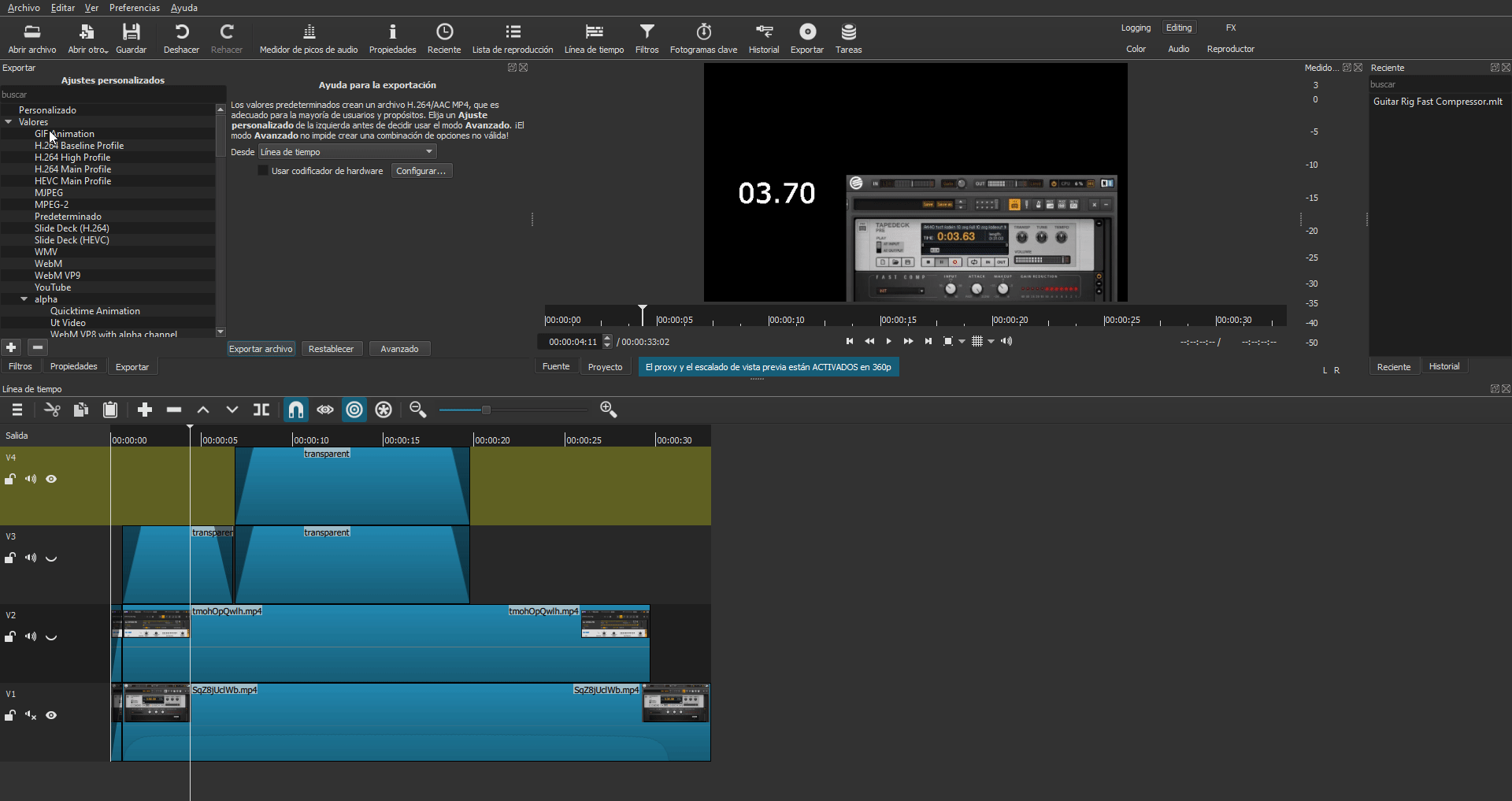
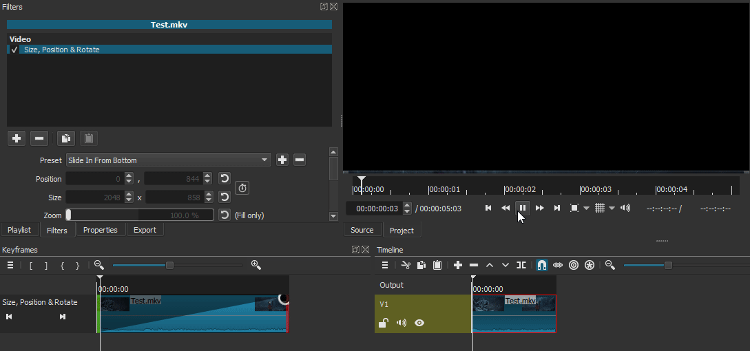
10 - Could you please consider removing the minimum size for the keyframes window? In my setup, I would have the keyframes window be right under the filters and playlist windows like this:

And I would just manually open and close that window with the handle when working with keyframes. I would rather use my personal layout to work with keyframes rather than the “FX” layout.

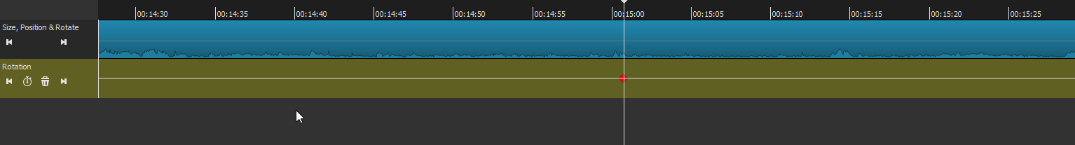
11 - Is the Color Grading filter not supposed to have Simple Keyframes?

12 – The new layouts are nice and it’s very useful to also include them on the top right of the GUI but I believe that “Playlist Project” and “Clip-only Project” are still useful and are worth keeping. I not only use them myself but they also let the user know that you don’t have to always bring clips to the timeline as there are certain use cases where projects can be done just with the preview window or playlist. I suggest keeping Playlist Project, and Clip-only Project and limiting those options to just View>Layout as the first two options above Logging.

LAYOUTS

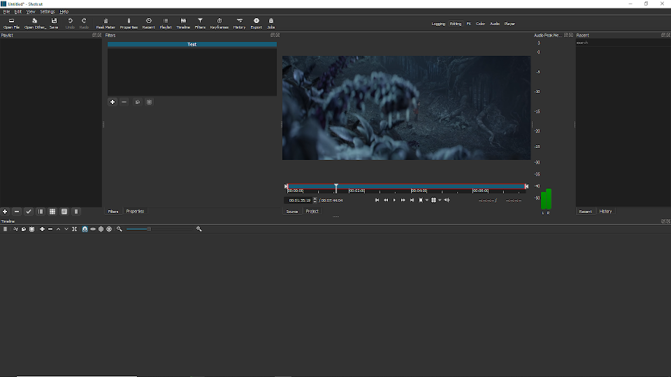
  • In the Editing layout, the playlist is kept above the timeline in its own space alongside the filters window:

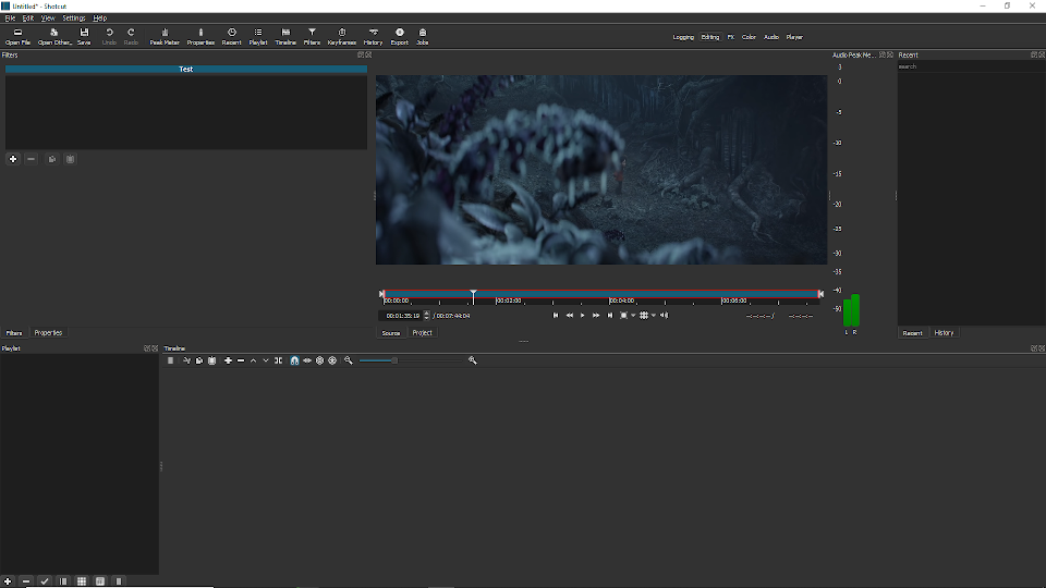
This takes away space from the preview window and makes it smaller than it should be for such a layout. When editing users would want the preview window to be as big as it can be. I suggest moving the playlist down to the left of the timeline similar to how it’s done in the FX layout (although maybe not as wide) and lowering the timeline a bit like this:

  • Perhaps the size of the playlist in the FX layout is a little too wide?

  • In the Color layout, if you keep hitting “Restore Default Layout”, it keeps swapping the positions of the Video Zoom and Video Vector scopes.

  • For the Color layout, I don’t think that the Audio Peak Meter is needed since that layout is not about audio and it takes away from the space of the video scopes.

  • Also for Color layout, you would want the screen to be as big as it can be like how it is for the FX layout so I think the preview screen can be made bigger by dragging it a bit more to the left and lowering the timeline a bit.

1 Like
  1. not new; management of simple keyframes while editing is not implemented and no near term plans to add it
  2. fixed
  3. still in progress. This is a tough one with Qt being difficult. Only seems to be a problem when there is no text before or after table resulting in some phantom cursor positions at the beginning and end.
  4. not possible
  5. fixed
  6. fixed
  7. not possible. Technically, the VUI is not disappeared; only the rectangle’s corner controls. There is still a VUI with which you can rotate, position, and zoom (mouse wheel).
  8. not now, maybe later
  9. this is an unfortunate side effect of a fix for two bugs, one of which is a crasher. Still in progress
  10. I will not remove it completely because it can seemingly disappear and confuse people especially if the title bars are turned off. I reduced the minimum height significantly while still ensuring the toolbar shows.
  11. not new and not now
    • Restored Playlist Project and Clip-only Project.
    • Revised the Editing layout to move the playlist panel into the tabs with Filters and Properties. I do not agree with the argument about the player size, but its default layout was inconsistent with the initial (new install) default layout, and the default selected layout is Editing.
    • Fixed 3 of the video scopes toggling with each other.
    • Changed the Color layout as you suggested.

13 - When the rectangle control in Size, Position & Rotation disappears after using rotation, it comes back by clicking the default button for the rotation parameter. But it is very difficult to restore the rectangle control by using the VUI handle for rotation. The VUI handle seems to be too sensitive in that regard so that even if the VUI is rotated so that the parameter says 0 the rectangle control won’t reappear unless the VUI handle is in a very precise spot.

14 - The line that runs across the keyframe timeline for filters that have keyframes with curves disappears after zooming in at a certain amount. Demo.

15 - Considering that the Zoom parameter goes up to 1000%, perhaps the bar can be made a little longer so that the control for zoom by manually moving the bar can be a little more precise. Maybe moving the end of the bar on the right to be a little further down like so:

1 Like

This is fixed as well as 13 and 15.

15 - Considering that the Zoom parameter goes up to 1000%, perhaps the bar can be made a little longer

This UI was not expanding its width to occupy additional space like it is supposed to. After fixing it, I found several other filters with the same issue and applied the simple fix for them too. Also, for Zoom and Rotation, the numeric field was wider than the maximum digits needed and reduced that giving these sliders more width.

14 - The line that runs across the keyframe timeline for filters that have keyframes with curves disappears after zooming in at a certain amount.

This is not new and requires a big change to workaround a technology limitation making it out-of-scope for this release.

16 - The fix to the Pillar Echo filter has introduced a new bug. When you hit the default buttons the values get messed up. In this demo, the values are at default for a vertical video before I start.

17 - Bring a video file to the Playlist. Trim the video file down to at least 10 seconds in the Source tab by marking in and out points. Select the trimmed video clip in the Playlist and load it into the Slideshow Generator. You can leave the default settings as is and just press “OK” to bring it into the timeline. Even though keyframe animation was applied to the video in the Slideshow Generator it will not have any animation play out. If you look at the clip in the Keyframe timeline the Simple Keyframe animation will have the same messed up look that I reported on in Bug 1 which is why no animation is happening. Here is a picture of it after it goes through the Slideshow Generator:

LAYOUTS

  • With the updated Editing layout, the default sets the Filters tab as the active window. If the encouraged workflow is to go from Logging to Editing then the default should have Playlist as the active window so that after loading media in Logging you go to Editing and right away can start bringing media down to the timeline without having to first switch from Filters.

  • In View, if you switch off “Show Small Icons” the layout list in the top right is grouped on top of each other:

I don’t know if that’s intentional.

  • The Filters tab in the FX layout can be opened up more. Since focus of the FX layout is the Filters and Keyframes windows, the default for the Filters windows should be at a size that wouldn’t make the user have to resize it for certain filters that have more parameters. I made a demo here showing with both the Corner Pin and Color Grading filters that the Filters window can be made both longer and wider while still giving the Keyframes window to its right plenty of room so that its whole toolbar can be seen.

  • In the FX layout, I think it’s appropriate to add the Properties tab and put it in the same bottom left hand space as Playlist.

  • In the FX layout, if you press the button for the Export window it appears on the bottom left. It’s best that if that button is to be pressed while on the FX layout that it appear on the upper left in the same spot as Filters.

  • I think the highlight for the selected layout on the top right is too faint. Maybe adding an additional mark for highlighting the selection like a slightly more noticeable border or an added red or (Shotcut) blue line?

  • How about adding a “Delivery” layout at the end of the list of layouts after “Player”? It would be as simple as this:

The Export tab is on the left and the Jobs tab on the right. That would allow maximum view of the presets and jobs lists. I also added there the Playlist tab to share the same spot as the Export tab since exports can also be taken from the playlist.

By the way, thanks a lot for adding the “Zoom to fit” buttons for the timelines! :+1:

subjective, somewhat intentional, depends on window size, and not changing anything except probably the Editing layout

  1. fixed
  2. fixed, unrelated to 1

18 - In Size, Position & Rotate, when you press the default button for Zoom, it doesn’t bring the image back to the actual position that it was in. Instead it throws it elsewhere. However, this does work when typing “100%” back in manually. Demo.

19 - Selecting a clip with Text: Rich applied on the timeline will overlay whatever text is on that clip on to the preview screen regardless of where the playhead is. In this demo, I have 4 transparent clips. 2 of them have Text: Rich with “Text Rich” as the text in 2 different colors. To the right of them are 2 other transparent clips but with Text: Simple applied with “Text Simple” as the text also in 2 different colors. I first show the 2 Text: Simple clips and how keeping the playhead on one while selecting the other goes as expected. Then while leaving the playhead on either of those Text: Simple clips the problem that happens when selecting either of the clips with Text: Rich.

fixed

All VUIs currently behave like this, and Text: Rich is a VUI until it is no longer displayed as a VUI. Shotcut tries to hide the VUI when the playhead is not over the filter’s active area. But it is not perfect, and currently the playhead needs to be over a different clip if there are clips on V1 for the VUI to go away. This is out of scope to fix for this release.

For first time users who download this upcoming version of Shotcut what will the first layout be for them? Is it Logging? I am imagining that if a first time user starts off with Logging, loads their media then clicks on Editing to proceed that they might be thrown off a bit that their list of media is not on screen and it may take a little time for them to figure out they have to click on the tab next to Filters. It might be minor but I think it’s worth considering to make Playlist the default tab for the Editing layout to avoid that possible initial confusion.

By the way, Bug 16 has only been partially fixed. The default button for the Blur parameter is still buggy like how I show in the demo above.

Editing

think it’s worth considering to make Playlist the default tab for the Editing layout

It is changed; that is what I was saying I would be the exception about changing the layouts.