I’ve been using Shotcut for a while now, creating content for my YouTube channel. The Text: Simple filter is probably one of the most heavily used filters in my content, but it does have what I feel is an incorrectly implemented feature, text padding.
I have certain “standards” that I adhere to in my content, one of which being the font and colour of my text. As my choice of colour is a light colour, to ensure my text is easily read regardless of the background imagery, I always like to select black padding for my text. But, I feel that the padding that Shotcut creates is created in the wrong direction. It always pads inwards rather than outwards.
To explain:
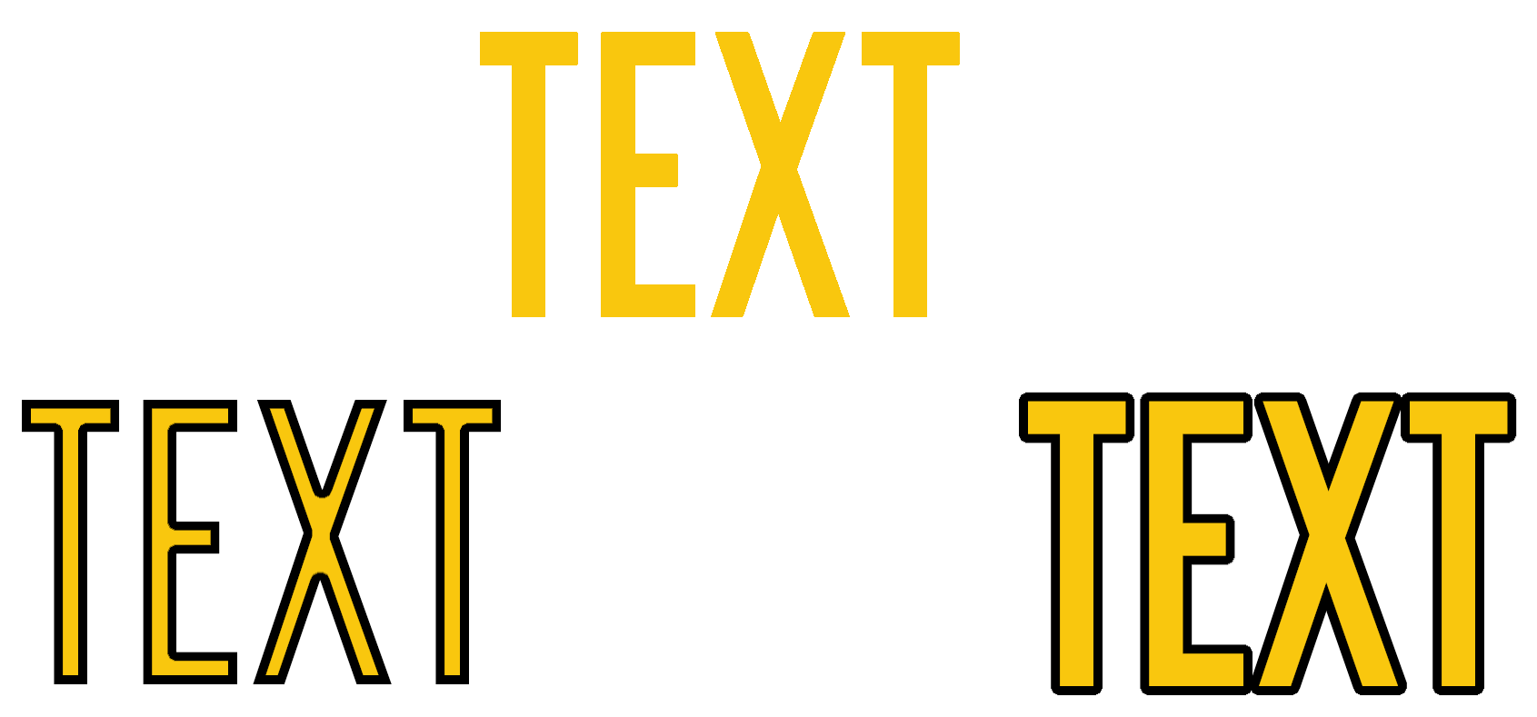
In my image above, which I’ve created in GIMP for the purpose of this explanation, the top is the original text without any padding, the lower-left is how Shotcut implements padding, whilst the lower-right is how I would prefer Shotcut to implement the padding. Basically, make it grow outward rather than inward.
The current method makes my text look duller as the padding gets thicker, making it harder to read if the text is too small. My current workaround is to create my text in GIMP and import it into Shotcut as an image.
It would be great if Shotcut could be tweaked so that I could have the padding grow outward if I choose to do so, either with a tickbox or with a negative value in the thickness box. Either would be great.