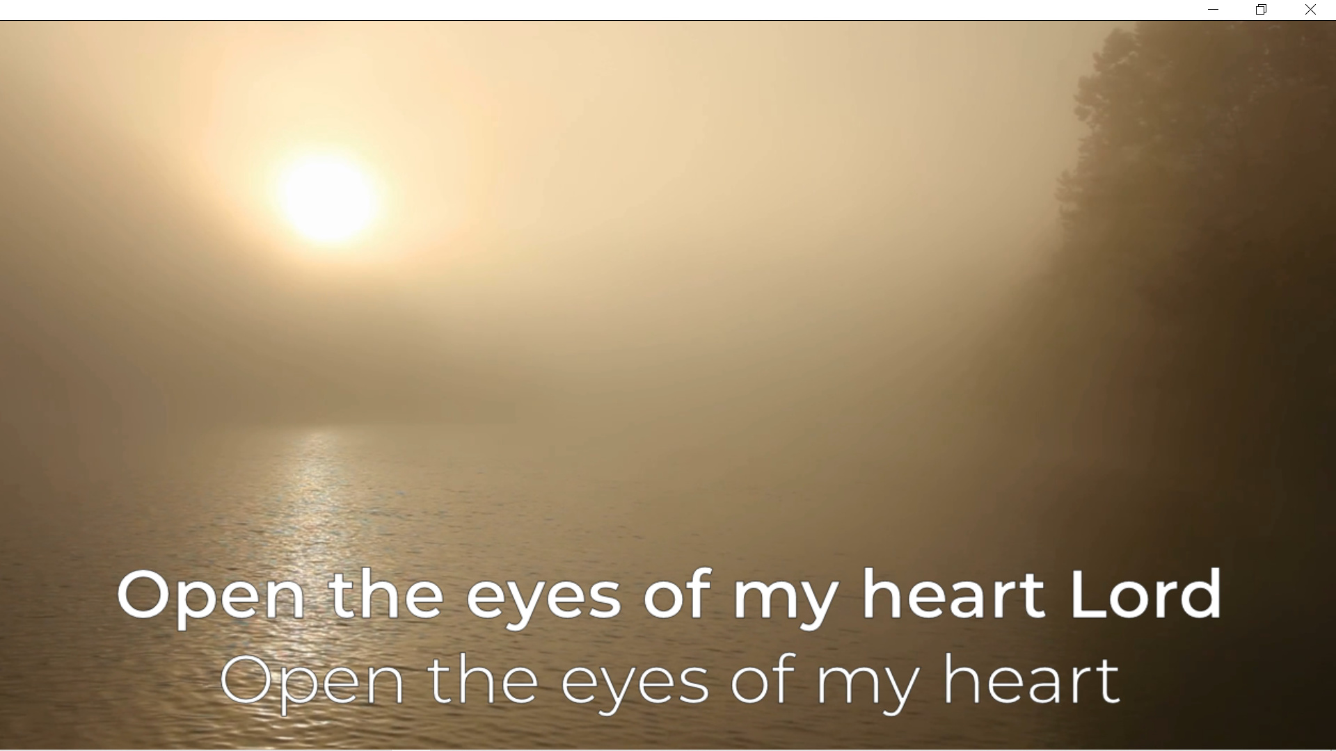
I added some lyrics to a music video and used my usual font, in white with a one pixel black outline.
It looked smaller than in similar videos I made with another editor.
I identified the reason for the difference!
Shotcut places the outline inside the characters.
This reduces the amount of white shown, creating the illusion of smaller letters.
Most other editors add the outline to the outside of the characters so the white area of the character stays the same.
This is not a huge issue, my simple workaround was to opt for the medium version of the same font instead of the standard size.
Suggestion 1 - this information is added to the documentation / help for the text filter.
Suggestion 2 - provide and option to choose whether outlines are added to the inside or outside of text.
Image showing standard font at bottom and heavier weight above.