I had an idea and set myself a challenge to create text which flows “typewriter” style - but on a circular or spiral path.
I did it - by using quite a complex mixture of an HTML animation from Codepen (which I PM’ed Elusien about, who kindly adapted it for me), and a clever AutoHotkey script (provided my by a person on the AutoHotKey forum) which automates the mouse positions and draws a perfect spiral on screen. I’ve just uploaded the Demo I made today to Youtube. I’ve written a more detailed description of how I did it in the description below the video on Youtube.
The effect probably isn’t very useful practically but it was great fun to do and I achieved my challenge!
This song written by a french guy doesn’t talk about spiral in the original lyrics… But it’s really fun to watch the writing of the text in this way! As you said, the effect probably isn’t very useful practically but it is the beauty of the thing, I like it.
Glad to see you got the spiral working. Here is a simple HTM fileL which has the effect of Text written on an arc of a circle, Then rotated. It is fairly simple to follow. Basically there are two parameters: --start = degrees at which the text starts, --end = degrees at which the text ends.
<!DOCTYPE html>
<html>
<head>
  <title>Text on an Arc plus Rotation</title>
  <style>
body {
  background      : black;
  color           : white;
  text-shadow     : -0 0 1px black;
  font-size       : 8vh;
  font-weight     : bold;
  font-family     : monospace;
}

.container {
  overflow        : hidden;
  display         : flex;        /* Use 'flex' to centre on the screen */
  flex-direction  : row;
  justify-content : center;      /* Centre text  vertically  inside the logo */
  align-items     : center;      /* Centre text horizontally inside the logo */
  margin          : 0;
  width           : 100%;
  height          : 100%;
}

div.circleText {
  transform       : translateX(50%);
  width           : 800px;
  height          : 800px;
  --start         :   -90;        /* Start of the arc (in degrees) */
  --end           :   270;        /*  End  of the arc (in degrees) */

}

.container { animation: rotate 5s linear 2s; }

@keyframes rotate {
    0% {transform: rotateZ(  0deg);}
  100% {transform: rotateZ(360deg);}
}
</style>
</head>
<body>
  <div class="container">
    <div class="circleText">
S.A. NATIONAL AERONAUTICS AND SPACE ADMINISTRATION U.
    </div>
  </div>
<script>
  var circleText = document.getElementsByClassName("circleText")[0];
  var       text = circleText.innerText.split('');
  circleText.innerText = '';
  var      style = getComputedStyle(circleText);
  var      start = +style.getPropertyValue('--start');
  var        end = +style.getPropertyValue('--end');
  var     radius = 0.5 * parseInt(style.width);
  var  arcintval = (end - start) / text.length;
  var     origin;
  for (let i = 0; i < text.length; i++) {
    origin                = 90 - start + (i * arcintval);
    circleText.innerHTML += `<div style='height:${radius}px;position:absolute;transform:rotate(${origin}deg);transform-origin:0 100%'>${text[i]}</div>`;
  }
</script>
</body>
Please feel free to use it. To see the effect just copy the code into an HTML file and run it in a browser window.
For my effect each character is in its own <div> each of which is rotated by an amount equal to the number of degrees of arc divided by the number of characters multiplied by the index of the character in the string. It is easier to see this here:
This is with Chroma?! Wow, looks very well.
I have always some issues with Chroma…
Howsoever, to be honest, I thought more in direction of fan out the single parts…, I think I will keep it in my mind…
Awesome! Just a little thing, we usually read from left to right and from top to bottom, wouldn’t it be better if the rotation was counter clock wise instead of clock wise (I’m not English native, I’m not sure of the words)?
The NASA seal is as shown (apart from the fact that “U.S.A” should be the correct way up, not upside down. Whether it rotates clockwise or counter-clockwise I suppose is a matter of preference. I tend to favour clockwise, but others may prefer the opposite. It is easy to change in the CSS; rather than:
100% {transform: rotateZ(360deg);}
you would have:
100% {transform: rotateZ(-360deg);}
I used Chroma key, but if WebVfx was not being discontinued I would make it into a proper Text:HTML filter, like the “sniperscope” filter I did a couple of years ago. I’d also be tempted to do “Text on a Bezier Curve” the you could have more or less any shape you wanted.
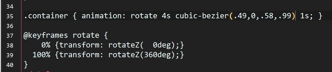
Cool effect, @elusien! I just made another demo replacing the easing “linear” in your code with a cubic-bezier animation to make the circle begin slower and end slower. (I could have just written “ease” but the circle accelerated too fast, I thought). Then in a second example I applied a different cubic-bezier code to get the circle to reverse anticlockwise slightly before continuing clockwise, then reversing slightly at the end! Both animations are in this demo -
You could create the circular text in an image editor and save this as a transparent PNG then use the Rotate-and-Scale filter with keyframes in Shotcut to do the rotation.
With HTML you could easily keep each letter vertical as the whole text rotated (like a ferris wheel). This would be an almost impossible challenge to do with Shotcut filters.
This effect is produced by animating only 1 element - the <div> that contains all the individual characters. To do the “fanout” would require every letter to be animated individually. This is not difficult to do when using my Shotcut CSS3 Animations application (Shotcut - Elusien's Contributions).

 As you said, the effect probably isn’t very useful practically but it is the beauty of the thing, I like it.