New here and hoping someone can point me in the right direction. I’ve been going back and forth between the various linux open source video editing tools trying to simply create fade-in, fade-out titles while also keeping the text size consistent from one fade-out/fade-in to the next. Either one system has a nice way of keeping all the fonts the same size it lacks fading in and out of the text. Or, another system allows easy fading in and out of text whilst making it very difficult to keep text consistent in size and shape throughout the video.
I’m sure I’m missing something basic here but all I want to do is make the text boxes and the fonts/sizes consistent from one title to the next.
I’m finding that difficult to do in Shotcut despite all the other features working seamlessly. Is there some basic tutorial on this specific issue anywhere? What is the trick?
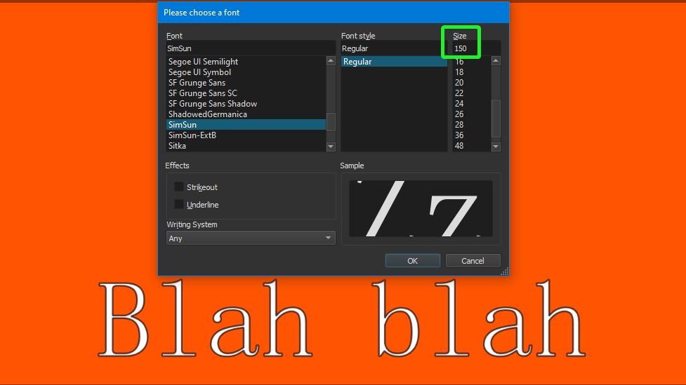
I can’t depend on the resizing bars in the text box because they are not consistent. Choose a font size indeed doesn’t keep the font the size I choose.
As I said, I’m sure I’m missing something basic but I can’t find out what that is. Any guru help would be much appreciated.
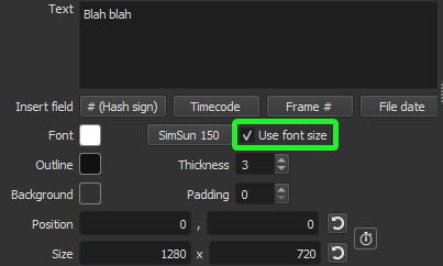
Not sure what you are doing, but with Text: Simple filter you need to turn on it’s option Use font size. Otherwise, the size depends on the rectangle and amount of text.
Oh, and the font size needs to be small enough, or it will be so large it is downscaled to fit within the rectangle.
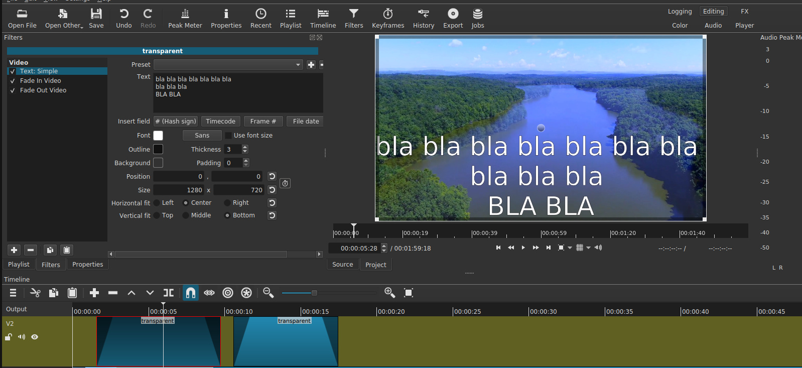
Thank you but I’m back to where I was before. See attached screenshots. Notice that I’m using the exact same text in two different fades but they display differently in the preview window.
That is the issue I’m having. From text fade to different text fade the fonts are all different despite my having the settings (and in the example the text ) the same.
And see this example (I could only upload one image). But if you compare the two you will see that the text is the same and so are the settings but the text displays differently
When Use font size is NOT on, a size is determined to ensure the rectangle is filled even with the smallest amount of text, for example only “!”. Imagine that needs to fill the screen; it needs to be big. To do that the text size is determined by the the video frame height divided by the number of lines of text. Finally, the resulting text-image is always scaled down to fit within the rectangle minus padding.
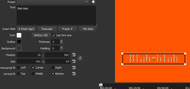
I did read that tech not about that and made sure Use Font Size is ON. But I think it may be something related to the UI.
In other words, I may slide the position bar over the subject text and see the values in the setting box, however, unless I first CLICK on the proper track, nothing will stick. At least that’s how it works on my Ubuntu box.
But it is not on in your screenshots! Also, the panels do not reflect what is under the playhead. What if there are multiple tracks with multiple clips at the same point in time? It reflects what is selected. It even tells you at the top of its panel what it is acting upon, and there is a red outline on the selected object. You asked before “what am I missing?” Attention to detail.