is it possible to have shotcut in dark mode (fusion) and use the system theme icon set??
I’m running it portable between win 10 & 11.
I loathe the flat and featureless icon outlines that’s all the rage these days. they’re easy make and look blaah.
is it possible to have shotcut in dark mode (fusion) and use the system theme icon set??
I’m running it portable between win 10 & 11.
I loathe the flat and featureless icon outlines that’s all the rage these days. they’re easy make and look blaah.
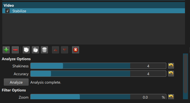
You can run shotcut.exe with the QT_STYLE_OVERRIDE environment variable. If you do not know what an environment variable is, then this is probably beyond your skill level and the answer would be “no, not available.” However, if you know or can learn it via the Web, there are some options with caveats. Also, you must:
Here is how they look
QT_STYLE_OVERRIDE=windows11
Not too bad, but:
![]()
QT_STYLE_OVERRIDE=fusion
A lot of the issues come from the GUI library we use and would require significant effort to override and workaround that is not a good use of our limited time. We could probably improve the second option by tweaking the palette and icons, and then include it in the System option to make it automatically adapt to the desktop (very reasonable to expect for something named “System”).
@shotcut
Presto! Thank you! that did the trick! this looks better.
lucky I’m better at tweaking windows than I am video editing for fun so I can over look the few oddities. and yes its working on win10
I found this bug already exists in the latest Shotcut version 25.05 on Windows with the System theme. So, I tried out an idea to make System theme follow the OS color mode and fix the colors and icons. I am strongly considering it for the next version 25.07. Here it is with Shotcut System theme, Windows 11 dark mode:
Nice, eh? It is darker and more contrast as it is based more on the Windows color palette instead of custom.
I can add “System Fusion” for those who want the monochrome icons and follow the OS color mode, like this (darker and more contrast–same as Windows):
I love it. looks great. maybe I’m old cause I loved the win7 style UI, windows with borders ( you can grab with a mouse that not a single pixel wide ) and icons with colors & textures.
yet DARKMODE everything. could never be blinded by win7 again.
my whine about modern ui, all in dark mode with flat gray icons, is you can ever find anything. the edges of windows and and icon all blend together.
so yes please and thank you, a bit more contrast and color pops would be great! ![]()
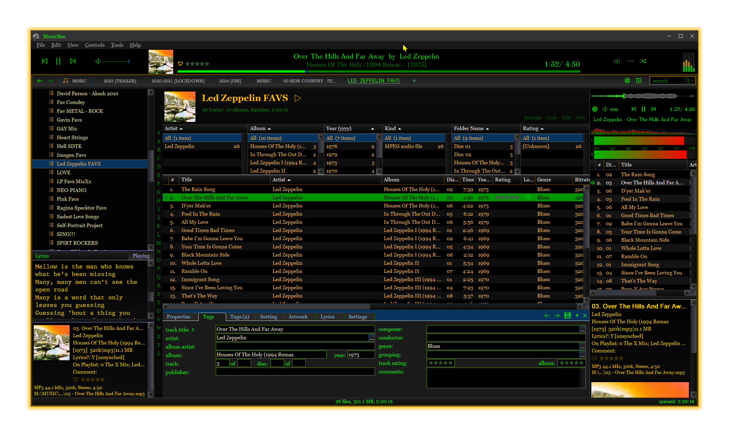
unrelated… I spend a week writing a skin for my music player after using the same one for 12+ years. LOL with lots of shading and gradients and all input elements change color when active. ![]()
This topic was automatically closed after 90 days. New replies are no longer allowed.