I set myself another task today, to see if I could create a video title with an animated “revealing” rectangle, using HTML/CSS/Webvfx,
but using a transparent background and overlay it above video footage.
Good news - I did it, using Elusien’s Webvfx framework to animate the four sides of the rectangle using this piece of code:
0% :   {webkitTransform:scale(1, 0);},
100% : {webkitTransform:scale(1, 1);}
(for the four sides of the rectangle).
Here’s the result:
However, although I like the effect of the revealing rectangle (each line growing outwards from its centre), I originally wanted the lines of the rectangle to reveal like they do in this screen capture which is the same video title but with a blue background rendered in Chrome:
To do this I added this code to the css:
transform-origin:bottom; (to the left rectangle side),
transform-origin:left; (to the top rectangle side),
transform-origin:top;(to the right rectangle side),
transform-origin:right;(to the bottom rectangle side).
However, Webvfx seems to ignore these “transform-origin” commands and in Shotcut the result is that each line scales outwards from the middle.
I know that Webvfx has limitations when it comes to “transform” animations. I was just womdering if there was another way of coding it using webvfx to achieve the effect shown in the video above (blue background)?
Thanks, any help gratefully received. Jon
PS full code is here if anyone would like to use it and experiment:
<html lang="en">
<head>
<meta charset="utf-8">
<title>Video title 01</title>
<style>
body {
background:transparent;
}
#big_container {
position: absolute;
width: 1920px;
height: 1080px;
background-color:transparent;
left:50%;
top:50%;
margin:-540px 0 0 -960px;
opacity:1; }
#global_fade_out {
position: absolute;
width: 1920px;
height: 1080px;
background-color:transparent;
left:50%;
top:50%;
margin:-540px 0 0 -960px;
opacity:1; }
#main_title {
font-family:Adequate;
font-size:150px;
text-align:center;
font-weight:bold;
color:white;
text-shadow: 2px 2px 4px #000000;
position: absolute;
width: 1800px;
height: 250px;
background-color:transparent;
left:50%;
top:300px;
margin:0px 0 0 -900px;
opacity:0;
}
#line_01 {
position: absolute;
width: 1100px;
height: 2px;
background-color:white;
left:50%;
top:550px;
margin:0 0 0 -550px;
opacity:0;
}
#subtitle {
font-family:Life Savers;
font-size:100px;
text-align:center;
color:white;
font-weight:bold;
position: absolute;
width: 1800px;
height: 250px;
background-color:transparent;
left:50%;
top:650px;
margin:0px 0 0 -900px;
opacity:0;
}
#box_left {
position: absolute;
width: 8px;
height: 600px;
background-color:white;
left:200px;
top:250px;
transform-origin:bottom;
opacity:0;
}
#box_top {
position: absolute;
width: 1500px;
height: 8px;
background-color:white;
left:200px;
top:250px;
transform-origin:left;
opacity:0;
}
#box_right {
position: absolute;
width: 8px;
height: 600px;
background-color:white;
left:1700px;
top:250px;
transform-origin:top;
opacity:0;
}
#box_bottom {
position: absolute;
width: 1500px;
height: 8px;
background-color:white;
left:208px;
top:842px;
transform-origin:right;
opacity:0;
}
</style>
</head>
<body>
<div id="big_container">
<div id="global_fade_out" class="webvfx" data-animate="{start: 0.7, end: 1, ease: "easeInOutSine",
0% : {opacity:1;},
100% : {opacity:0;} }">
<div id="box_left" class="webvfx" data-animate="{start: 0.0, end: 0.01, ease: "easeInOutSine",
0% : {opacity:0;},
100% : {opacity:1;} }" data-animate2="{start: 0.0, end: 0.1, ease: "easeInOutSine",
0% : {webkitTransform:scale(1, 0);},
100% : {webkitTransform:scale(1, 1);}
}"></div>
<div id="box_top" class="webvfx" data-animate="{start: 0.1, end: 0.11, ease: "easeInOutSine",
0% : {opacity:0;},
100% : {opacity:1;} }" data-animate2="{start: 0.1, end: 0.2, ease: "easeInOutSine",
0% : {webkitTransform:scale(0, 1);},
100% : {webkitTransform:scale(1, 1);}
}"></div>
<div id="box_right" class="webvfx" data-animate="{start: 0.2, end: 0.21, ease: "easeInOutSine",
0% : {opacity:0;},
100% : {opacity:1;} }" data-animate2="{start: 0.2, end: 0.3, ease: "easeInOutSine",
0% : {webkitTransform:scale(1, 0);},
100% : {webkitTransform:scale(1, 1);}
}"></div>
<div id="box_bottom" class="webvfx" data-animate="{start: 0.3, end: 0.31, ease: "easeInOutSine",
0% : {opacity:0;},
100% : {opacity:1;} }" data-animate2="{start: 0.3, end: 0.4, ease: "easeInOutSine",
0% : {webkitTransform:scale(0, 1);},
100% : {webkitTransform:scale(1, 1);}
}"></div>
<div id="main_title" class="webvfx" data-animate="{start: 0.0, end: 0.2, ease: "easeInOutSine",
0% : {opacity:0;},
100% : {opacity:1;} }">Planet Earth
</div>
<div id="line_01" class="webvfx" data-animate="{start: 0.1, end: 0.4, ease: "easeInOutSine",
0% : {opacity:0;},
100% : {opacity:1;} }">
</div>
<div id="Subtitle" class="webvfx" data-animate="{start: 0.3, end: 0.5, ease: "easeInOutSine",
0% : {opacity:0; letterSpacing:0;},
100% : {opacity:1; letterSpacing:30;} }">as seen from space
</div>
</div>
</div>
<script src="WebVfx 1_4.js"></script>
</body></html> . I thought of using the S &P filter but I couldn’t figure out how to do it…
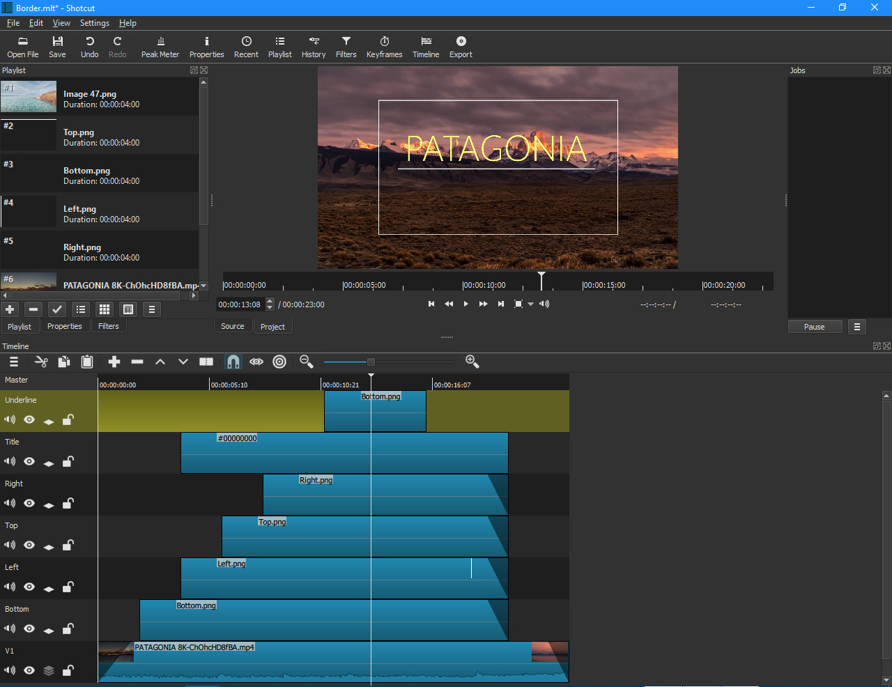


