Here is a link to the official Shotcut channel. Shotcut - YouTube
I know that the channel is not the main focus of the shotcut team, but I am speaking what is in my mind, which can make it look better.
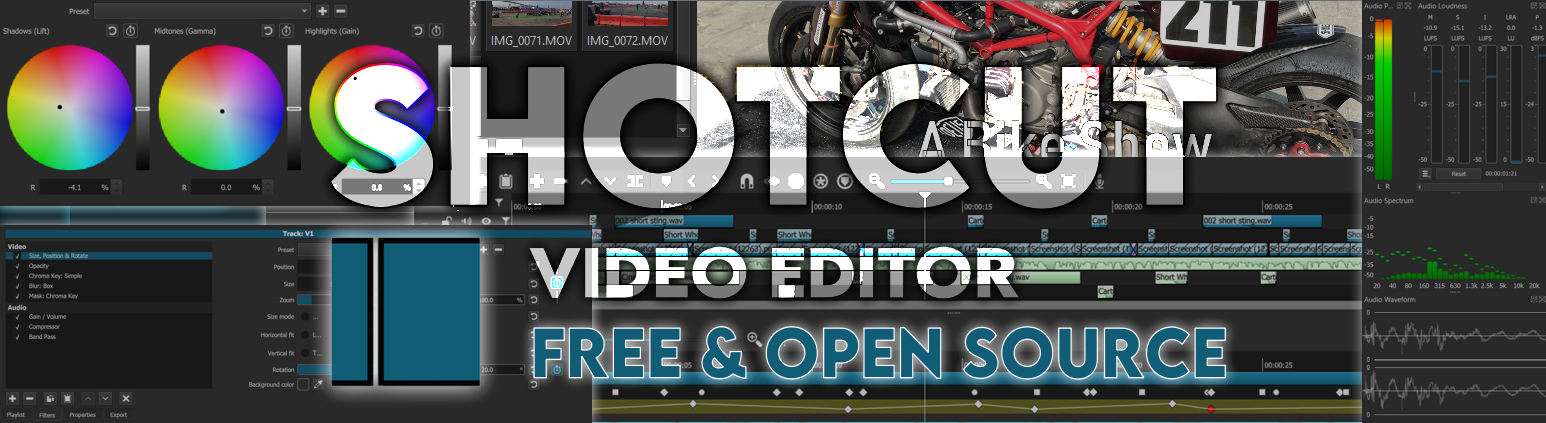
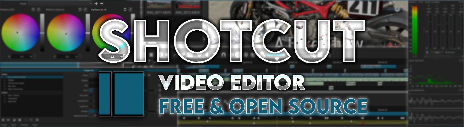
I feel that the banner is not up to the mark for a feature rich tool like shotcut.
It is just a screenshot of the editor window.
I have tried my best to design a new banner for shotcut.
I have kept everything simplistic and minimalistic, just the way shotcut is. Easy to use and to the point.
I have also tried to include as many features as I could show. The logo is there too.
I would like some views from all of you about this. Hope you guys like it. Open to suggestions and criticism.
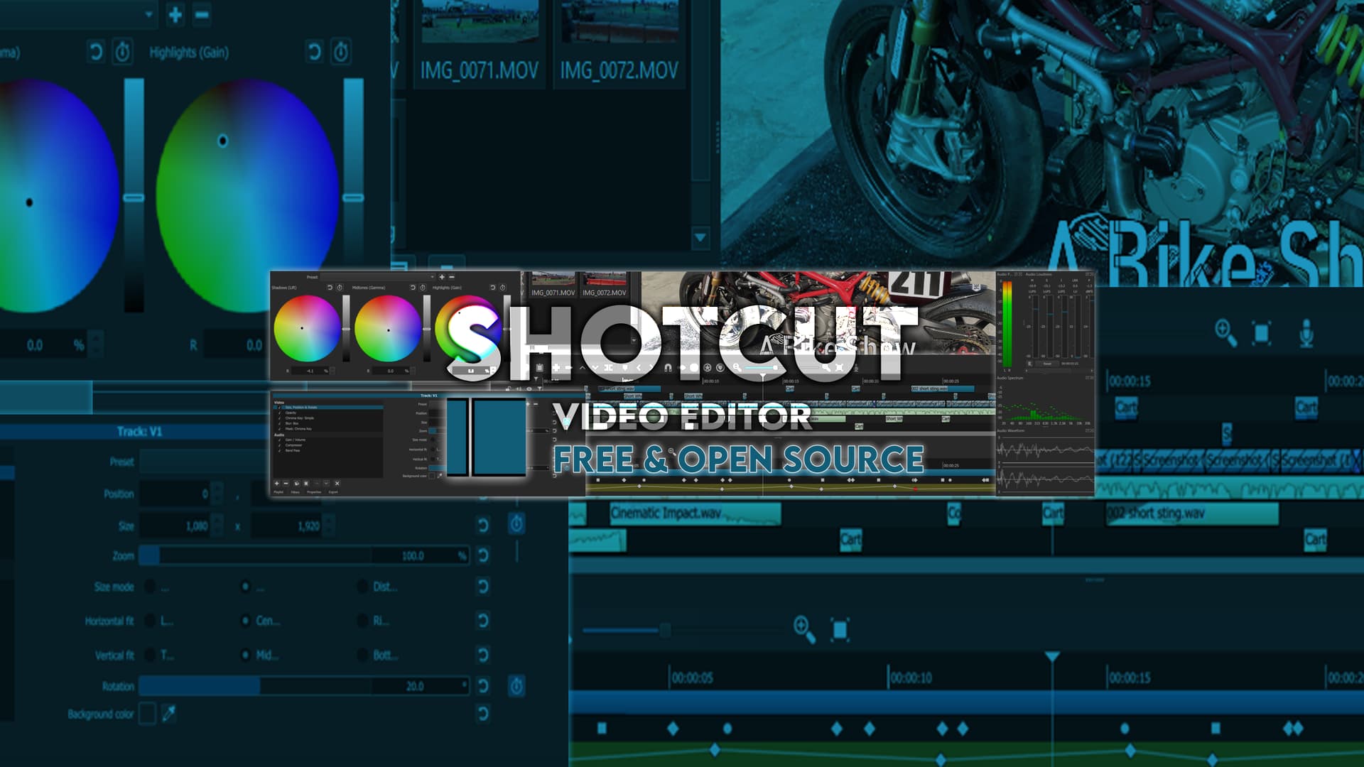
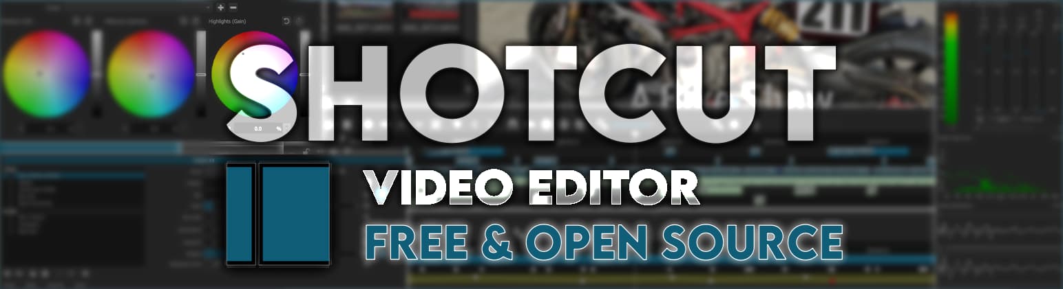
The above is just a crop of how it would look on all devices. The complete banner format size is here:
Here’s my opinion: Not bad, but the text is too hard to read. Since it’s transparent, it gets lost in the busy background behind it. In my opinion, the text should be the first thing we see when we look at the banner. Maybe all you need to do is remove the transparency from the text.