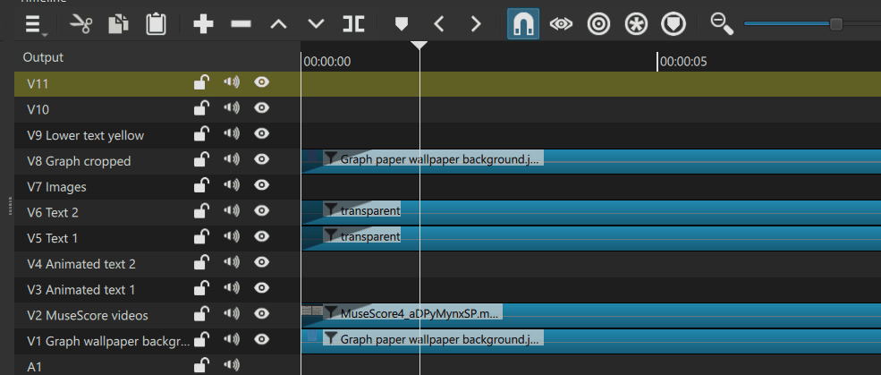
When reducing the tracks height below a certain size, the track name and the track head icons are displayed on the same line, which leaves very little space for a custom name (only 4 or 5 characters). On audio tracks you need to increase the tracks height a lot to have the name and icons on separate lines.
Would it be feasible to make the width of the Name area of the tracks heads adjustable?
Moi aussi, je soutiens cette suggestion. Je pense qu’il y aurait une solution qui convienne aux développeurs et aux utilisateurs avertis, très facile à coder et qui ne change rien aux fonctions actuelles de Shotcut.
Il suffit d’ajouter une ligne “onWheel” dans le fichier timeline.qml après la ligne 189, ce qui donne
I also support this suggestion.
I think there would be a solution that would be suitable for both developers and advanced users, very easy to code, and that doesn’t change anything about Shotcut’s current functionality.
Simply add an “onWheel” line to the timeline.qml file after line 189, which gives
Merci pour cette amélioration. Personnellement, je ne suis pas convaincu qu’il faille sauver la largeur définie, on est amenés à la modifier plusieurs fois au cours du projet. Mais tant qu’à choisir, la sauvegarde dans le projet est plus logique.
Thanks for this improvement.
Personally, I’m not convinced that saving the defined width is necessary, we’ll likely change it several times throughout the project.
But if we have to choose, saving it in the project makes more sense.
Considering the only reason people want to adjust this is to see the track name fully, wouldn’t it be better to just automatically resize them all to fit the longest name when it’s changed? And only saved to project file if manually resized?
@shotcut “Adjustable timeline header width” from the nightly version works very well but there is a small issue:
When a clip is located at the very start of the Timeline, it is no more possible to grab + drag its first frame to the right (for trimming). The left edge of the clip turns green, but it’s the header that gets dragged.
@Namna worked on a way to solve the issue. But I think I’ll let him submit his changes himself.
Voici la modification du code effectuée pour décaler sur la gauche la zone de sélection de la ligne de séparation afin qu’elle ne soit pas superposée à celle du bord gauche du clip. J’ai ajouté en plus une modification de la couleur de la ligne (Blanc → Rouge) pour permettre à l’utilisateur de bien distinguer quelle zone est sélectionnée.
Here’s the code modification I made to shift the selection area of the dividing line to the left so that it doesn’t overlap with the selection area of the left edge of the clip.
I also added a color change for the line (White → Red) to allow the user to clearly see which area is selected.
I applied the code change to fix the problem, but red is an appropriate color to use for this. That color is about selection in Shotcut and danger in general. But the color treatment for moving panel dividers will not work here because it blends in too much with video clips starting at 0. No special hover color is needed. It has a mouse cursor.