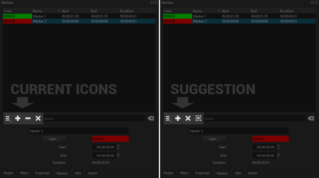
In the Markers panel, I’m sure I’m not the only one that occasionally click the X button instead of the minus button to remove a marker.
X is used in so many places to delete or remove something that the eyes are instinctively drawn to it.
I think it would make the button bar more intuitive in the panel if the Deselect the marker button was replaced by something else. I’ve looked for such buttons/icons on Google and found many variations of this design:
 .
.
Also, since the X sign is almost always associated with removing or deleting objects, maybe it could be used to replace the minus button.
Thanks for reading my suggestion, and happy new year to everyone.