Hello, I just joined the Shotcut forum because i made a restyling of the logo of this software, I would like to show you and know what you think and if it could also be something to apply to the software, i’m using Shotcut from 2018 and I saw that you still have this logo (for me it is very old-style now) so I decided to do a restyling for you, i hope that you can see my project!
(sorry for my english)
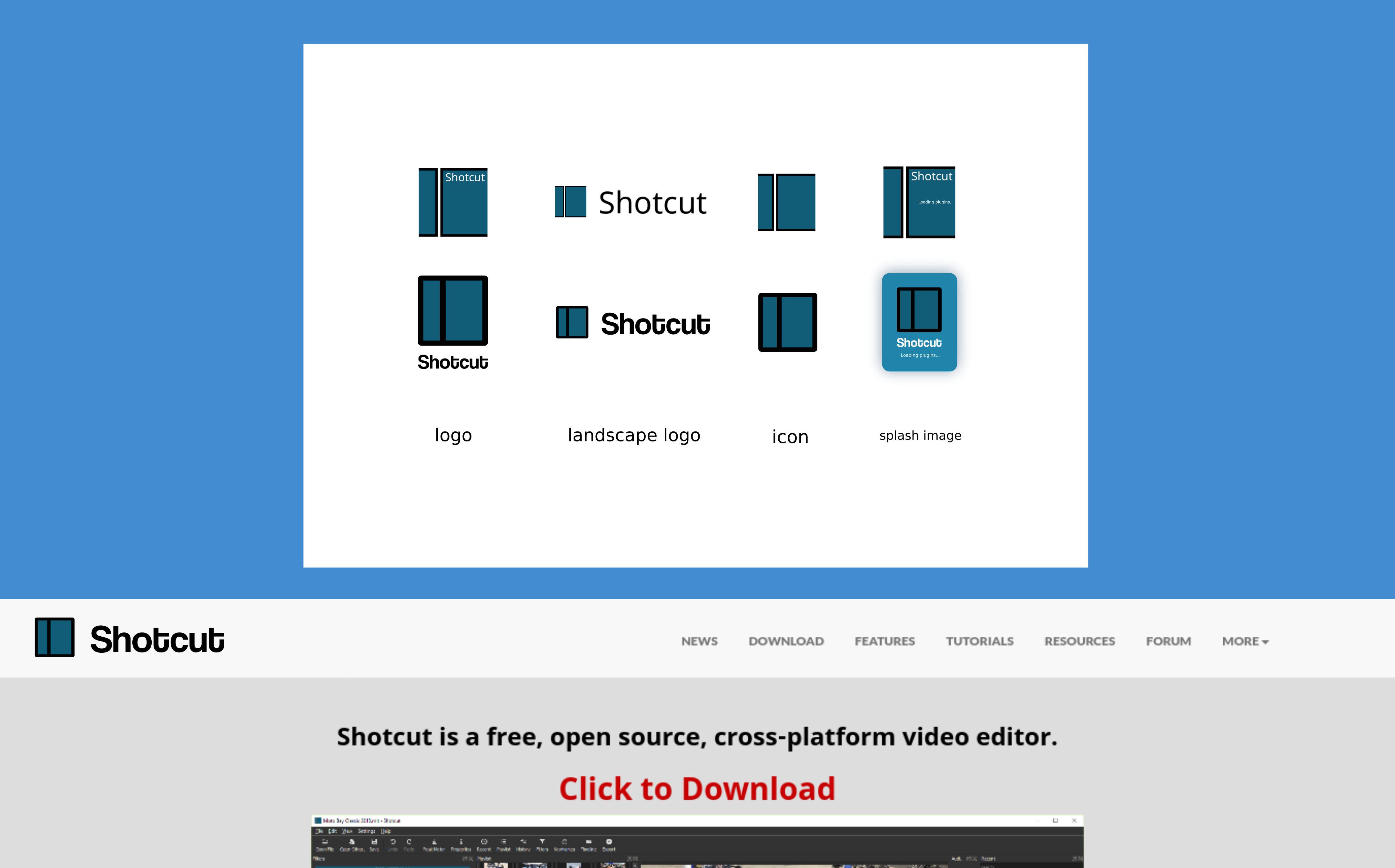
I’m not a fan I’m afraid. The font is not clear and looks quite amateurish (if you look at it from a distance it seems to read “Shobcub”) and the original logo is supposed to represent frames of a roll of film, while to me the new logo doesn’t really convey any relevance to film.
thank you for letting me know, you are right, i make the logo too simple haha, i will update the project considering the things you let me know 
Actually, quite the opposite. I tried to avoid anything to do with film and blades or scissors since modern video editing has nothing to do with those things most people have never seen or touched (in the context of video editing). Rather, it is a simplistic, zoomed-in view of 2 clips on a track of a NLE. Interesting to read that some think it is film, but not surprising upon viewing with a fresh perspective. Probably explains why some logo proposals simply add film sprocket holes to the existing image. In any case, while appreciate the enthusiasm, rebranding is not something to be done often or without much consideration as there are many things to update. I am not interested at this time, thanks.
1 Like
oh, i think i was wrong, i always thought that they are two zoomed clips, so i was right, but i wanted to try to do something with films as well. But nothing for now as you said.
This topic was automatically closed after 90 days. New replies are no longer allowed.