I need help with making a 3D spinning object

I found that to make a spinning 3d object there is a filter with the name “Corner Pin” in Shotcut.

I having a hard time on how to set the values to make it look like this.

To do it solely in shotcut see here:

2 Likes

Or you could run the following HTML file as a browser souce in OBS and record the spinning logo then add it as a clip in Shotcut and chroma-key it to make the background transparent. Of course you need to replace the Shotcut png with one of your logo.

<!DOCTYPE html>
<html>
<head>
    <title>Rotating Logo</title>
    <meta charset="UTF-8">
    <meta    name="description" content="Rotating Logo">
    <meta    name="keywords"    content="rotating, Shotcut, logo, animation">
    <meta    name="viewport"    content="width=device-width, initial-scale=1.0">
    <meta    name="author"      content="Neil (elusien.co.uk)">
    <style>
html {
    height: 100%;
    --background_color: #999999;  /* or #00ff00 for a green-colored chroma-keying */
    --rotate_axis     : rotateY; /* or rotateX */
    --delay           : 3s;
    --duration        : 2s;
    --easing          : linear; /* or one of: ease, ease-in, ease-out, ease-in-out  */
    --perspective     : 2000px;
}
img {
    backface-visibility: visible;
    animation          : var(--rotate_axis) var(--duration) var(--easing) var(--delay) infinite
}
body {
    height          : 100%;
    overflow        : hidden;
    display         : flex;
    justify-content : center;
    align-items     : center;
    background-color: var(--background_color);
    perspective     : var(--perspective);
}
@keyframes rotateY {
    from {transform: rotateY(  0deg);}
    to   {transform: rotateY(360deg);}
}
@keyframes rotateX {
    from {transform: rotateX(  0deg);}
    to   {transform: rotateX(360deg);}
}

    </style>
</head>
<body>
    <img src="shotcut-logo-640x640.png" alt="Shotcut logo" width="320" height="320">
</body>
</html>

Result:

5 Likes

Very useful as usual, @elusien. Thank you!

Or set OBS to export with transparency, like you explain here:

Gives a much cleaner result. To me at least
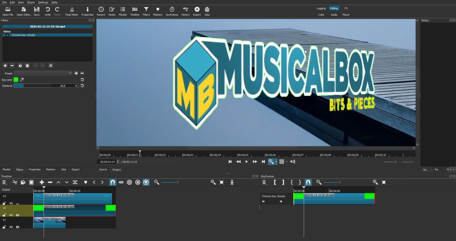
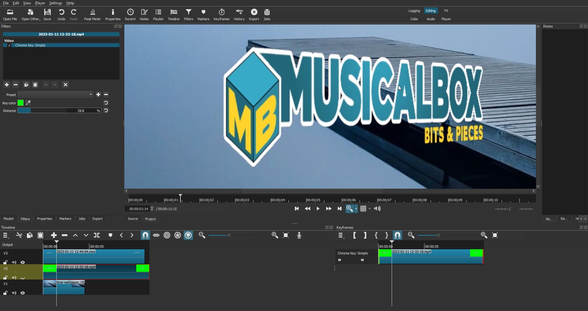
In the screenshots below, the zoom is set to 300% in the preview panel.

Using a MP4 file with green background:

Using a MOV file with alpha channel:

Demo

5 Likes

Yes, you’re right, the Chroma-key method can be a bit hit and miss depensing on the colours and the fine detail. So saving it as a MOV with an ALPHA channel is much better, especially as I use this method myself. Thanks for pointing this out.

1 Like

@Elusien
J’ai testé votre code html, je pense qu’il y a une inversion entre delay et duration ligne 22
Pour moi delay c’est la durée avant que l’animation démarre et duration c’est le temps pour faire un tour complet.
C’est un détail, votre code me sera très utile. Merci.

I tested your html code, I think there is an inversion between delay and duration line 22
For me delay is the duration before the animation starts and duration is the time to make a complete turn.
It’s a detail, your code will be very useful for me. Thank you :wink:

1 Like

Thanks for spotting this and reporting it. I have fixed the code above.

Merci d’avoir repéré cela et de l’avoir signalé. J’ai corrigé le code ci-dessus.

Nice.

I think I spotted an anomaly. Your logo appears to be a 2D object and not a 3D object.

If you need a hand making your logo as a 3D object in .STL or .OBJ or one of the other 3D formats let me know.

Otherwise, your demo looked great and I only noticed because I do a lot of 3D design here.

I agree it’s not a 3D object. But in the example video shared by the original poster (@GoodFellas), the objet is not in 3D either. It’s a flat 2D JPG image. The tutorial shows how to animate that image in Adobe Premiere to make it look like it’s spinning.
3dspin

Furthermore, @GoodFellas mentions the Corner Pin filter. That also suggests that he doesn’t plan to use a 3D object. The title of this thread says the poster needs help with making a 3D spinning object, not help with making a 3D object spin :wink:

That’s pretty much what is accomplished with the two methods proposed above by Elusien.

The only purpose of my demo was to illustrate the advantage of choosing a clip with a transparent background instead of a clip with a green background when using @Elusien’s HTML file method.

Thanks! :blush:

It isn’t difficult with HTML/CSS to create 3D cubes and cuboids and rotate them. The HTML to do this for a cube is given below.

<!DOCTYPE html>
<html>
<head>
    <title>Rotating Cube</title>
    <meta charset="UTF-8">
    <meta    name="description" content="Rotating Cube">
    <meta    name="keywords"    content="rotating, Shotcut, cube, animation">
    <meta    name="viewport"    content="width=device-width, initial-scale=1.0">
    <meta    name="author"      content="Neil (elusien.co.uk)">
    <style>
* { background-color: transparent; }

html {
    height            : 100%;
    --font_size       : 64px;
    --cube_size       : 200px;
    --background_color: transparent ; /* #999999 or #00ff00 for a green-colored chroma-keying */
    --opacity         : 0.8;
    --text_color      : white;
    --text_shadow     : 2px 2px 2px #000000, 2px 0 2px #000000, 0 2px 2px #000000, -2px -2px 2px #000000;
    --top_color       : red;
    --bottom_color    : orange;
    --left_color      : yellow;
    --right_color     : green;
    --front_color     : indigo;
    --back_color      : violet;
    --rotate_axis     : rotate_XY; /* one of rotateX, rotate_Y, rotate_XY */
    --delay           : 3s;
    --duration        : 6s;
    --easing          : linear; /* one of: linear, ease, ease-in, ease-out, ease-in-out  */
    --perspective     : 2000px;
}

body {
    height          : 100%;
    overflow        : hidden;
    display         : flex;
    justify-content : center;
    align-items     : center;
    font-size       : var(--font_size);
    color           : var(--text_color);
    text-shadow     : var(--text_shadow);
    background-color: var(--background_color);
    perspective     : var(--perspective);
}

.scene {
    --half_size: calc(var(--cube_size) / 2);
    width      : var(--cube_size);
    height     : var(--cube_size);
    perspective: var(--perspective);
}

.cube {
    position       : relative;
    width          : 100%;
    height         : 100%;
    transform-style: preserve-3d;
    transform      : translateZ(calc (-1 * var(--half_size)));
    animation      : var(--rotate_axis) var(--duration) var(--easing) var(--delay) infinite

}

.face {
    position       : absolute;
    width          : 100%;
    height         : 100%;
    display        : flex;
    align-items    : center;
    justify-content: center;
    opacity        : var(--opacity);
}

.top    { background-color: var(--top_color   ); transform: rotateX(  90deg) translateZ(var(--half_size)); }
.bottom { background-color: var(--bottom_color); transform: rotateX( -90deg) translateZ(var(--half_size)); }
.left   { background-color: var(--left_color  ); transform: rotateY( -90deg) translateZ(var(--half_size)); }
.right  { background-color: var(--right_color ); transform: rotateY(  90deg) translateZ(var(--half_size)); }
.back   { background-color: var(--back_color  ); transform: rotateY( 180deg) translateZ(var(--half_size)); }
.front  { background-color: var(--front_color ); transform: rotateY(   0deg) translateZ(var(--half_size)); }

@keyframes rotate_Y {
    from {transform: translateZ(calc(-1 * var(--half_size))) rotateY(  0deg);}
    to   {transform: translateZ(calc(-1 * var(--half_size))) rotateY(360deg);}
}
@keyframes rotate_X {
    from {transform: translateZ(calc(-1 * var(--half_size))) rotateX(  0deg);}
    to   {transform: translateZ(calc(-1 * var(--half_size))) rotateX(360deg);}
}
@keyframes rotate_XY {
    from {transform: translateZ(calc(-1 * var(--half_size))) rotateX(  0deg) rotateY(  0deg);}
    to   {transform: translateZ(calc(-1 * var(--half_size))) rotateX(360deg) rotateY(720deg);}
}

    </style>
</head>
<body>
    <!-- 3D Rotating Cube -->
    <div class="scene">
        <div class="cube">
          <div class="face top"   >Top</div>
          <div class="face bottom">Bottom</div>
          <div class="face right" >Right</div>
          <div class="face left"  >Left</div>
          <div class="face back"  >Back</div>
          <div class="face front" >Front</div>
        </div>
      </div>
      
</body>
</html>

OK, for a cuboid use the following HTML.

<!DOCTYPE html>
<html>
<head>
    <title>Rotating Cuboid</title>
    <meta charset="UTF-8">
    <meta    name="description" content="Rotating Cuboid">
    <meta    name="keywords"    content="rotating, Shotcut, cuboid, animation">
    <meta    name="viewport"    content="width=device-width, initial-scale=1.0">
    <meta    name="author"      content="Neil (elusien.co.uk)">
    <style>
* { background-color: transparent; }

html {
    height            : 100%;
    --font_size       : 64px;
    --w               : 400px;  /* cuboid width  */
    --h               : 200px;  /* cuboid height */
    --d               : 150px;  /* cuboid depth  */
    --background_color: transparent ; /* #999999 or #00ff00 for a green-colored chroma-keying */
    --opacity         : 0.4;
    --text_color      : white;
    --text_shadow     : 2px 2px 2px #000000, 2px 0 2px #000000, 0 2px 2px #000000, -2px -2px 2px #000000;
    --top_color       : red;
    --bottom_color    : orange;
    --left_color      : yellow;
    --right_color     : green;
    --front_color     : indigo;
    --back_color      : violet;
    --rotate_axis     : rotate_XY; /* one of rotateX, rotate_Y, rotate_XY */
    --delay           : 3s;
    --duration        : 6s;
    --easing          : linear; /* one of: linear, ease, ease-in, ease-out, ease-in-out  */
    --perspective     : 2000px;
}

body {
    height          : 100%;
    overflow        : hidden;
    display         : flex;
    justify-content : center;
    align-items     : center;
    font-size       : var(--font_size);
    color           : var(--text_color);
    text-shadow     : var(--text_shadow);
    background-color: var(--background_color);
    perspective     : var(--perspective);
}

.scene {
    --half_w   : calc(var(--w) / 2);
    --half_h   : calc(var(--h) / 2);
    --half_d   : calc(var(--d) / 2);
    width      : var(--w);
    height     : var(--h);
    perspective: var(--perspective);
}

.cuboid {
    position       : relative;
    width          : 100%;
    height         : 100%;
    transform-style: preserve-3d;
    transform      : translateZ(calc (-1 * var(--half_d)));
    animation      : var(--rotate_axis) var(--duration) var(--easing) var(--delay) infinite;
}

.face {
    position       : absolute;
    display        : flex;
    align-items    : center;
    justify-content: center;
    opacity        : var(--opacity);
}

.top    { width: var(--w); height: var(--d); background-color: var(--top_color   ); transform: rotateX(  90deg) translateZ(var(--half_h)); }
.bottom { width: var(--w); height: var(--d); background-color: var(--bottom_color); transform: rotateX( -90deg) translateZ(var(--half_h)); }
.left   { width: var(--d); height: var(--h); background-color: var(--left_color  ); transform: rotateY( -90deg) translateZ(var(--half_w)); }
.right  { width: var(--d); height: var(--h); background-color: var(--right_color ); transform: rotateY(  90deg) translateZ(var(--half_w)); }
.back   { width: var(--w); height: var(--h); background-color: var(--back_color  ); transform: rotateY( 180deg) translateZ(var(--half_d)); }
.front  { width: var(--w); height: var(--h); background-color: var(--front_color ); transform: rotateY(   0deg) translateZ(var(--half_d)); }

.top    { top : calc((var(--h) - var(--d)) / 2); }
.bottom { top : calc((var(--h) - var(--d)) / 2); }
.left   { left: calc((var(--w) - var(--d)) / 2); }
.right  { left: calc((var(--w) - var(--d)) / 2); }

@keyframes rotate_Y {
    from {transform: translateZ(calc(-1 * var(--half_d))) rotateY(  0deg);}
    to   {transform: translateZ(calc(-1 * var(--half_d))) rotateY(360deg);}
}
@keyframes rotate_X {
    from {transform: translateZ(calc(-1 * var(--half_d))) rotateX(  0deg);}
    to   {transform: translateZ(calc(-1 * var(--half_d))) rotateX(360deg);}
}
@keyframes rotate_XY {
    from {transform: translateZ(calc(-1 * var(--half_d))) rotateX(  0deg) rotateY(  0deg);}
    to   {transform: translateZ(calc(-1 * var(--half_d))) rotateX(360deg) rotateY(720deg);}
}

    </style>
</head>
<body>
    <!-- 3D Rotating Cube -->
    <div class="scene">
        <div class="cuboid">
          <div class="face top"   >Top</div>
          <div class="face bottom">Bottom</div>
          <div class="face right" >Right</div>
          <div class="face left"  >Left</div>
          <div class="face back"  >Back</div>
          <div class="face front" >Front</div>
        </div>
      </div>
      
</body>
</html>

I should have used the Shotcut logo instead of mine in my demo… :sob:

This topic was automatically closed after 90 days. New replies are no longer allowed.