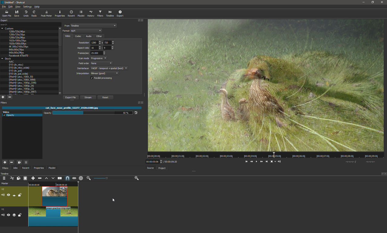
I have a project with two video tracks.
Upper track V2 is a still image, duration 5 seconds
Lower track V1 is a video clip, duration 30 seconds.
Still image in V2 is position at middle of video in V1.
I want the still image to be about 50% opaque.
I selected the still image, applied Filter>Opacity, set slider at 50%.
Still image totally obscures video clip below it. No change.
I then found the following: “…enable Compositing on the top track, then you’ll see the opacity behave as you might expect and you’ll be able to see the clip in the background track start to show through.” So I tried various combinations of the Compositing icon. I also tried various opacity settings from 5% to 95%. Nothing worked; there is no change.
What am I doing wrong?
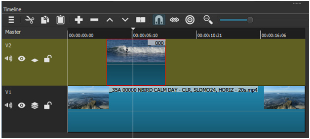
No, compositing should be on V1
Got it, thanks. The internet is a cornucopia of misinformation, innit?
The gem I quoted is from reddit.
I included a link but it generated some garbage so I removed it.
No, it should not. I am considering to remove the ability to toggle it on the lowest video track because people are shooting themselves in the foot by turning it on. Your screenshot even shows composting ON on V2 and OFF on V1.
More than likely, the image was not properly selected. There are some selection bugs in Shotcut. If unsure, click select something else and then re-select the image clip. Then, check filters.
Oh ffs. So I don’t understand your icons and tool tips. Point is, the OP had the wrong track I had the opposite and it was the correct way. That I misread the icons and tool tips is a UI/UX issue.
It’s on by default, btw.
At least every time I open SC and add a video to the timeline.
No, it isn’t
Sigh. I give up. The stacked icon makes no sense to me, clearly.
The icon is similar to “flatten layers” or not as used in some image editing programs repurposed for this. I am not really keen on this icon either, but I have not found much better. The system theme icon is different and perhaps and possibly worse in my opinion. The tool tips reflect what happens if you click them as opposed to the current state.
Yes, that’s where it’s confusing me.
I’ll get over it - carry on ![]()
I don’t know about should or shouldn’t, but I did it the way Steve suggested and it worked.
Unless, of course, I misread the icons and the explanatory messages when hovering the mouse over them.
You likely did as I did, which as I implied to Dan do seem counter intuitive.
I am going to change the icons and tooltips. The track icons represent the current state, and things like mute and lock are clear but not compositing. I will change the icon to make it clear by adding the common circle-with-slash not-symbol to represent the disabled state. I will also change the tooltips of all these to say: ____ is currently enabled/disabled. Click to ____.
For now, think: the multiple layers icon is intended to mean the layers are independent and not blending while the single layer icon is intended to mean the layer is composited (i.e. flattened). That combined with the fact that compositing is a top-down behavior - ala layers.
Leader:
Thanks for your patience. I have some idea of what you are going through - when I was writing text materials for language courses, I found that no matter how you word it or explain it, someone will get it wrong.
Bien OUI je relance car la gestion de l’opacité est vraiment bizarre
J’utilise ShotCut pour aider les débutants et les conseiller vers un soft gratuit de qualité
ShotCut est pas trop mal mais la gestion des points clé est assez laborieuse
comme cette utilisation de l’opacité.
ce qui a été écrit précédemment m’ai aidé …Il faut qu’il y ait une piste vidéo en dessous pour que l’opacité agisse . Ok ça correspond à une certaine logique.
Pas du tout ce problème avec Première …OK il n’est pas gratuit.