(a) Sure. I am new on this forum and didn’t know there was any such prohibition.
(b) I posted again because the first post got no response. I felt it was poorly worded; hence the lack of attention.
(c) Did you delete my second post, which did get a response and generated a helpful little dialogue? I don’t see it in the general list anymore. That would be very peculiar!
(d) Is there any way to delete a post? I would have done this to the first post if I had thought of it and if it were possible.
I repeated this post, moved it to #suggestion, and removed your first post that got no responses. Yes, you can delete a post you’ve made but also doing that repeatedly to get attention will be cause some temporary silencing.
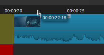
I found at least a partial solution: Make the tracks taller in the Track Height options in the Timeline Menu and adjust the relative sizes of the timeline and the rest of the screen above it. The timecode box automatically rises through a range of positions well above the waveforms, including, depending on the adjustments, much closer to the cursor. (The cursor is not shown in the screenshot.)
I do not want to add an option to hide the time indicator. But I do think that it pops up in the way some times. I am going to work on a change to make sure that it always appears just to the right and just below the mouse pointer. That should keep it out of the way for the most part.
I actually thought the same thing and made the comment below, but since I’m not yet very familiar with how this forum works, I inadvertenty deleted it when I added a new comment:
“Another idea: If the timecode isn’t made removable, at least it could be placed higher, closer to the cursor. Then it would never obstruct the waveforms no matter how low in that space at the top of the timeline the cursor was.”
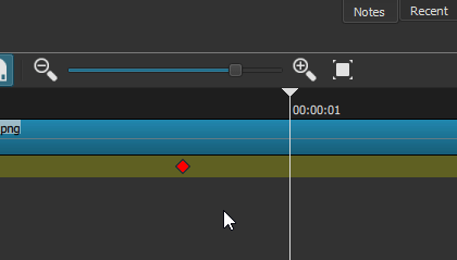
While you’re at it @brian is it possible to also modify the other indicator?
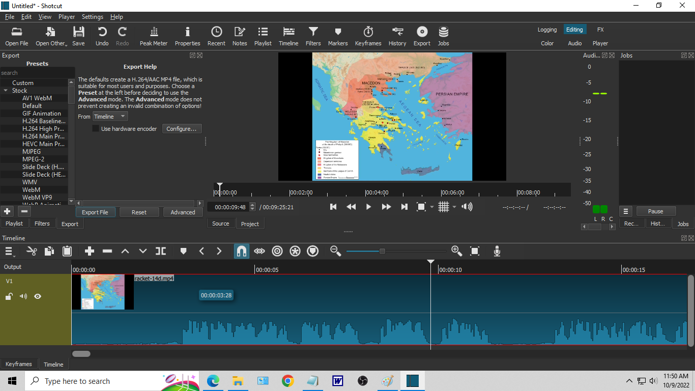
When the name of the clip is short, sometimes the cursor will hide a part of the timecode.
I think that users typically expect “tool tip” type popups to be in the lower right. But in the specific case of the timeline, I think middle works a little better to stay out of the way.
We have implemented improved and more consistent positioning of the popup “bubble” for the next release. I think this will reduce the obstruction of waveforms and clip names.
A bit of a different scenario but can the same treatment (align start to the right of the mouse) be given to the “popup” when dragging clips from the playlist into the timeline? The image below the mouse completely obscures the timeline drop location so I usually end up messing it up and having to undo.
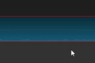
In the way of what? The keyframe itself, the waveform above, or the parameter tracks below? I doubt we can avoid all of them.
Update: This is implemented differently than the others, and I was not able to get it to reposition. And after making a conversion to the same implementation, the text in the tooltip no longer updates as you drag around. One thing I can do is to not show it while dragging.
I see. So it is either leave it as it is, or hide it while dragging.
I vote for leaving it as it is. It’s not that big of a problem anyway. And it only hides the keyframe when the height of the track is quite small. Plus, I have a feeling you’ll get a few complains if you choose the second option.