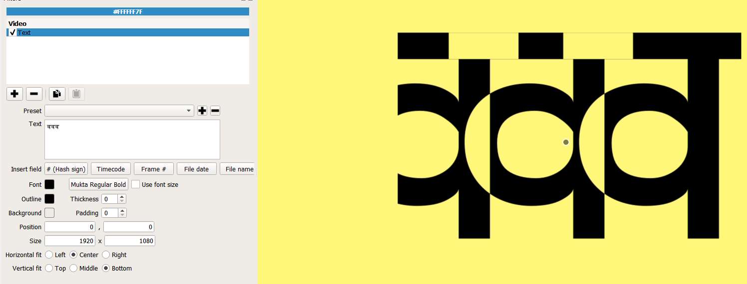
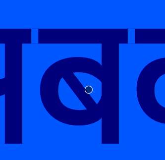
When I write it in Text filter - it shows “gaps” in between letter tops (note the WHITE gaps). There should not be any such gaps between letters of a word.
“Why” in IT is a tricky question, but I will try: You need to realise that any program which is showing text, is using some rendering engine or other. Otherwise you would only see the glyph-codes in some default console-font.
Now with Devnagari fonts, as you have certainly experienced elsewhere, classic rendering engines are still struggling; as your fonts are considered somewhat “exotic” from a classic it perspective (where ASCII did not have enough characters for any non-English language)(for example from this need to have your top-linen join each other).
I looked over the text filter in Shotcut again and did not find what you would need: An option to tweak the horizontal spacing of your characters. You would find this in any DTP program, but SC is for video. (In Scribus the option is under Advanced Settings(!) and is called Manual Tracking, other tools are calling it something else.)
I am confident that this forum will find you several solid workarounds for the moment. In the long run, if we are asking nicely, the SC team might include “advanced text settings” into their roadmap. I would +1 this, as we are working with another “exotic” language in West Africa.
If you get tired of preparing workarounds, like HTML pages or even PNG files with text and transparency, you could consider hacking your font: You would grab another OpenSource tool like FontForge and try to make a copy of your font for Shotcut-use:
I quote from the book “Design with FontForge by the FontForge Community”
Chapter Spacing, Metrics and Kerning
…
In FontForge, the Metrics Window allows you to design the metrics of your font, alter the spacing between them, and test how glyphs look together. Metrics Windows can be opened from the ‘Window’ menu, or by using the Control-k command.
The space between any two glyph has two components; the space after the first glyph, and the space before the second glyph.
These spaces between glyphs are composed of the ‘side bearings’ from each glyph pair. Each glyph has a left side bearing and a right side bearing, in the example … of the lowercase ‘a’ of Open Sans the right sidebearing has a value of 166 units, and the left sidebearing has a value of 94 units.
You can use a sample text first in Shotcut and then in the FontForge metrics window, guessing and testing by iteration how much you need to remove in sidebearing units. I propose you start by removing 80 units on each glyph of your sample text and see what that does in SC. Then either remove even more or some less units.
Now I would go to the FontForge forum and ask there, how to efficiently reduce all the right sidebearings (for the entire font) by x units by way of a batch-job. That way the font would look too tight in any other tool and just right in Shotcut.
This sounds like real work, and all you want to do is “make nice videos”. But if you figure this out once, you will never suffer this problem again in SC. And for each text you need, you will save time - as compared to the workarounds. hth
PS: for a very quick-and-dirty fix, I tried with capital letters “TTT” and some random font and picked the maximum “outline” available (30) and picked the same outline-color as the main Font-color. Now my characters are indeed touching each other but the outline gives them “funny rounded corners” (as outlines normally do). (I also looked into the Shotcut .mlt file which is XML and found my text filter and reduced the line <property name="weight">500</property> to <property name="weight">300</property>
hoping to counter the effect of my artificial outlines. You would need to see what that does for your fonts, it might help or make things ugly.
The process you are looking for - that of increasing or decreasing the gap between characters is called “kerning” and you’re right - it’s really useful. I’ve just installed 18.06.01 and it isn’t present yet, so may be a subject for a feature request.
To overcome your difficulty in the meantime, the only suggestion I can think of is to create titles using such fonts in an external vector graphics editor (which should enable kerning as a basic feature) and export/import the results as transparent PNGs. I do this as a matter of course anyway for the extra flexibility it allows me with style in other ways and It doesn’t significantly hold you up
Gravit Designer which I heard about from a mention on this very forum by @Steve_Ledger the other day, does this brilliantly by adjusting the “character spacing” as explained in this article:
And can be downloaded for free, or even used online in a browser window from here:
Thank you @QDSOV for giving this workaround for right now. As I have mentioned in my reply, any designer tool will have a mature text rendering engine.
So the OP will not even need to get into kerning, as his font will display properly in Gravit Designer or others: All his top-lines will be touching, as intended by the font-designer. Just several extra steps, but “the show must go on” so I always appreciate any working workaround.
(I am Scribus man, 100%. Scribus gives you total control of your text and your page and is OpenSource and have many powerful exporting options, not least for PNG. But this is not important here. Just sharing my passions. )
Is there predefined Kerning setting with the Shotcut text filter? I see the OP’s point, and not quite understanding of why it’s happening myself. I looked at the git hub link and the font is TTF.
Yes the workaround would be making a transparent PNG with the font, but the font is correctly displayed in the the very first post.
We use Qt to render that text, and it should be using the font’s kerning. We do not turn off kerning in the Qt API.
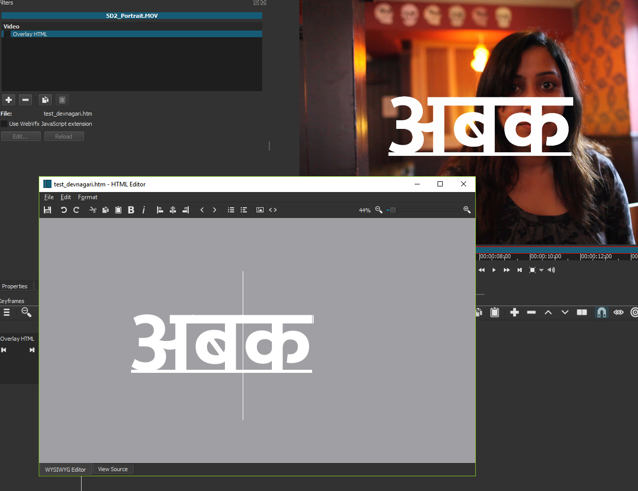
I recommend trying to use the Overlay HTML filter. That is a different text renderer using a WebKit runtime.
I downloaded the font and tested on Windows, which is likely to work best. It somewhat works in Overlay HTML filter, but it adds an underline that is different than if you choose to underline.
downloaded the zip and opened Mukta-Regular.ttf in Fontforge to have a look; all in order, well done font
now found a website for a how-to on batch processing the entire font:
Basically I did this:
First opened font in Font Forge
Element / Font Info / Changed the name to Mukta-Regular-narrow.ttf (otherwise I override original font)
Edit / Select / Glyphs worth outputting
Metrics / Set both bearings / Increment Bearings by -20 (note the negative value)
File / Generate Fonts / True Type .ttf / Generate
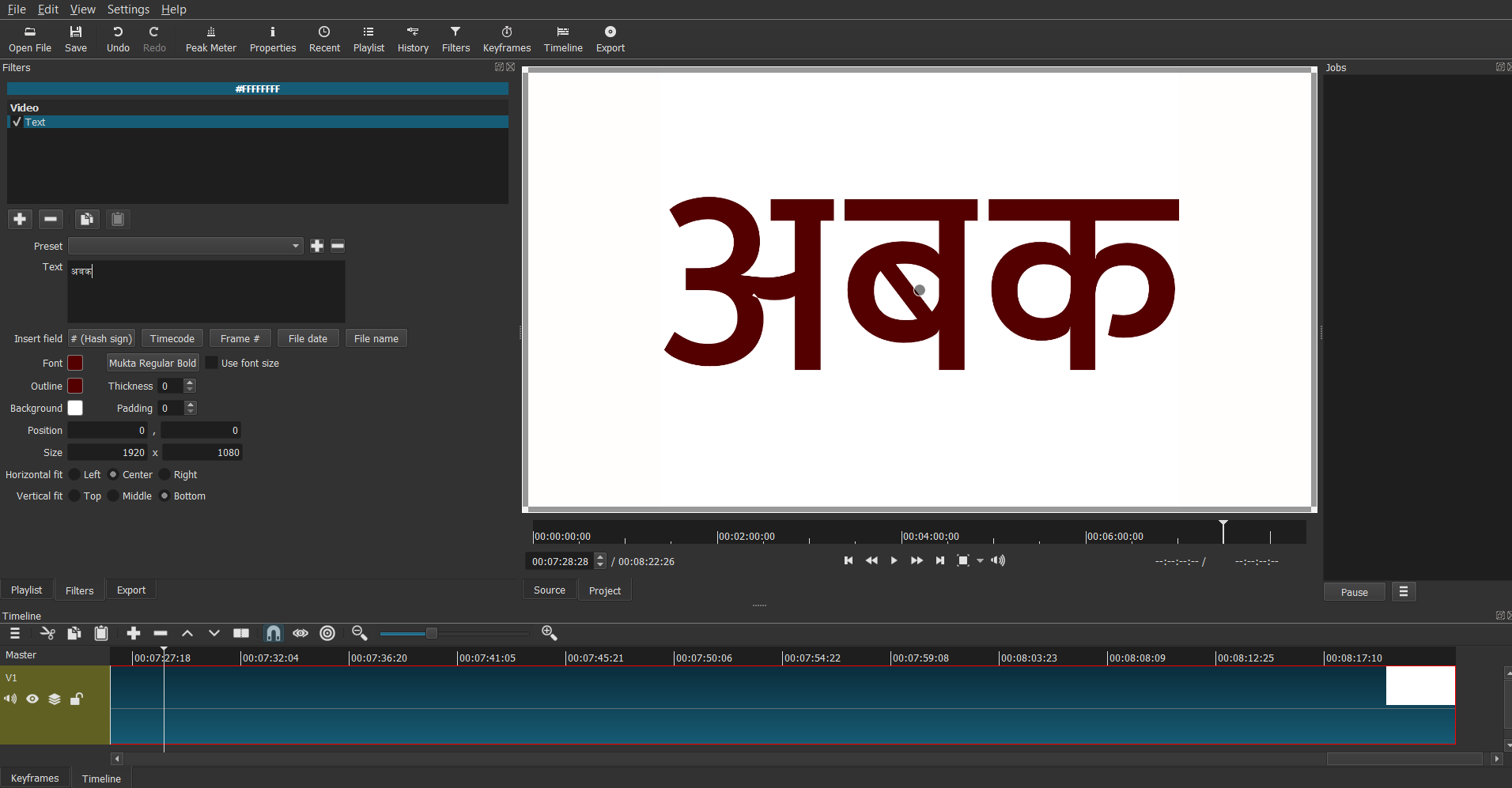
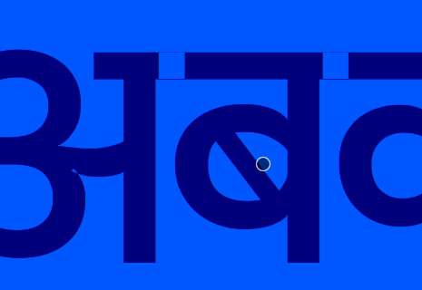
Now I tried both fonts in Shotcut, and in my screenshots you will notice what finally occurred to me:
My first screenshot: original spacing, second screenshot: identical font but reduced spacing by -20 front and rear.
The glyphs, even in the initial screenshot by the OP, are already overlapping slightly, as they are supposed to. But where they overlap, SC is wrongly rendering the overlap as a “cutout” (like when combining two vector-paths in Inkscape and getting a hole, like the center of the letter “o”).
The overlap is where you see the not-fontcolor squares with the fine hairlines around them.
So the font is fine and the spacing is fine (but with my trick you could test any reduced or mildly enlarged spacing you want, just for fun). But the rendering needs a little correction by the developers.
!
!
Hope this helps. I love typography. Shout if you need more details.
I believe, from my just now testing, that this thread could or should be re-tagged as a discoverd “bug”. No emotions needed, but many languages need touching or mildly overlapping glyphs; so guess it is a bug.
Thanks for trying, I couldn’t figure out how to do it myself.
That’s interesting. I had a suspicion that something like this were happening. If the letter overlap color were adjustable and were the same as the letter color - this issue wouldn’t be observed.
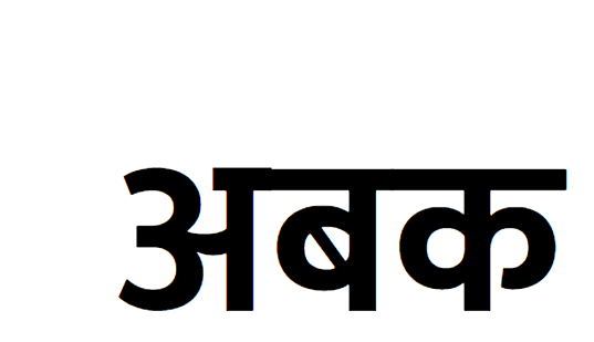
What you see on the top-line is the OP’s trouble. What you see below in the belly of the glyph is a dummy problem, which I have forced, just for show&tell. I picked a character with a curve and with a vertical line to make it really obvious.
Once the overlap–>cutout behaviour is fixed, the OP’s problem will be gone. And nobody will ever use such a tight kerning, but what about Asia and what about effects like “strike through”…

 )
)
 !
! !
!