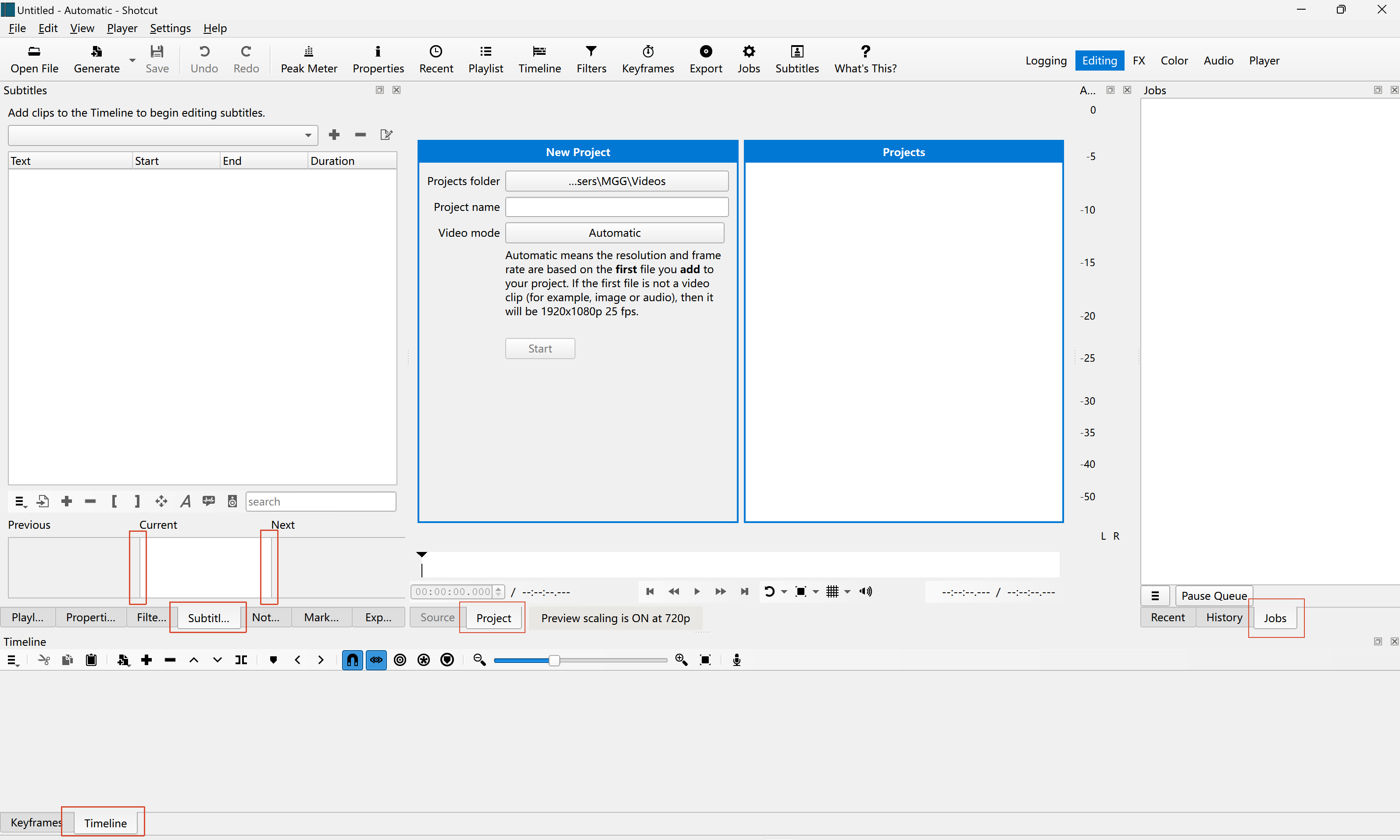
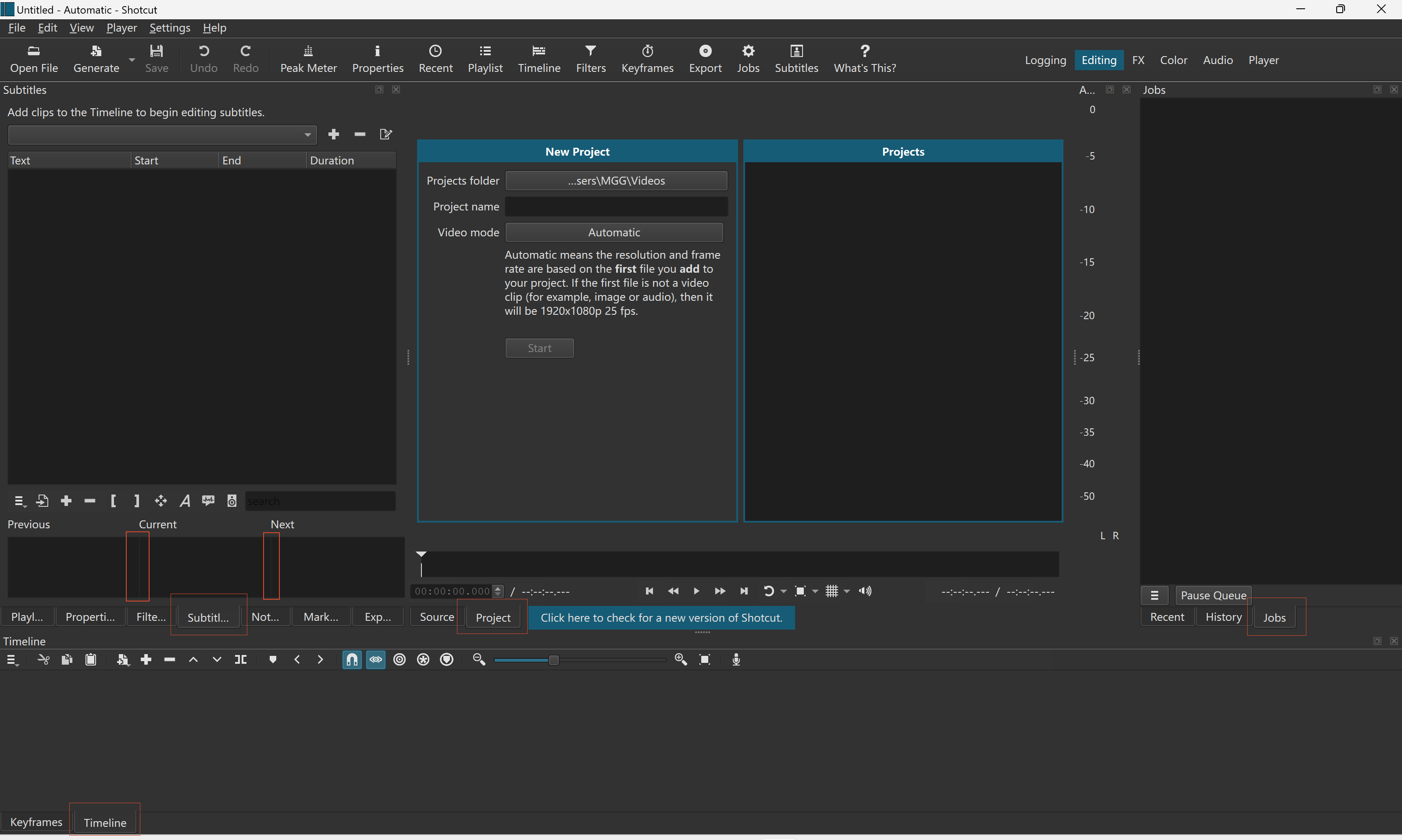
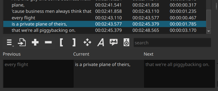
In light mode, it is much easier to distinguish different UI elements, especially those activated buttons, and borders of some regions than in dark mode, just like:
It would be better if the colors used in dark mode can be adjusted to improve the distinguishability between elements in the window, especially between active and inactive elements.
If your OS is in dark mode, the System Fusion theme often has greater contrast. The lower contrast Dark Fusion is by design to reduce distraction from the video content.
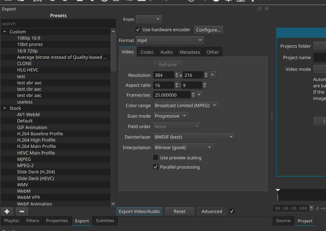
I looked into this, and for technical reason it is not easy to change. The change is intrusive to code within the Fusion style engine. It took quite a bit of work to change the tabs, requiring difference between top and bottom oriented tabs. The top ones do not bland in as well. The subtitle dividers I am not going to bother with.
Thanks for response, the new appearance seems much better now.
If it is hard to change the dividers for subtitles, how about adjusting the background color of the content window, i.e., using a brighter color, just like the light mode and the new appearance do.
In addition, can long subtitle text be automatically wrapped in the window and add a vertical scrollbar. This may be more in line with common usage habits and can also make better use of the window area.
Thanks for your efforts again. Wish you a pleasant life.