You are looking at the preview, which is using Settings > Interpolation that is probably set to Nearest Neighbor. The text compositor changed in v18.07 to fix a different compositing bug and to offer motion animation with sub-pixel rendering. Export interpolation settings defaults to bilinear, which is better quality. Try viewing the export.
OK, I just tested it, and I can confirm the text edges are not as clean and anti-aliased on v18.07 even with interpolation set to bilinear. I will look for a solution.
UPDATE: This has been fixed for the next release v18.08.
For in-app preview, it uses Settings > Interpolation. For export, it uses Export > Video > Interpolation.
Pardon the newbie question, but I see a menu-bar “Settings” menu and not an “Export” menu–how do I get to this option? (I did find an Interpolation setting in the Export pane, having pressed Advanced, after Deinterlacer, but I presume it’s only for the deinterlacing; at any rate, I set it and saw no result when I exported again.
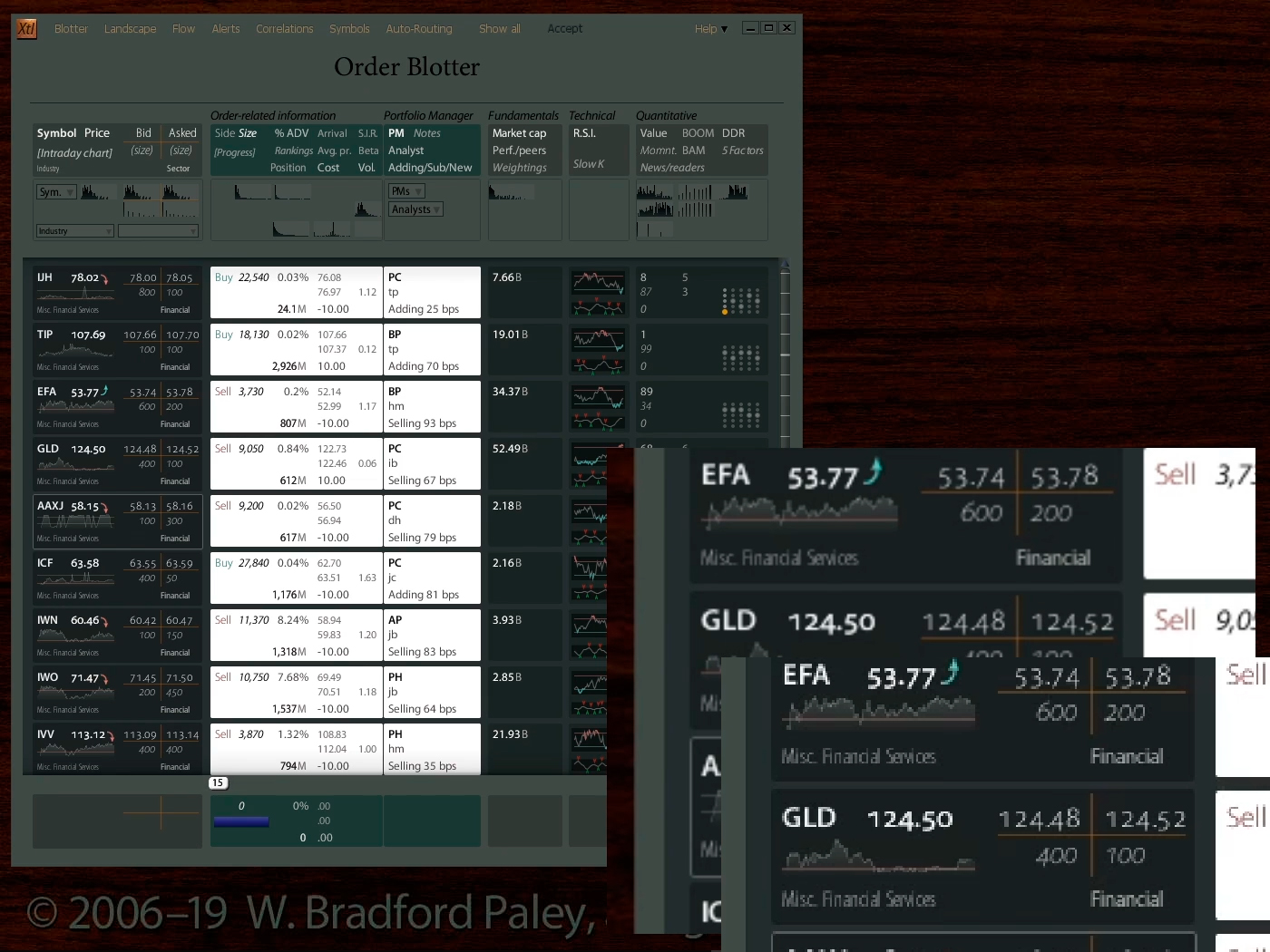
What I’m going for is what you’ll see in the lowest-right scaled inset below (which I scaled from the base image with Photoshop & nearest-neighbor). What I’m getting is the inset Shotcut scaled in the video, just “behind” it. (Some might think I’m splitting hairs, but the high-frequency (sharp) edges, even on the scaled pixels, prevent the eye from thinking they need to re-focus; even though its scaled antialiased text, it’s more comfortable; clearer to my eye.)
P.S. Is there an easy way to put, say, a red border or drop shadow around the inset to help people feel that it’s not a part of the base image?
BTW: thank you for all the hard work and this great gift to the community!
PPPS: Worse, the image-uploading process seems to not only blur the image, but change all the colors: amping up saturation! (I have clean pixel-boundary green/white edges around the bottom-right-most “Sell” round rectangles here) In a forum like this, where I think we all care (overly?) about colors and edges, might it be useful to turn off the perhaps-helpful-elsewhere image-mangling–assuming the site software allows it?