I’m sharing this video only to discuss / share the tech side of things…
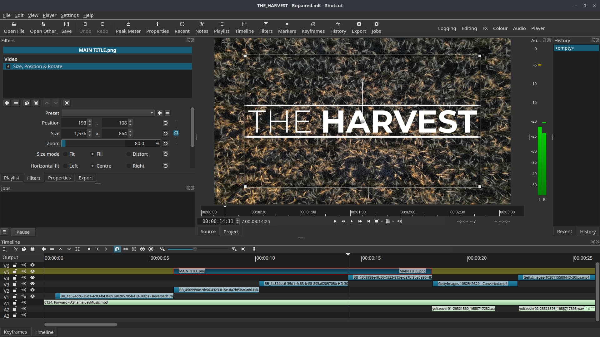
Video starts with Cinematic title with size Positions & Rotate. It was a challenge to make it work… but I was happy on the 2nd attempt…
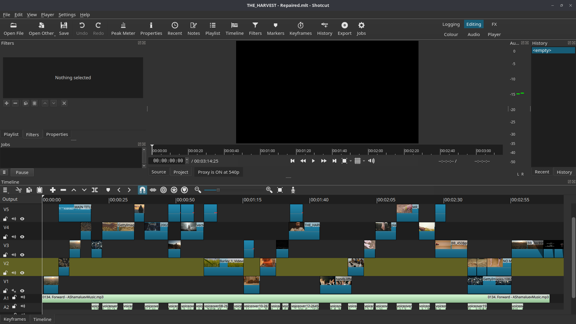
Once more I used straight cuts on most of the video… Soundtrack helped me a lot!
Transition using Hue/Lightness/Saturation around 35 secs, 1:47 min, 2:38, 2:42:12, 2:55 and 03:05 (with fade to black). This worked pretty well with the soundtrack.
Blend mode filters (Screen) from around 2:39 to 2:55
Colour Grading filters were also used…
The film looks really great.
1ne thing could be improved in my opinion:
The 1st writing 6-10 seconds disturbs a bit. After that everything is perfect in my eyes.
It is very typical that adaptive bitrate streaming (as used by YouTube and many services) starts out with a low resolution and bitrate before climbing to something good quality. Sometimes this is guided by the size of the playback device - a somewhat small rectangle embedded in a window on your screen. Right-click the video and choose Stats for Nerds to see what is going on. For me, even though the gear icon shows HD and clicking it shows “Auto (1080p)”, after I switch to full screen and restart from the beginning it is actually playing 360p in the beginning. It does not reach 1080p until 0:22. This low quality beginning has been cached and is being used when restarting instead of downloading new hi-res chunks of video (yes, it literally is chunks : segments, fragments, or byte ranges). So, for me, that low quality in the beginning is what is causing “1st writing 6-10 seconds disturbs.”
We may need to ask @thegrobi what they meant, since I took a different meaning to that of the video “quality” being disturbing.
I may well be wrong, but based on what I saw, I think @thegrobi was referencing the specific way you are bringing the text in on that 6-10s segment and how it is cut. That section of text never fully reveals itself and is abruptly cut off with only the “E HARV” showing (which is why some might find that rather jarring, and I am included in that group). Then a similar (but not the same) zoom sequence is used so the text is fully displayed and the viewer can read it. That part looks great, but I agree with @thegrobi and to my poor eyes it looks like the 6-10 second text animation shouldn’t even be there.
However, I can see that it was a deliberate effect, since the texts and zooms are different sizes and positions, and I can see how some would like it.
To each their own, and I really like the rest of the video!
Thank you for your feedback.
I reckon that the video title sequence is a bit odd…
In my editing, I follow a lot the soundtrack…
That’s why I choose to use 2 videos in sequence to avoid boring continuous zooms ins and outs…
Without a title, it works great…
I hope the screenshots help to show what I tried to do…
I used shot 2 and 4 as basis… Title is absent on the 1st and I tried to match title animation with 3rd shot zoom out animation and, at the same time, to try to give some continuity to the the Title’s animation between shots 3 and 4…