Hi everyone.
I have been using Shotcut since 2017 and I am fairly happy with the results, especially since I learnt how to use the Chroma Key Advanced which made a big difference
The above link is one of my latest reviews and I need your advice on what and how I could take them to the next level.
They need to look a bit more professional and I am lost on what to add to achieve this!
I am okay with honest opinions (not really I cry off screen)
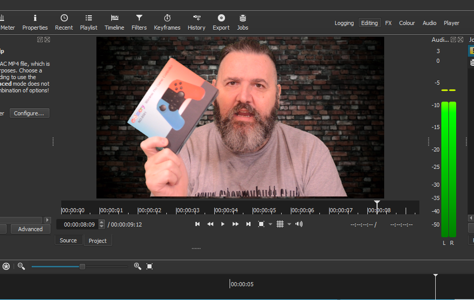
Show more details of the controller, with closeups front, back, and the buttons, like what the texture looks like. Describe the textures.
Let the viewers hear the sounds of actual vibration on all 3 settings and button usage while playing the game. Maybe set the controller on the table as the vibration happens when knocking on the door to illustrate how much it vibrates. Capture the game play of you knocking on the door and putting it upper left or right hand corner of the screen.
Nice thumbnail by the way!
Edit: A few other thoughts. Show how it connects to the Switch, and talk about how much battery life the controller has as to what you are experiencing. You may have viewers who want to watch your video to figure out if it’s easy enough for them to get the controller and use it. If you have any difficulties fully explain how you resolved them.
YouTube related:
Take advantage of YouTube’s chapters (timestamps) as people may only want to see how it connects, or hear how the buttons sound when used, and they can easily jump to that spot in the video. Also use hashtags in your description/titles. Chapters and hashtags can be added/changed at any time for your current videos.
I like that your video gives examples from actual gameplay of what makes a controller good or bad! That’s useful to know how you reached your conclusions.
My first thoughts in no particular order:
Audio: Reducing echo in the room, then reducing noise with Audacity perhaps. Background hiss is quite high. Your voice sounds almost like Jeremy Clarkson talking about racing games, so we need to let your great speaking voice shine.
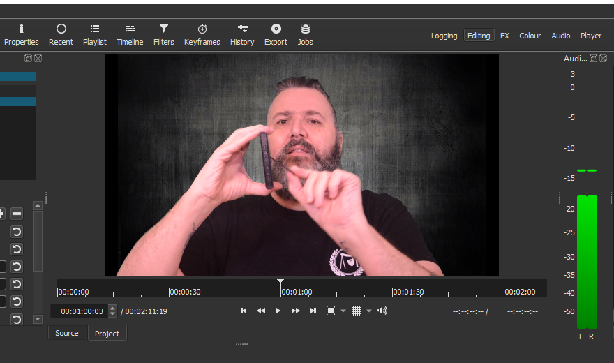
Camera angle: I realize that your face is offset from center to leave room for holding up products. But that product space is rarely used. So we get an entire video that’s too-zoomed-out which means less face and product detail, all while being uncomfortably off-center. I would be more engaged if there was less wall and more face, and product shots were high-detail close-ups that @Hudson555x suggested. The occasional jump cut would make the overall flow more interesting too. If you wanted to hold up a product, there is still plenty of room directly above your shoulder even while zoomed in if you allow the product to briefly overlap your ear. EDIT: Clarity on zooming in… There is more empty space than necessary between the top of your head and the top of the screen. If the camera was tilted down to put your eyes around the 1/3rd vertical mark, the new view would see down to your elbows. That’s probably too low, meaning the camera could zoom in now to crop out your elbows and get back to the shot you have now. As in, tilting the camera down would allow a slight zoom with more face detail but without giving up the current space for moving hands and products.
Lighting: It is very flat at the moment and slightly over-exposed. The end result is not being able to see curvature on your face or the products. It looked like you had two overhead light sources from opposite sides. If one was made slightly darker than the other (either by moving the light further away or putting a diffuser in front of it), then we could get slight shadow on one side and detect curvature. The result should look more dimensional. If you try this and the dark side gets too dark too fast, it can be boosted by changing the Gamma point of the Levels filter (or use Color Grading sliders).
Background: The brick is nice. However, the brick and your face contain similar shades of red, meaning low contrast, meaning your face doesn’t pop from the background. It blends in. Trying other colors could create more contrast, especially complement or split complement colors. Or, simply reduce the saturation of the brick to make its red less pronounced.
Nice video!
Have you considered making a Chroma Key Advanced tutorial? I haven’t seen many of those, especially recent.
I am no pro but what came into my mind immediately: the brick wall background is nice but completely irritating here. It shows a lot of detail and as Austin mentioned interferes with your head and hair and made me very nervous throughout the whole video. You should replace it with something smooth single colored maybe blueisch to white/grey gradient.
One technique to play with the point of focus is to focus to the main object and let the background in blurriness. You could open your apperture on your camera to achieve this or simply replace the overdetailed background.
Also mentioned: do closeups of the product, show the detail and buttons.
Maybe also show it in action and how it behaves in critical situations.
Voice was quite o.k. for me but maybe a bit too fast and unprecise for non-english motherlanguaged
Yeah, that’s a good point. The details on the brick are much sharper than the details on your face. This instinctively makes the viewer think that the camera focused on the brick rather than your face, as if the camera missed focus. Whatever the background is, it needs to be less sharp than your face in order to make your face look like the foreground element.
Aside from that, it sounds like everyone wants to see the controller in action! It’s like the script writer’s mantra… “Show, Don’t Tell” haha. Your best asset is yourself and your voice, really. You seem like a cool, chill person. So a live demonstration from you would probably be entertaining without having to be hype noise like so many other reviewers.
Thank you @Hudson555x@Austin@RilosVideos
It was more advice about video rather than the actual product review and you have given me some very good advice.
I will look to replace the background with something less fussy and red, I hadn’t realised.
Yes I use two LED Panels either side and about 3’ away from the camera angled in, then a small LED panel on top of the camera. I will reduce the intensity on the camera top light and also one of the LED panels to create some shadow. I had actually just been trying to properly light the green screen as had issues when I was only using the Simple Chroma filter, now I use the Advanced I will have more control with less light intensity.
The sound, maybe if I can lose the LED panel on top of the camera, I can place a shotgun mic on top, I am currently using a cheap Boya lav mic that sits in front of me!
I had thought sitting to one side was good, alas I am wrong and that is okay, I will try and zoom in and also try close ups, I am working from one camera but I could bring in another and chop between the two?
Thank you so much for the advice!
To be honest i am not really happy with this background either. The grey is very similar color as your hair and interferes. Why didn’t you try my advice just to use a blue-white gradient color that really chops you out of the background? Also there is too much dark for my opinion but that may be personal feeling. I would opt for something bright and distinguishable
Unfortunately for the OP, this is the part of the show where he will have to do whatever he likes best for himself because there is no way to please everybody haha.
I actually liked the gray background. If there is a way to lighten or darken it to distinguish it from your hair more, that would be a nice bonus as Rilo mentioned. But it’s not a deal-breaker to me personally. Having your hair blend in a little (not totally) actually makes your eyes all the more prominent as the focal point, and that’s a useful feature. And the really helpful feature is that having similar colors between background and hair makes rough edges from the chroma key drop-out appear less noticeable. A neutral background like gray also makes it easier to highlight the colors of products. As in, a red product doesn’t show up against red brick obviously. A gray background allows every color of product except gray to pop forward.
As for gradient backgrounds, that’s also a tough area of personal preference. For me, I’ve seen a few that look okay, but it’s really easy to look artificial or sterile or super 1980’s in a hurry if not careful. Whether that’s a good or bad thing depends on how much you like the ‘80s.
I gotta say I’m impressed with your chroma key work. I can see how trying to add a shadow on the side (modifying the light configuration) would cause problems with the evenness of the green screen. What about moving yourself maybe five feet in front of the screen so the side lights are minimal spill onto the green, then light the green independently with a light that’s behind you? As in, maybe taking the current front light and moving it between you and the green screen to give the screen independent even lighting? Hopefully a cleaner green screen would keep your post-production work easy.
In my personal opinion this is so much better! You are clearly visible, no irritating background. And you did a really good job on the gradient color background as well! Of course the color is personal flavour, but i like it as it is. If you feel this pops you out too much, you can still change it to a gray gradient with less variation if you like.
I am very limited on room, so I am sat probably about 18" in front of the screen and have no extra room. It took me a long while to get the hang of the Chroma, it drove me mad and you can see by my older videos that it was not great!
So after chopping and changing and not being happy, I went back to the brick but added a vignette and a blur. @Austin I have centred myself in the video and I think the filters applied to the brick is better.
To me, that looks way better than the original shot!
I am curious what a very slight drop in saturation from the Hue/Saturation/Lightness filter would look like.
I’m totally impressed you’re only 18 inches from the green screen and have no noticeable green spill on your face or clothes. I would watch any tutorial you made on how to do that.