I came up with several suggestions while using Shotcut recently. I didn’t want to make a separate thread for each one so I put it all under one post.
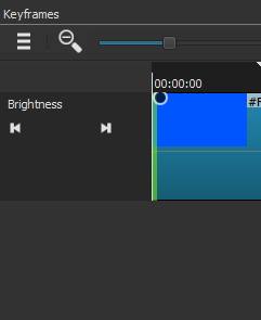
1 - Simple Keyframes could be improved. The issue is that having to move the trim and drag handles to where you want can slow down the workflow especially since there is no real snapping option. If you are working with a long clip then there is a lot of zooming in and out plus moving that has to be done to get the trim and drag handles exactly at the time you want them to be. To really improve this my suggestion is to add additional buttons that would be like instant snap buttons. The buttons would correspond to the left and right trim and drag handles. When you press one of them, that corresponding trim or drag handle would instantly snap to wherever the playhead is. This would speed up the workflow considerably as you won’t even have to bother zooming in and out of the Keyframe timeline nor take time moving the trim or drag handle to exactly at the spot you want it to be at. Just place the playhead where you want the trim or drag handle to go and press its button. This would make the Simple Keyframes option truly simple! 
There is enough room to add these new buttons:
Two new lines of buttons could be added right under the existing line of arrow buttons that are right there. One new line for the drag handles and another new line for the trim handles. There could also be default buttons in the middle of each new line to reset the positions. For filters that are not keyframeable but still have the Simple Keyframes timeline for trim handles like the Mute filter then just one new line of left and right buttons for them would be available.
2 - When dragging a clip from the preview window to the timeline the graphic for placement on the timeline for the clip looks like this:

This is very useful. It lets you know exactly where it will be placed, how much space it will take up and respects snapping. However, when a clip is dragged from the playlist to the timeline that is not the graphic that shows up. What shows up is not useful because it’s not clear where the clip will be placed, how much space it will take up and has no snapping. Can the graphic for dragging clips from the playlist be made the same as the one that comes up when dragging from the preview window?
3 - Whenever a clip is brought down to the timeline, the playhead will always end up at the end of the clip. I don’t know how others feel about this and they could chime in if they feel otherwise, but I think it makes more sense to have the playhead be at the start of the clip when its brought to the timeline. This is especially an issue when you are first starting a project and you bring down your first clip but have to then take the extra step to go back to the start of the timeline.
Edit: Rethinking this. Instead of it defaulting to the start of the clip, I think it’d be better that when a clip is brought down to the timeline by drag and drop that the playhead simply stay exactly where it is just like how the playhead doesn’t move when clips about being dragged around inside the timeline. When a clip is brought down via a shortcut key (“B”) then it makes sense to have the playhead be at the end of that specific clip.
4 - In Text Simple, if you set the font and colors then pick a preset position/animation, then your font and color settings reset to the default. Can this be programmed so that picking a preset after customizing the text will still keep those settings?
5 - Also about Text Simple: Can any of the settings for colors (font, outline, background), thickness and padding be made keyframeable?
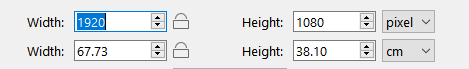
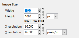
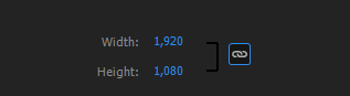
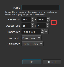
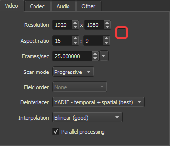
6 - It would be great to have an aspect ratio lock for the Export and Custom Video Mode menus. It’s a button that if selected would make sure that numbers typed for resolution respect the aspect ratio selected. Different programs have it like
nomacs
Gimp
and also Premiere Pro
It could have a similar placement in Shotcut
7 - Shotcut allows you to do an entire project in just the playlist and export that as one file. There is a sort of hidden mode in the preview window “ruler” (I think that’s what it’s called) for the playlist where it marks where every clip is.
In that mode, the playlist will play as if it’s one file. If you want to do a very simple edit in just the playlist that’s useful except that it can only be accessed if you remove an item from the playlist. How about creating a new tab under the preview window where that mode can be easily accessed? A “Playlist” tab in the middle of Source and Project?
8 - Also there is a limitation right now with the playlist if you want to do a simple edit. If you add any filter to a clip on the playlist then go to another clip on the playlist and back to the first clip, any filter added to the first clip is gone. The playlist will keep the filters on a clip if it came from the timeline but not if filters are added to a clip in the playlist. Can this be updated so that filters added to clips in the playlist will stay?
9 - Can a zoom in/out function be added for the ruler under the preview window? Or at the least an option to open a sub-clip in the playlist and have the preview window ruler reflect the whole sub-clip duration? This would be very useful when wanting to scrub around a short sub-clip in the playlist to make other sub-clips from it.
10 - Can sound options for 3.1, 6.1 and 7.1 channel surround be added?
 for all suggestions and especially the second and third.