Making skew text

Therein lies the problem…

(and I was actually speaking in jest, because this is a known problem with such “cursive” fonts)

…in an italic cursive font, the lowercase “f”, “k” and “l” must partially occupy the same space as the letter following.

Tools like FontForge, at least the better ones, allow you to specify how this is handled between two letters, but many operating systems and many apps simply ignore these directions and space the letters each in their own space.

… …In the case of TrueType Zapf Chancery and The Gimp, I think this is the case, that the font specified overlap, but the software in The Gimp doesn’t support letter overlap, creating a very awkward space in my business logo.

… …and so kerning the text, in such a case, involves making RGBA images of the text in sections and overlaying them with offsets to slide the “t” in “Software” in under the high tail of the “f”.

Without really knowing what I was doing I was able to modify the “k” character of Zapf Chancery.

Doesn’t look too good in this case, but doesn’t it prove that it’s possible to create a version of the font that will work in Shotcut ?

If that top example is the modified font, then the answer to…

…is that Shotcut handles such fonts properly, which is very good news indeed.

Here is how The Gimp handles the Z C font…

Note the spaces after “f” and “l” which preserve a no-vertical-overlap rule.

The top one is the original font
The one under is the one I modified. But that still show that each font can be modified. I just changed a few parameters without knowing what I was doing. With practice it will get better

So Shotcut obeys the kerning rules built in to the font. Good. Many apps don’t. The software for that is difficult.

I don’t see that problem with Zaft in Shotcut
(original font here)

You are right…


(from my external monitor)

…and with Lens Correction

1 Like

In fact, I don’t see it in Gimp either :thinking:

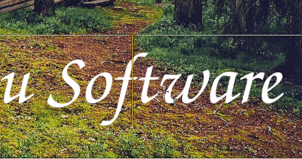
By the way. In case you don’t already know this trick: In Gimp (works also in Photoshop) you can modify the spacing between each character easily.
Position the cursor between two characters and use Alt+Left Arrow or Alt+ Right arrow to increase/decrease spacing.

2021-04-03_19.42.36

Wow!
That works!

Now I can fix my logo easily.

It is also relevant for my Shotcut work, because the way my workflow is already set up, I use the Gimp for my text PNGs.

Thank you.

1 Like

I have seven different Zapf Chancery fonts, from at least three different font houses, and they all start out with absolute one-character-per-rectangle in the Gimp. But now I know how to kern them.

Thank you.

I downloaded mine from there: ITC Zapf Chancery free font
Maybe I got lucky and found the right one on my first try.

You’re welcome @Sheep.

Let me know who you are backing for the Derby, the Preakness and the Belmont; I want to get in on the action.

Yes, that one works.

1 Like

:laughing:
I never had any luck at betting or at the lottery.
Sadly, my super power only work with fonts.

1 Like

My father only ever bet on two horse races, both times on tips from colleagues at work.
The first time, “It’s a sure thing; the jockey is hiding a shocker in his palm.”
And sure thing, on the final stretch the jockey shocked the horse, which promptly threw the jockey, jumped the fence and went bounding across the infield.
The second time, “This time it’s for real, there’s this new drug…”
The gate opened, the horse took a mighty leap, had a massive heart attack, and fell dead on the turf.

1 Like

This topic was automatically closed after 90 days. New replies are no longer allowed.